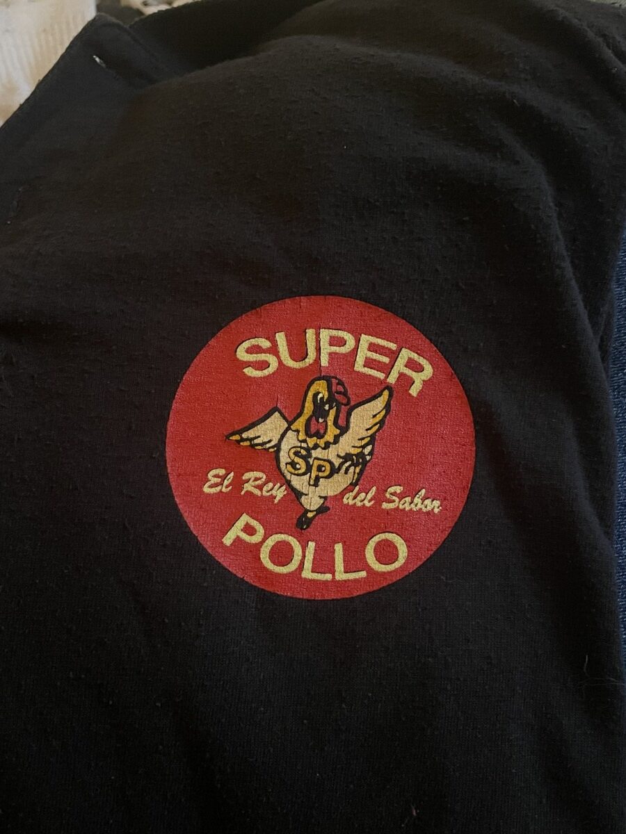
I found this logo on a sweater. The logo is suppose to represent a restaurant. Within this logo, we notice type on a curve and type horizontally. I definitely do think that this is a success. The curve type brings emphasis to the center without diminishing its purpose. Sure, the chicken is front and centered but the “Super Pollo” still speaks dominance with its big letters and contrast from red. I feel like the curve type does bring a bit of character than simple straight type. It would probably still be successful, but if the logo is supposed to represent Latin cuisine and rotisserie chicken, I definitely would be intrigued seeing this logo to go check it out. Many logos tend to go simplistic, but thats not always the case to success either.


Leave a Reply