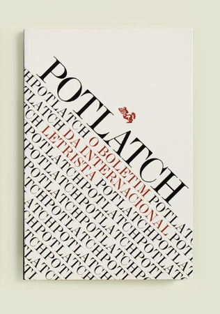
The cover that caught my attention is the one that says “potlatch” in all caps. I believe the artist used a modern sans serif for all the covers. This specific one however drew my eyes towards it the most due to the fact that it’s all tilted. All the words within the page are tilted at an angle, as if it’s going down a hill. It seems that towards the bottom of the cover, they repeat the same word “potlatch” over and over. Along with this they are spaced very close together.
KEY INFO
Professor
Beth Tondreau (Mary-Elizabeth)
Email
mtondreau@citytech.cuny.edu
Office Hours
Tuesdays and Thursdays from 11:00am to 12:00pm, Pearl-116 (after class).
Course description
A foundation course in typography with emphasis on using type in industry-related applications from print to interactive. Students will be introduced to principles of type design and terminology
Search this Course
Find Library Materials
Library Information
Ursula C. Schwerin Library
New York City College of Technology, C.U.N.Y
300 Jay Street, Library Building - 4th Floor
OpenLab Help
Sharing
Logged-in faculty members can clone this course. Learn More!
Acknowledgments
This course is based on the following course(s):


You are correct. The typeface is Modern.
The dense tilted type you describe so well contrasts successfully with the white space at top.