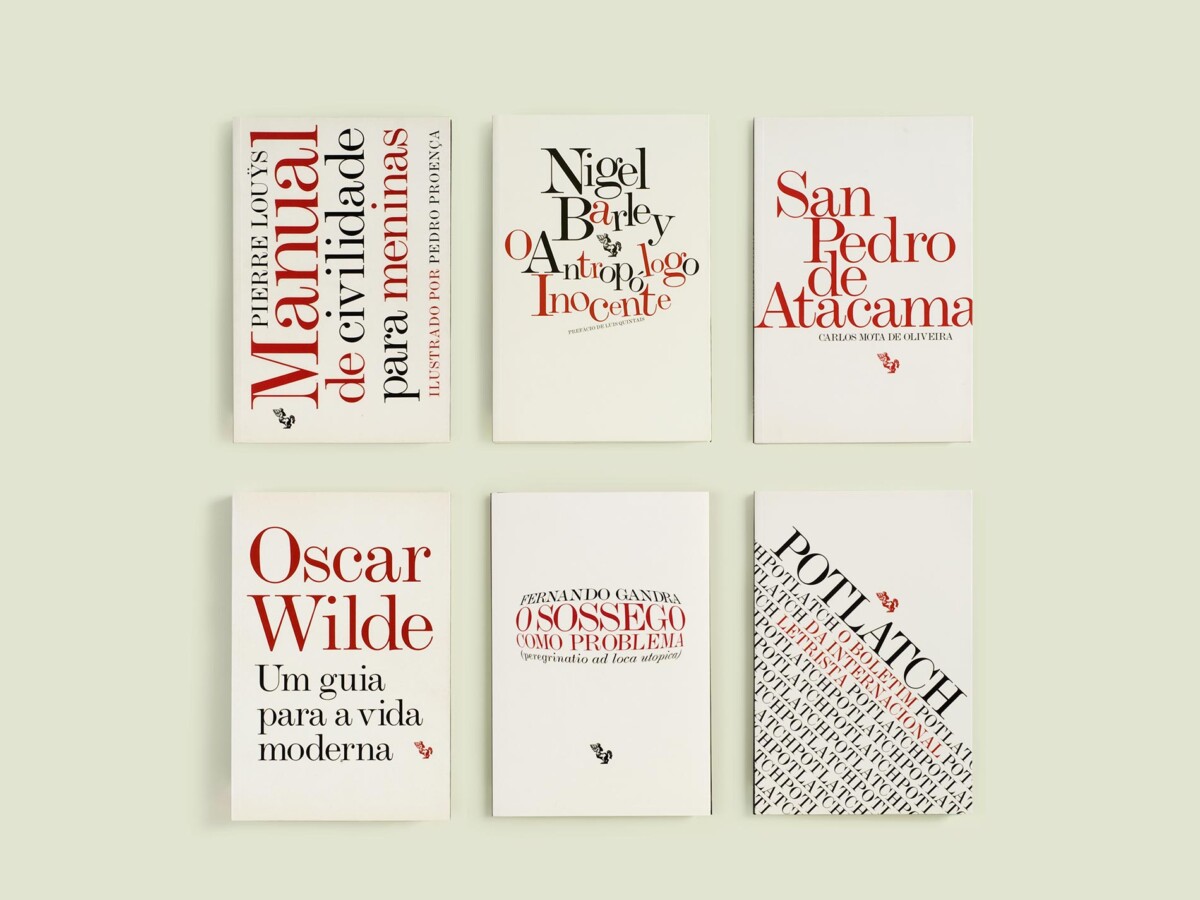
The left image is my favorite and most eye-catching. The designer used the type of a path tool in a radial pattern and it draws the viewer’s eye in. Although it is hard to read the actual text due to the sideways nature of the design, it is still visually impactful.
My favorite legible cover is the top right design in the right photo. The design is successfully impactful because of the creation of a visual hierarchy. The important text is a bolded large serif font, and the less important text is smaller regular text. The leading of the title is also much smaller, which makes the viewer’s eyes drawn to a smaller area, rather than the whole cover.


Leave a Reply