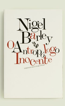
I enjoyed the following covers: ” Nigel Barley”, “Fernando Granda”, and Anotnin Artuad. I feel these covers are creatively designed and It would grab readers attentions. For Example: The “Nigel Barley “covers plays with thin and thick wording strokes. They also seem as if they are all sitting in a vertical position, but the words sit clustered. They’re still playful and interactive. They type face I’ll classify this one cover as is Modern.
KEY INFO
Professor
Beth Tondreau (Mary-Elizabeth)
Email
mtondreau@citytech.cuny.edu
Office Hours
Tuesdays and Thursdays from 11:00am to 12:00pm, Pearl-116 (after class).
Course description
A foundation course in typography with emphasis on using type in industry-related applications from print to interactive. Students will be introduced to principles of type design and terminology
Search this Course
Find Library Materials
Library Information
Ursula C. Schwerin Library
New York City College of Technology, C.U.N.Y
300 Jay Street, Library Building - 4th Floor
OpenLab Help
Sharing
Logged-in faculty members can clone this course. Learn More!
Acknowledgments
This course is based on the following course(s):
You’re right. The face is Modern. The design is delightful.