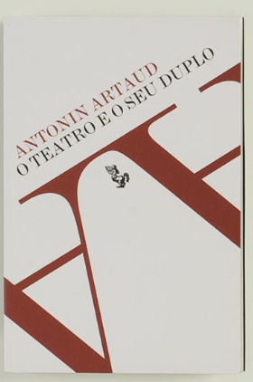
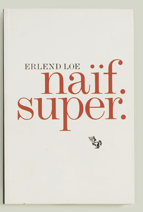
These two covers were my favorite. For the one on the left, it’s a unique contract to have the giant letters upside down and, because of their tight leading, using their serifs as almost a platform to have the smaller texted placed upon. On a cover like this, a non-horizontal path could be successful. On the right i like how while trying to use the least amount of space, it still manages to capture your attention to its title and doesn’t hide its author within its own title like some other books do.
KEY INFO
Professor
Beth Tondreau (Mary-Elizabeth)
Email
mtondreau@citytech.cuny.edu
Office Hours
Tuesdays and Thursdays from 11:00am to 12:00pm, Pearl-116 (after class).
Course description
A foundation course in typography with emphasis on using type in industry-related applications from print to interactive. Students will be introduced to principles of type design and terminology
Search this Course
Find Library Materials
Library Information
Ursula C. Schwerin Library
New York City College of Technology, C.U.N.Y
300 Jay Street, Library Building - 4th Floor
OpenLab Help
Sharing
Logged-in faculty members can clone this course. Learn More!
Acknowledgments
This course is based on the following course(s):
Good choice. The cover on the left certainly is arresting. The tight kerning of the two “A”s makes a ligature.
Leading (pronounced “ledding”) is space between lines (aka line space).