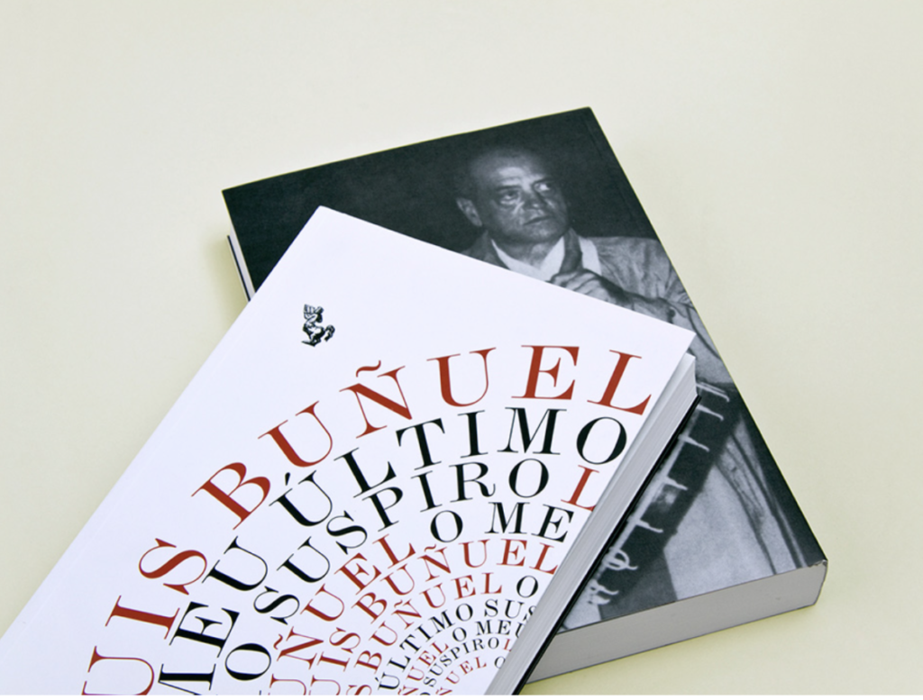
This cover right here is the cover that caught my attention the most. The curvature of the path the text is following is perfect. As the lines continue to get smaller it gives it perspective and kind of a cool 3D effect. I like how the space between letters stay the same and don’t condense all the way down to the last line. The typeface use looks more old style or even transitional which goes well the simple color schemed used and gives it a very clean look
KEY INFO
Professor
Beth Tondreau (Mary-Elizabeth)
Email
mtondreau@citytech.cuny.edu
Office Hours
Tuesdays and Thursdays from 11:00am to 12:00pm, Pearl-116 (after class).
Course description
A foundation course in typography with emphasis on using type in industry-related applications from print to interactive. Students will be introduced to principles of type design and terminology
Search this Course
Find Library Materials
Library Information
Ursula C. Schwerin Library
New York City College of Technology, C.U.N.Y
300 Jay Street, Library Building - 4th Floor
OpenLab Help
Sharing
Logged-in faculty members can clone this course. Learn More!
Acknowledgments
This course is based on the following course(s):
Your choice is a design that makes one sigh with happiness. The typeface is Modern. Note the thick and thin strokes.