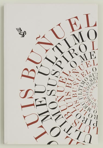
This cover caught my attention because as a book reader, I have never witnessed a cover use half circles in their cover. In general, skimming through the other covers, this one just tends to look more dramatic. Not only just dramatic but really eye pleasing. There is also a contrast of color, so it gives an almost depth effect. I like how perfectly spaced it looks and this illusion just keeps me locked in. Its as if im staring into a hole of letters. Very creative overall. I do consider this to be successful because while it may be annoying for others to possibly read the words, usually what people tend to see first are covers, and if this was a cover, I would already be engaged. Looking at the leading, as said before, it looks evenly spaced out which continues with the healthy balance and perfect look. If the words were probably more condensed, then maybe, in my opinion it would not be as successful because it will look too crowded, which may not be nice to look at, but rather produce a possible headache. The leading of words allows for the viewer to easily distinguish the letters.


Nicely-put.
The cover dramatic and readable, with its semi-circles of type.