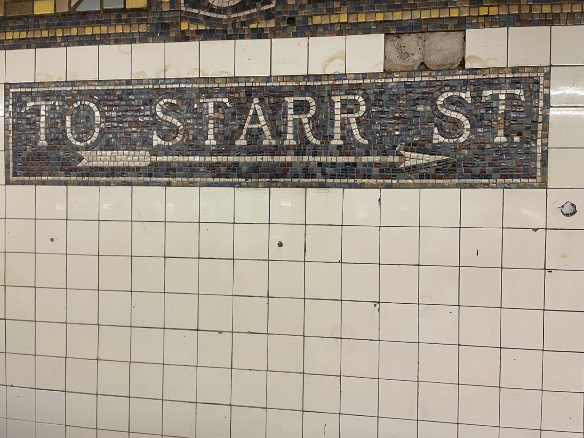
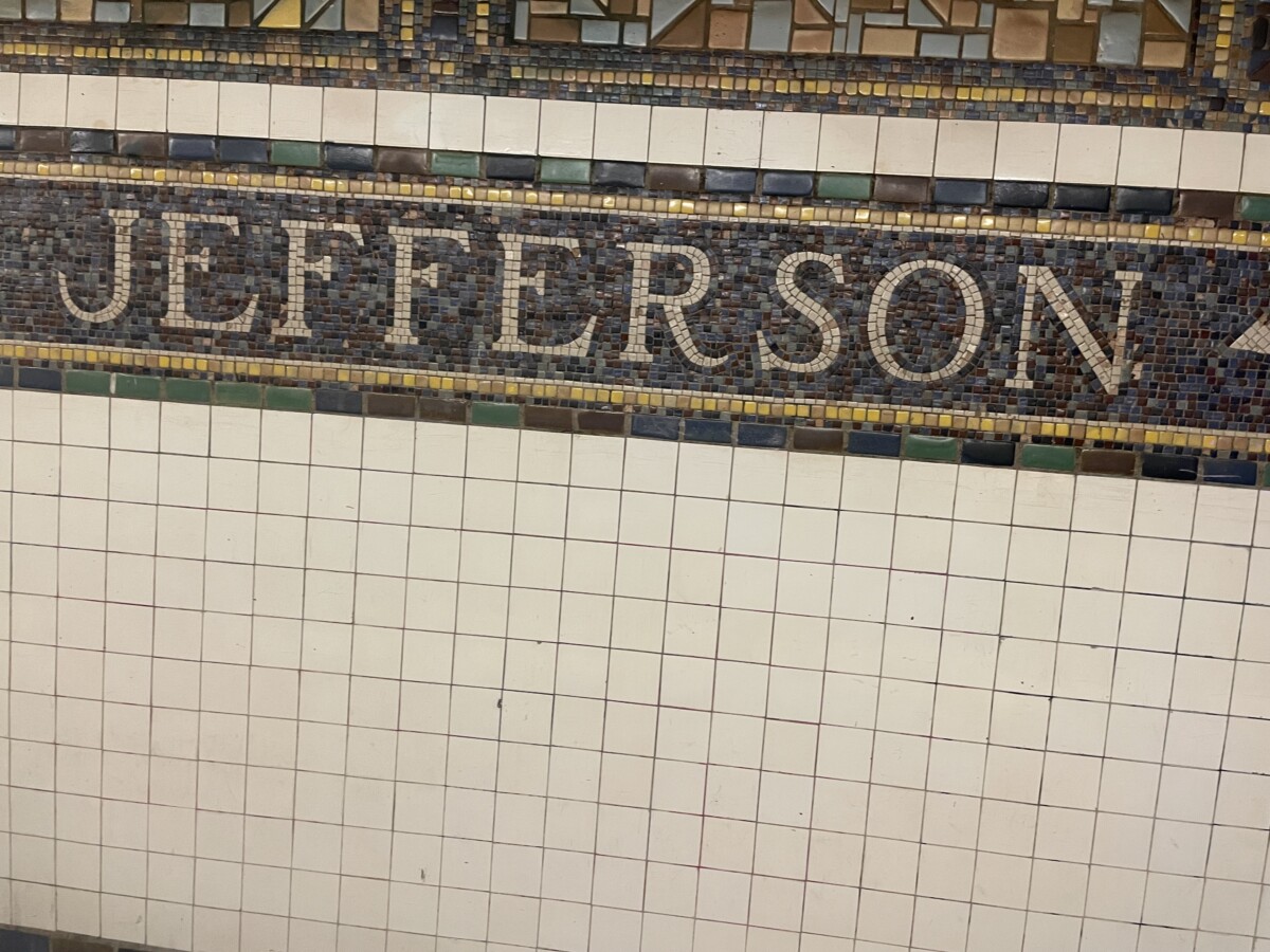
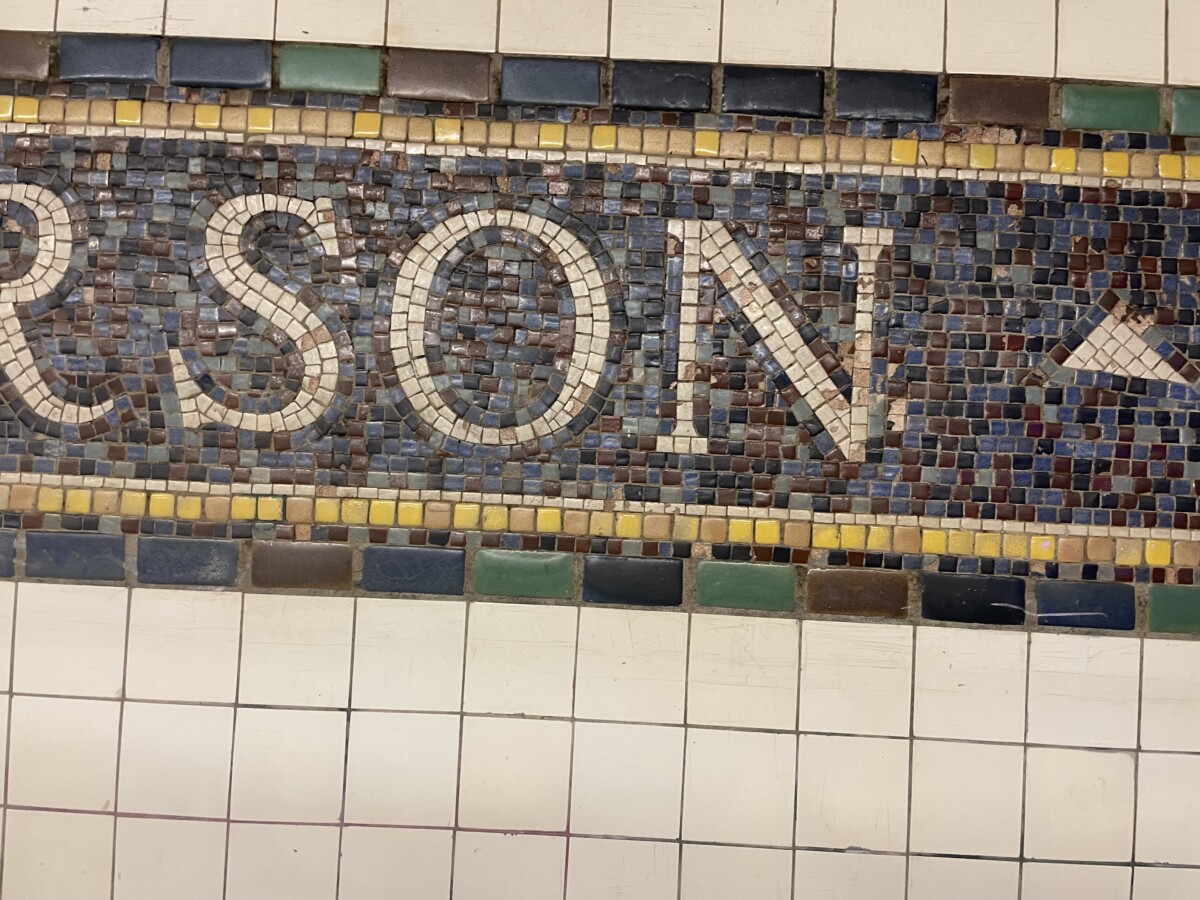
The Starr street sign. In the Jefferson street station is my favorite train sign. Because it’s where my dad lives. And I love stars so it’s the perfect combination. The sign uses a transitional serif font. We can tell because it has high contrast between the thick n thin strokes. And because the O in the Jefferson sign (they both use the same font so I used both for my type face analysis) has a vertical stress. Instead of the slightly tilted stress that most old style use. The font also represents it’s time period as the station was constructed in the 18th century (1928) aka the time period of the transitional font


Leave a Reply