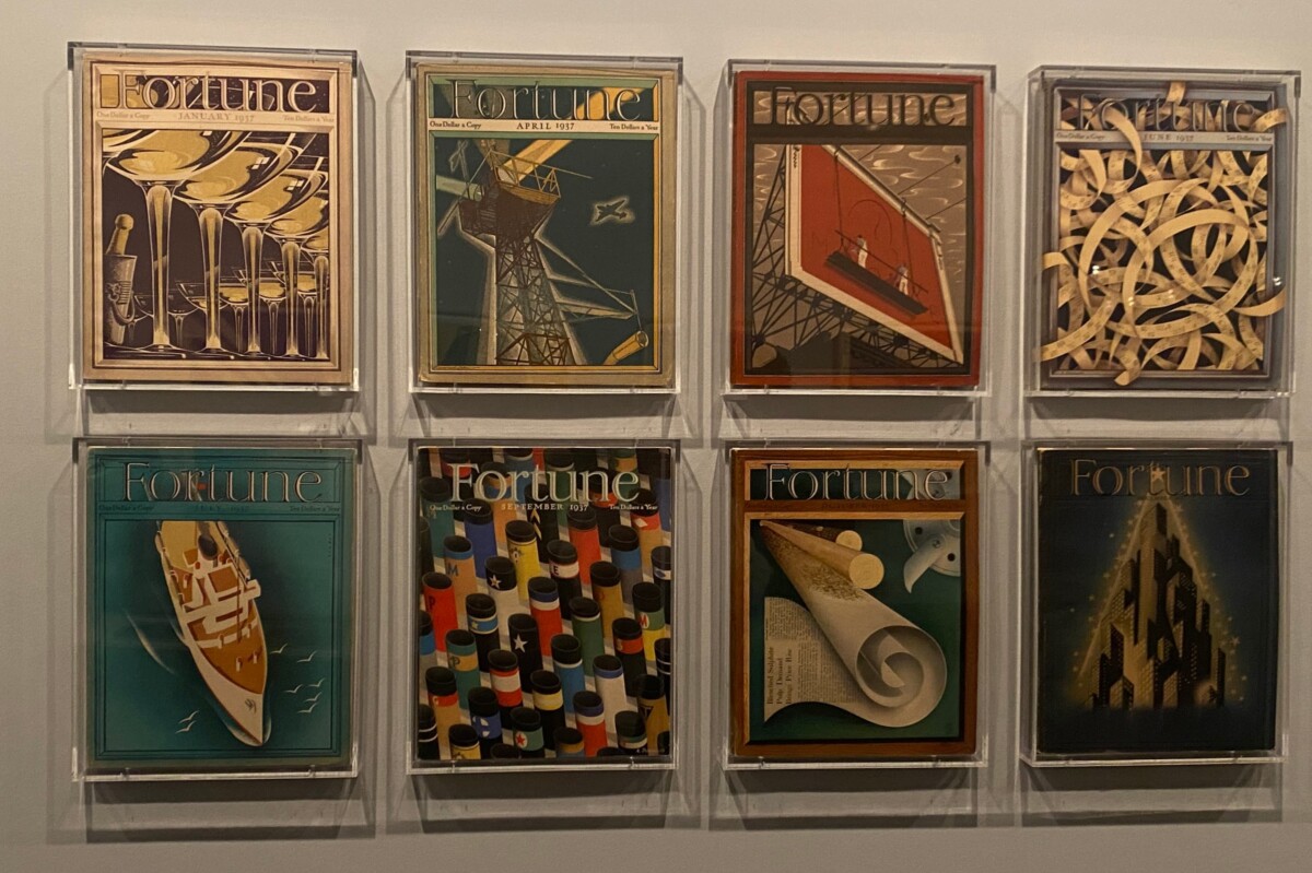
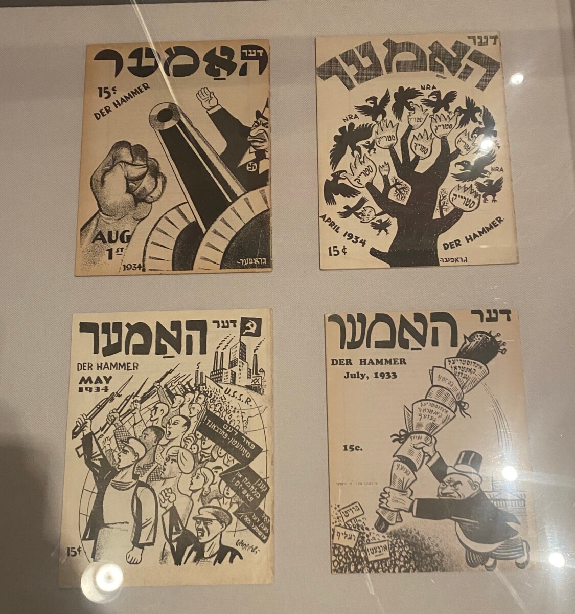
I went to the MET and saw Propaganda posters and Fortune Magazines. I found varying weights in both of the examples.
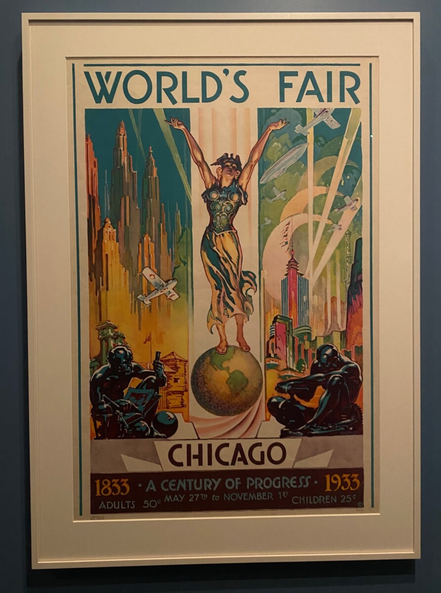
I know it’s small, but the “to” at the bottom of the poster is in italics. It’s not very prominent, but it is still there.
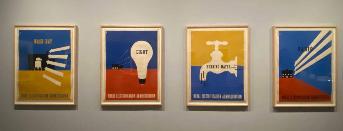
The Rural Electrification Company posters are condensed and regular. The bottom text is more condensed than the main text.


Leave a Reply