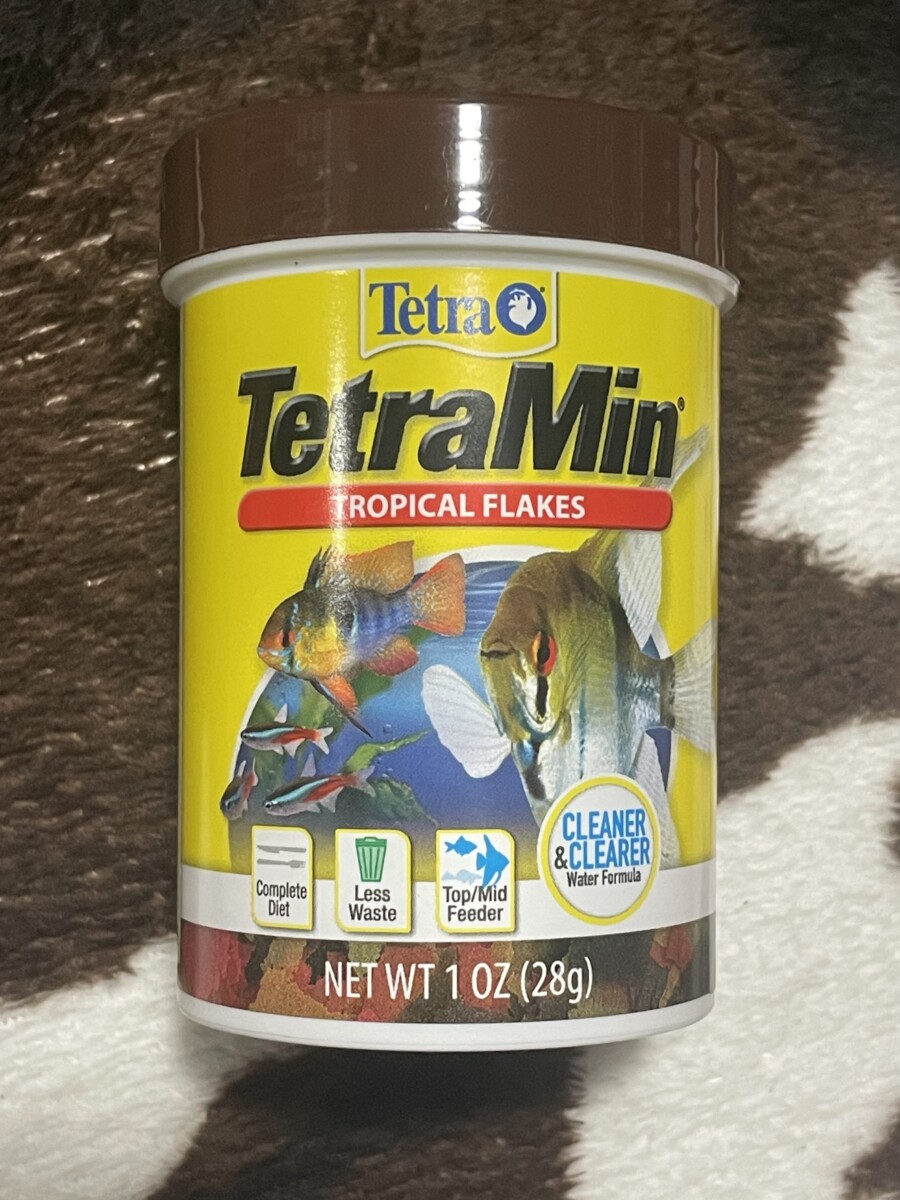
1) The image located on the top left clearly represents bold with regular. Found on what I use to feed my fishes, this is a perfect example of bold usage. Not only does it state what KIND of fish but maybe also the brand. Its very much noticeable already that its fish food, however the BOLD characters bring attention to the top of the container which helps as a fish owner, I would know this food is specifically for tetra fish.
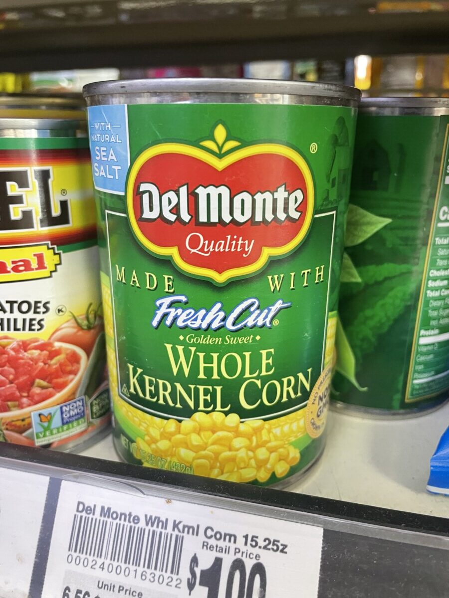
2) The image on the top right is what I hope to be mostly italic and regular. What somewhat brings attention to the italics in the words “Fresh Cut” would be that its in a whole other typeface of script and a different color, as well as it being centered. While the bottom words are in a more larger size, we would still glance at the center because of how distinguished and popped out it looks.
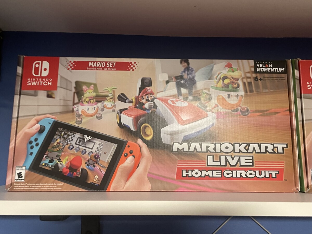
3) I had somewhat difficulty in finding a condensed/narrow, but I did find an EXTENDED. We notice how much space the letters take up and feel quite stretched out. In a way I want to say it does give a condensed feel because of how packed they look, but individually, I think the letters are more widened than slim.


Leave a Reply