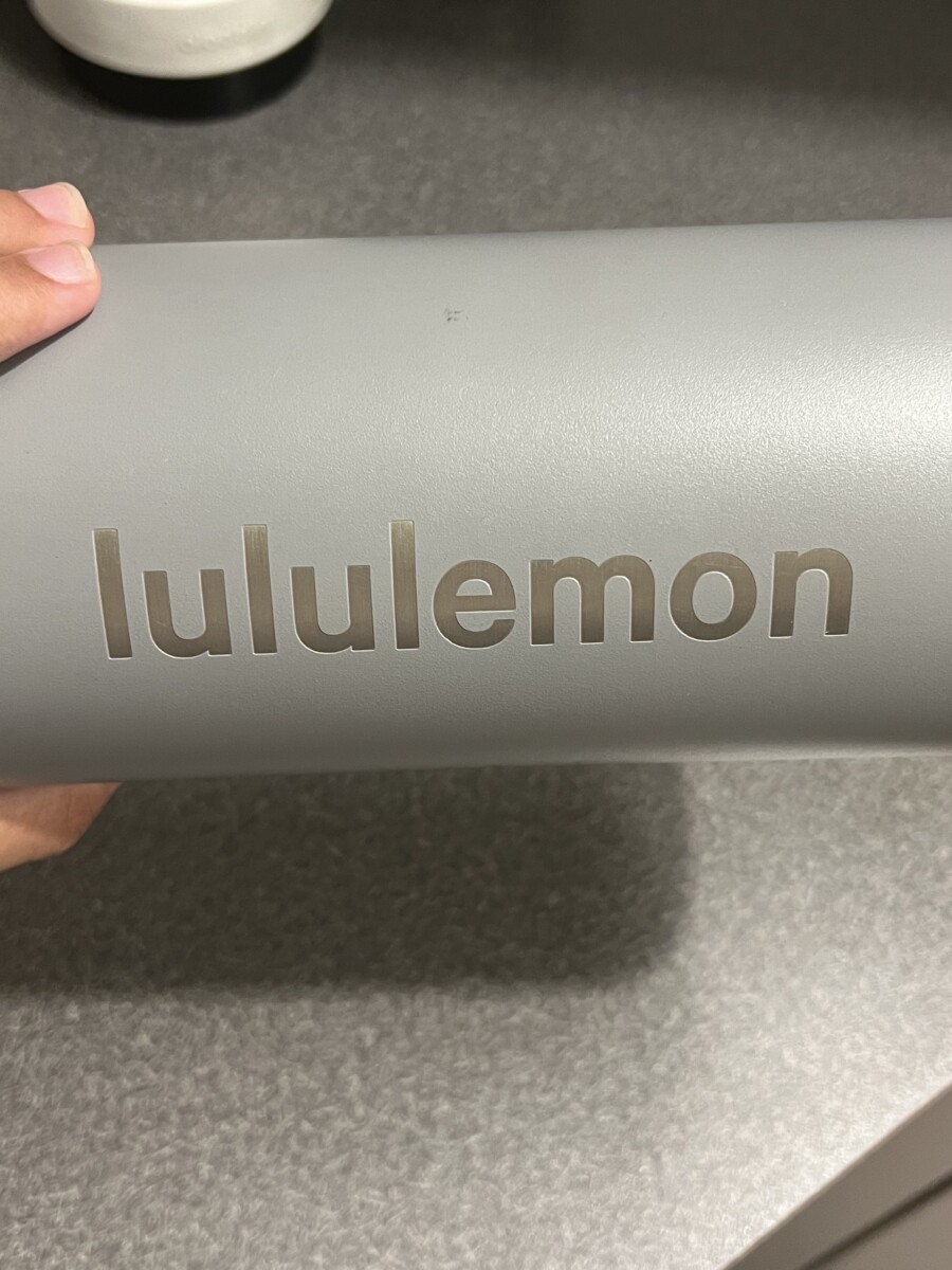
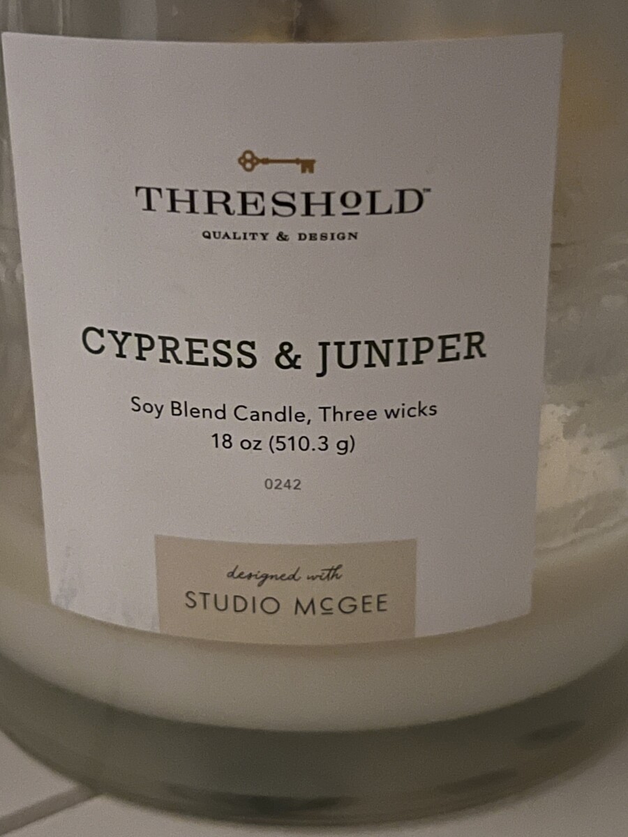
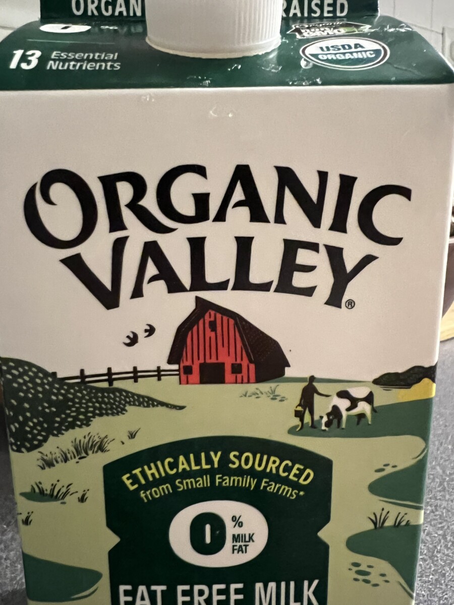
I found a brand bottle, a candle, and a milk carton.
All of these examples use bulky and thick styles. Two of these contain mixes of different typefaces, the candle has a thin yet heavily dark typeface that uses serifs while the text below it is sans serif. The Lululemon bottle is using a sans-serif style as well. The Organic Valley carton, while not noticeable at first glance, uses serifs. It is not noticeable due to the massive letters along with the stylization they have; the serifs are there, but are very small and can only be noticed upon close inspection. These combinations work well because they make the designs and the words flow well together, meaning one isn’t engulfed by the other in terms of eyesight.


Leave a Reply