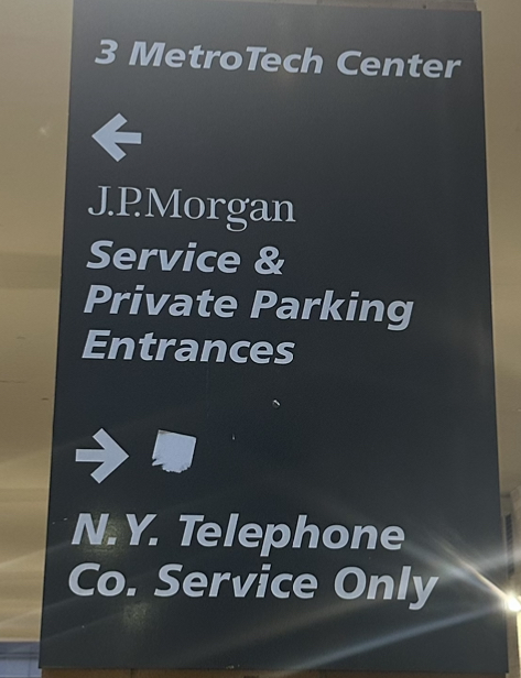
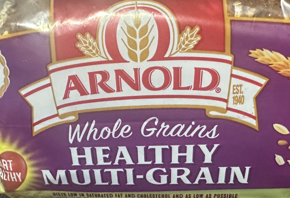
For the Typeface scavenger Hunt I found a parking service sign that had both San Serif and San serif. It is clear and simple for drivers to see. The bread is Serif and Script. I Think the script was a smarter choice because it looks polished and isn’t drowned out by the bold Serif in the rest of the packaging logo.


Leave a Reply