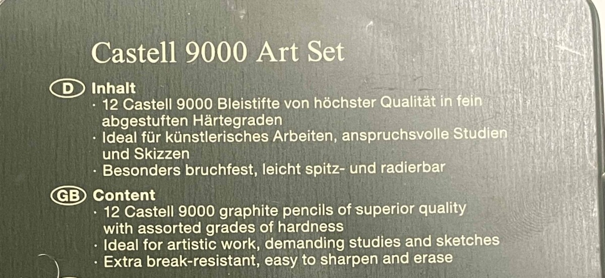
I Found my example on the back of a pack of pencils. It uses a serif font for the brand name but a sans serif font for the description of the product. I Believe they did this in order to make the descriptions as readable as possible. Maybe because the descriptions are smaller than the brand name so the serif font won’t be as readable at a smaller size. And also to allow the brand name to stand out as its in a different font.


Leave a Reply