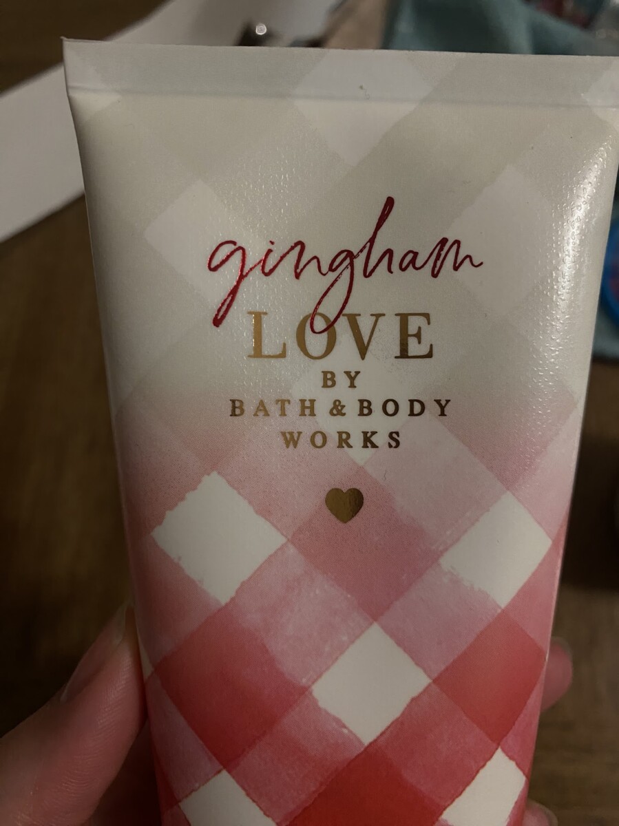
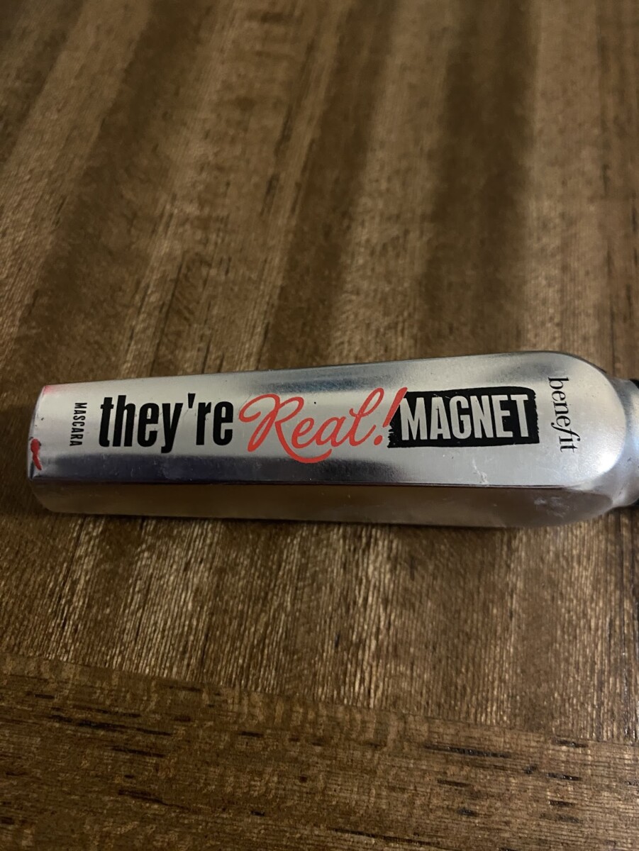

I found a tube of lotion, mascara, and eye primer. These examples use a script font with either a sans serif or serif font. All of them feature the mixed typefaces in the product’s title, which I found interesting. Most brands make detailed text in a serif or sans serif font, leaving the name a script face. These are different because the faces are mixed together in the title. I also found it interesting that all of these are beauty/self-care products that utilize the same general concept of typography. The last thing I noticed about these is that the mascara and eye primer utilizes three separate type faces as opposed to only two!


Leave a Reply