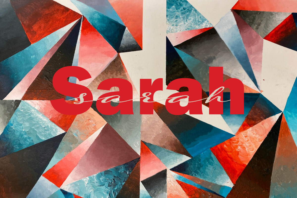
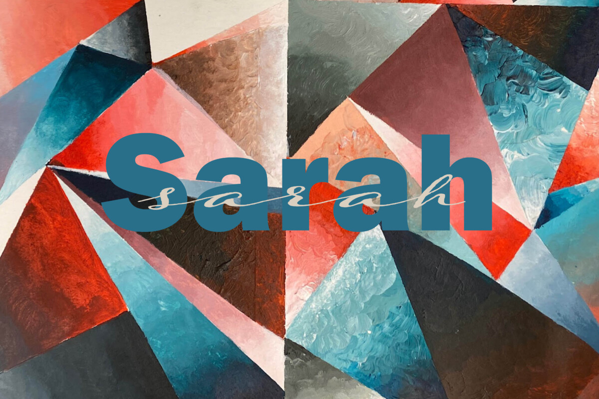
I have a few variations because I’m not sure which one I like the best. I find using multiple variations helps with my creative process. You’ll see the background is an abstract painting where I used shapes, color gradiation, and a little texture. I chose them very specifically, not just because they’re complimentary. The blue-green is supposed to look like the ocean and represent marine illustrations so they are both subjects that inspire me. The orange-red was chosen as a representation of sunsets because they are a phenomenon that intrigues me. I never miss looking at the sunset because the colors are beautiful. The sharpness of the shapes is representative of a cityscape and a nod to man-made structures. The overall piece is the idea that man-made structures and natural phenomena can coexist.
I like to use these concepts in both typography by using contrasting typefaces within a single piece. I used very different typefaces using a script and sans serif to type my name. They are so different, but they work together well and say the same thing.


Leave a Reply