Class Info
- Date: September 19, 2023 (Tuesday)
- Meeting Info: In person, Pearl 116, 8:30 to 11:00am, followed by Professor’s office hours in the same room.
Warm Up
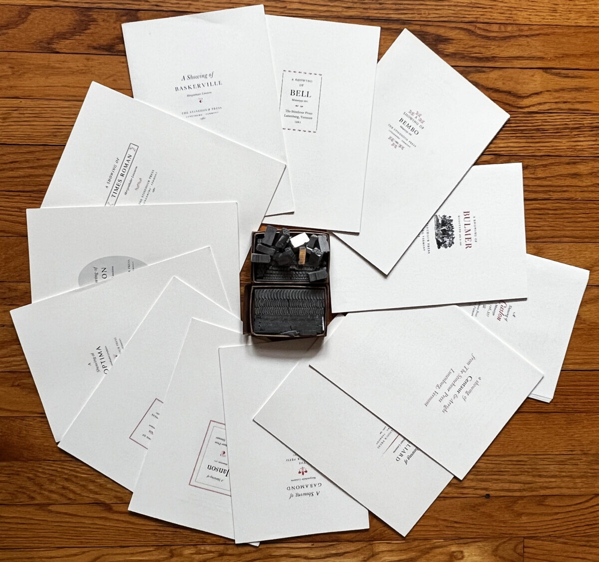
Type showings and catalogues from both pre-digital and early digital times. Name the classification and sub-classification in each of the brochures with the white covers.
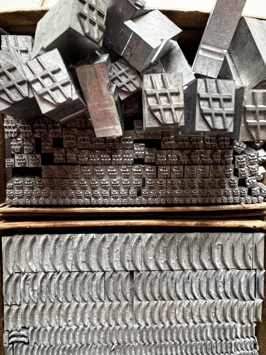
What are the grey metal items in the photos?
Announcement
It is important to follow deadlines and follow the specific formats for assignments.
In a week or two, I will tell you grades to date for all current graphic assignments.
For Participation Activities , students receive a a check mark if activities are done on time and correctly. If necessary, I’ll write comments. Often but not always, Participation Activity Posts will be discussed in class.
Grades will stand, but corrections marked need to be corrected for Project 1, which is the TYPE BOOK. Corrections are due at time of completion for Project 1 (Completed, corrected on October 11).
Topic
- Discussion of Participation Activity Posts:
—One example of bold text next to regular (i.e. Roman)
—One example of Italic next to regular (i.e. Roman)
—One example of condensed or narrow type in use. - Project 1: Continue Type Book:
- Alignment pages 8 to 9 of book
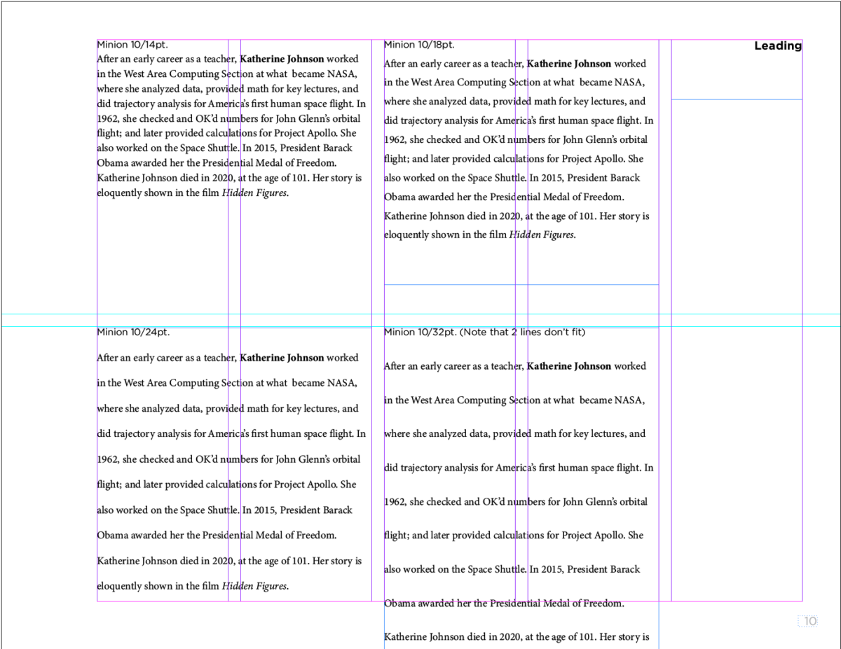
- Line Spacing (formerly called “Leading”) and Word Spacing pages 10 and 11 of book
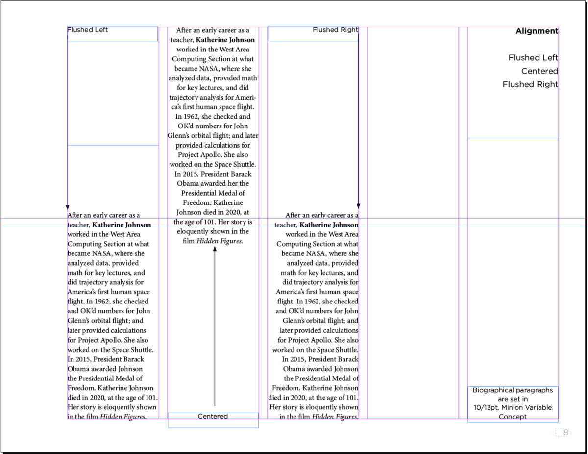
Objectives: Alignment
- Learn about type arrangement and legibility through alignment:
- Flush or Align Left (FL/RR)
- Flush or Align Right (FR/RL)
- Center (C)
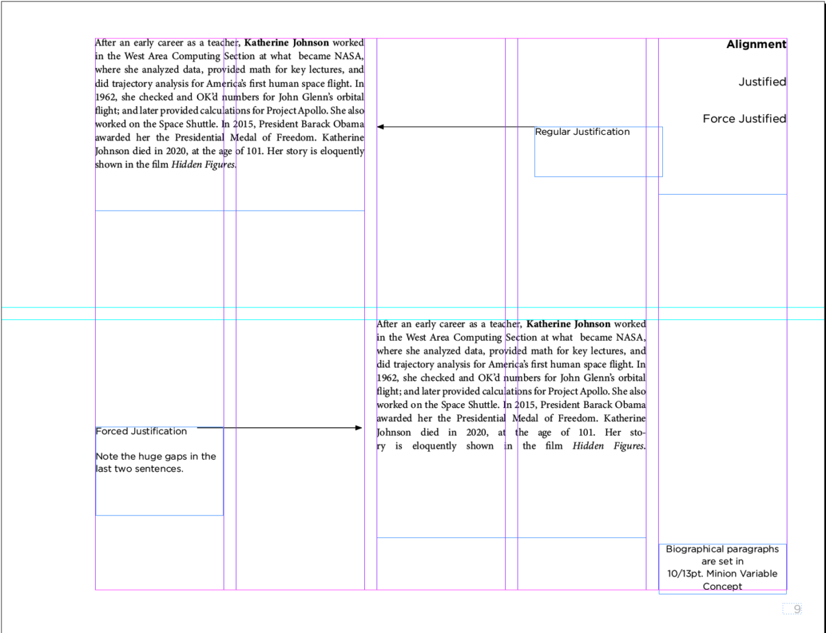
- Justify
- Justify all lines (Forced justification)
- Understanding the different scenarios of their uses. See Alignment PDF.
- Continue page setup InDesign
Graphic Assignment
- Go to Pages 8 and 9 of Project 1 InDesign document
- You can refer to this PDF with specifics, in red (DO NOT use/insert the red instructions!)
- Use the short paragraph of your selected person or group.
- NOW that you know about type variations, italics and bolds must be used to emphasize part of your text.
- Page 8: FL, CENTERED, FR alignments
Use columns 1, 2, 3. Column 4 will be blank, column 5 will have title and source of text info.- Align the following way:
- 1st column = flushed left
- 2nd column = centered
- 3rd column = flushed right
- 4th column = blank
- Do not use display/scripts. OK to use Serif or Sans Serif, but no larger than 12 pts.
- Mark each column with the alignment heading (can rotate if necessary) and place an arrow indicating alignment.
- Use individual columns (grid) for your layout
- Align the following way:
- Page 9: Justified and Forced Justified
Divide your page in 4 main squares. Use Same text for your favorite food.- Top left square:
The paragraph must have a Justified alignment - Top right square must have the label: “Regular Justification.” (You do not need to include the quote marks. See the example below.)
- Bottom left square must have the label: “Forced Justification. Note the huge gaps in the last two sentences.”
- Bottom right square
The exact same paragraph must have a Force Justified alignment—which is not the optimum way to set content, as you can see in the example below. When you justify type, it’s better to deploy regular Justification.
- Top left square:
- Save your InDesign file
- Export pages 8 to 9 only as a PDF
Lastname_alignment_091923.pdf - Place PDF file only in class Dropbox
If you complete pages 8 and 9, proceed to work on pages 10 and 11.
________
Objectives: Line Height/ Word Spacing
- Project 1: Continue Type Book:
- Line Length and Spacing, specifically letter spacing (pages 10 and 11 of your Type Book)
- Spacing between lines and letters
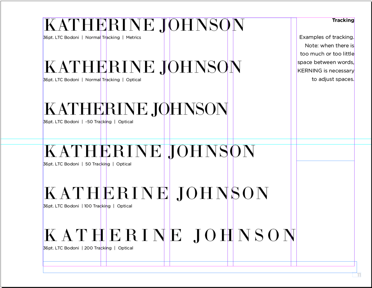
- Line Spacing (Leading) & Letter and Word Space (kerning & tracking)
- Review the PDF and see pages 10 and 11 with and without instructions. Instructions are in red. Pages without instructions follow those with them. DO NOT INCLUDE THE RED INSTRUCTIONS!
- Learn about the relationship between type selection, size and spacing:
- Understanding more type terminology and how it differs from print to screen: Leading or line height, tracking and kerning (space between letters)
- Leading or line spacing (or interlinear spacing) refers to the space between the baselines. In the early days of type, in order to add space between lines, typesetters inserted thin bars of lead, hence the term “leading” (pronounced “ledding”).
- Tracking refers to the adjustment of space between all the letters of a specific word or heading
- Kerning refers to the adjustment of space between two specific letters
- Understanding the different scenarios of their uses
- Continue page setup InDesign
Activities
- Play the kerning game. This is very cool and a bit humbling.
https://type.method.ac/
To-do / complete after class = 2 Assignments
Assignment 01
Graphic Assignment Pages 10 and 11
- Complete pages 10 (line spacing—back in the day called “leading”/”—can also be called Interlinear Spacing) Project 1 InDesign document
- For this page you will use the short bio of your selected artist (4 times)
- Remember to use variations in type.
- Create the 4 headings first (each on its own text box)
- As the leading gets larger it is possible that your text will not fit. THAT is OK– it proofs a point.
- See page 10 of the PDF for instructions. Instructions are in red. Do NOT include the instructions.
- Complete page11 (tracking / kerning) of the Project 1 InDesign document
- For this page you will only use the name of your selected artist.
- Follow this PDF with kerning and tracking (letter space) specifics. See page 11 of the PDF.
- Save your InDesign file
- Export pages 10 to 11 as a PDF
- Name the file (for Line Spacing, Tracking, Kerning):
Lastname__LTK_091923.pdf - Upload PDF file only to Dropbox
NOTE: You can upload pages 8, 9, 10, 11 as one PDF. Lastname_Alignment_LTK_091923
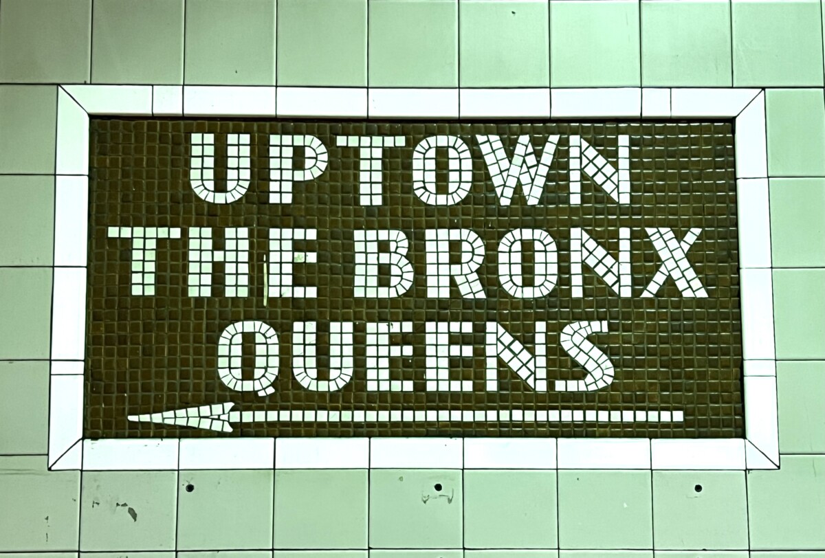
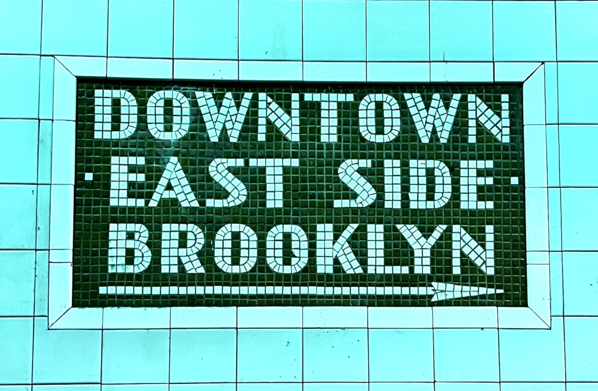
Assignment 02. Type Scavenger Hunt
Take a photo of the signage at your favorite (or least favorite) subway station. What is the classification of the type used? Does the sign give a sense of when the station was built? How? When was the station built? Do some research.
Post to Student Posts > Type Scavenger Hunt. File Name:
Lastname_TSH_091923
Example:
34th Street, Herald Square. The classification is Sans Serif. Because it has thick and thin strokes reminiscent of the Art Deco type shown in Class 06, the sun-classification could be called “Humanist.” (Research to come on years the BMT and IND subway lines were constructed.)
_______________________________________________________________________
Graphic Assignments are always due the day before class at 8 pm, and must be uploaded to Dropbox unless indicated otherwise. Assignments uploaded during class on the day that they are due are marked as late.
Participation Activities (Scavenger Hunts, Type Talks and Type Challenges) are due during class or the day before class at 8pm, as specified. The Participation Activity is saved as a jpeg and posted to OpenLab in the category specified.
Print this page


Leave a Reply