Class Info
- Date: Thursday, November 30, 2023
- Meeting Info: In person, Pearl 116, 8:30 to 11:00am, followed by Professor’s office hours from 11:00am to noon in Pearl 116.
- Refined versions of Projects 1 and 2 are due by Class 28 (i.e. the night before class, which is Dec. 6) December 7, 2023.
Announcement
- Because this is Class 26, we have 3 full classes before all projects are complete on Class 29 (Dec. 14) for final presentation in Class 30 (Dec. 19).
- There is no class on Tuesday, Dec. 12th (Reading Day)
Topic
- Review work one-on-one
- Continue Project 3: Review, refinements, edits to Posters and Social Media
- Possible introduction to Type in Motion
Objectives
- Evaluate and understand the differences between static type and type that moves (for instance, static Social Media Posts as done last class and an animated version of one of them).
_________________________________
Activity 1. Type Talk.
See the list below for inspiration for Posters (on a range of topics). Look at work in all links and then choose one poster from one person or company.
Write about what speaks to you and why. What principles that we’ve covered in class are in the work you’ve chosen. What makes the work successful . . . or not?
- James Victore. Bold. Brash. Big ideas.
- Amos Kennedy. Letterpress with a mission.
- Jon Key. This is just one of his many works; my fave.
- Louise Fili. Elegant.
- Gail Anderson. Versatile (well, all of the above are versatile).
- Rick Griffith and Debra Johnson.
Student Posts > Type Talk. Name it: Lastname_TT_PosterInspo_112023
_________________________________
Reminder of text in Social Media Posts (shown in and updated from Class 25)
Content: Illustrator file 1080 x 1080 pixels with 120 pixels space.
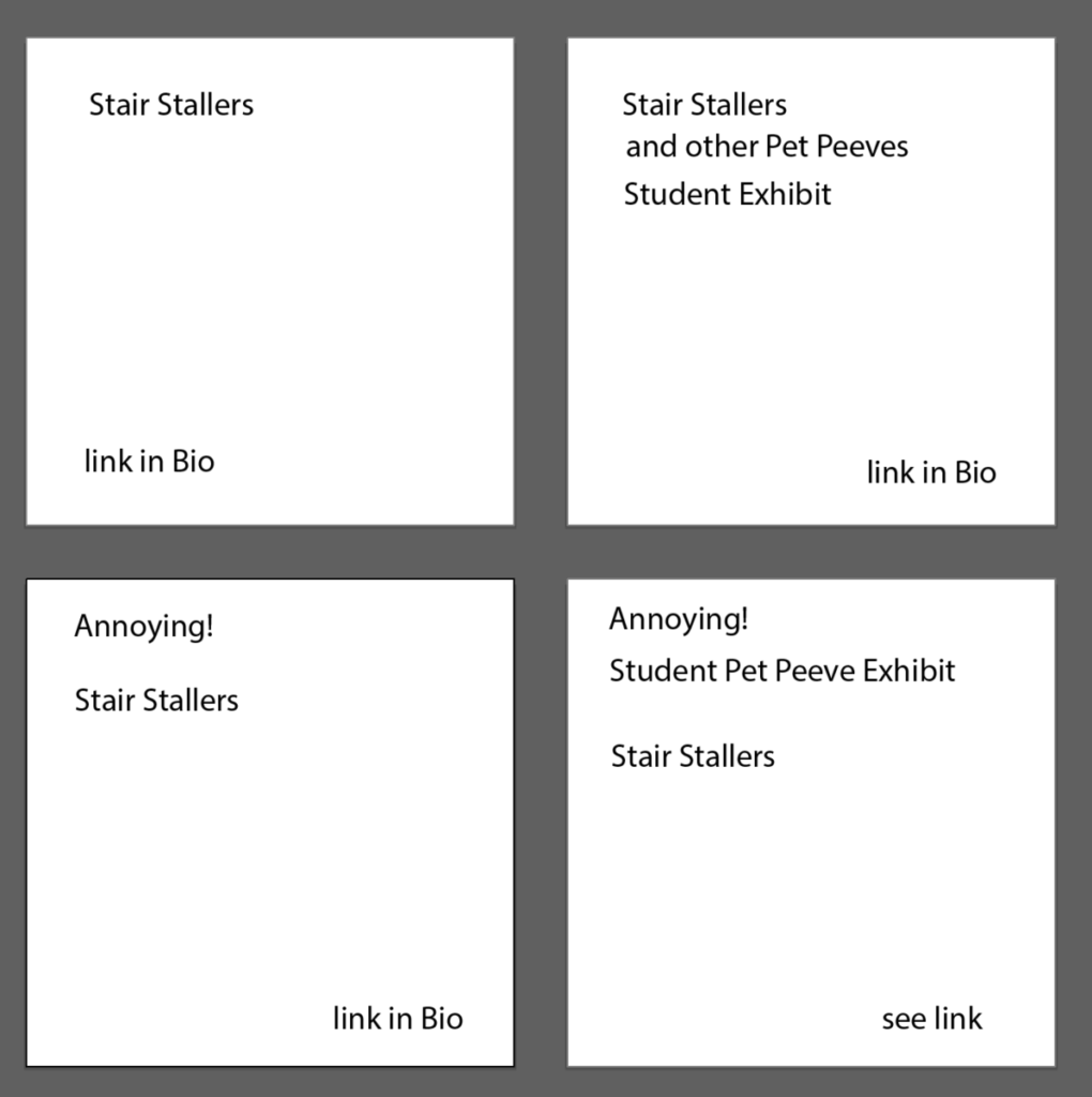
Roughs for Professor Beth’s peeve: Stair Stallers (people who stop at the top of the stairs).
- Square 1: Black Text on White Background
- Square 2: White Text on Black Background
- Square 3: Photographic or Textural Background Choose RGB color. For typography, remember our readability studies)
- Square 4: Use RGB color somewhere in the post.
Note that the lower right has an image within the type.
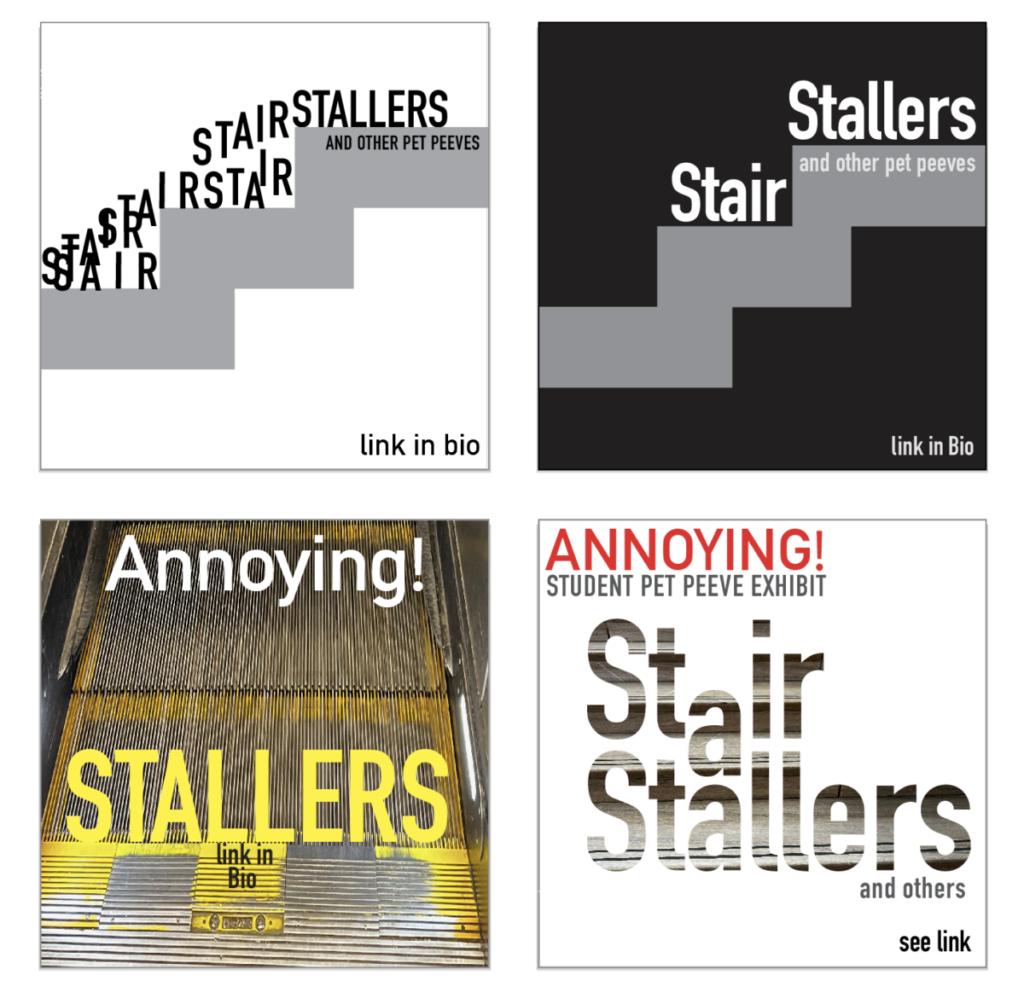
Notice that these examples are a different design, with different type and different layouts, from the “Loud Chewing” shown as an example in Class 25. Design your own posts. Do you notice anything else?
________________________________
Extra!
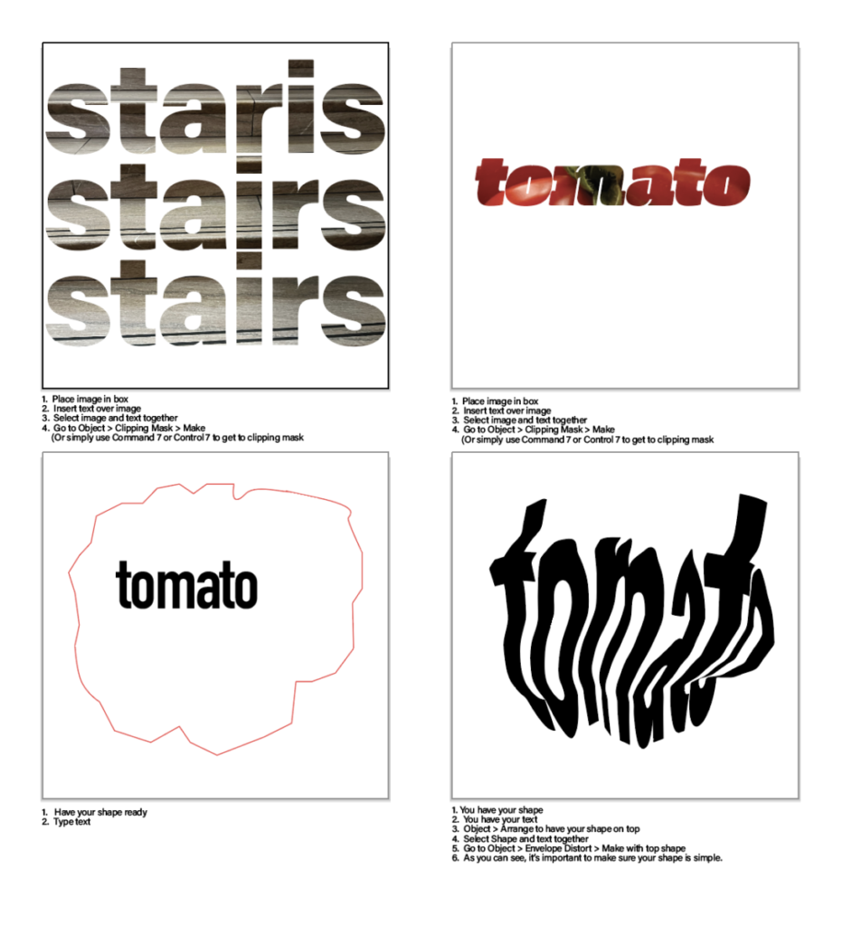
Adobe Illustrator: type in an image and type in a shape. PDF in Dropbox. Note a typo on the upper left artboard.
__________________________
Further Activities
Activity 2
Review everyone’s posters and Social Media sketches to date.
Activity 3
- Create an animated GIF. Class Exercise.
- We will use Photoshop and the words, “HELLO it’s me” broken into two lines.
STEP BY STEP (PDF in Handouts).
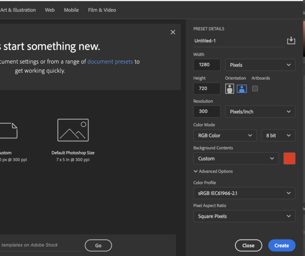
START by creating a 1280 x 720 pixel document and add a background color to your first layer (you can specify the color when you create the document).
_______
Create a separate layer for each of the letters of the word “HELLO” then an additional layer for “it’s me” (Grammatically, the wording should really be “it’s I” but we’ll ignore that for now.) You will have 7 layers.
Note: if you have to practice getting your size right by starting out with one layer for “HELLO” so you can determine size, that’s OK. Then, do each letter on a separate layer. Be patient.
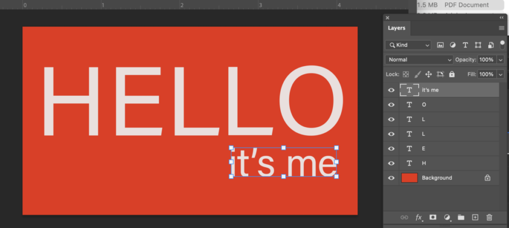
Remember: to get lowercase letters, go to Type Options.
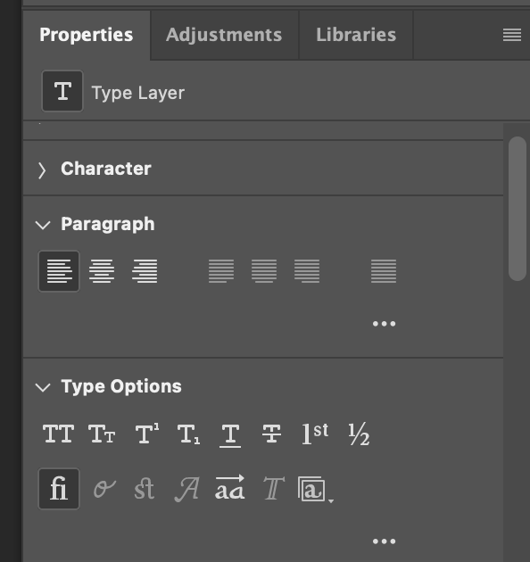
_______
Go to WINDOW and select TIMELINE.
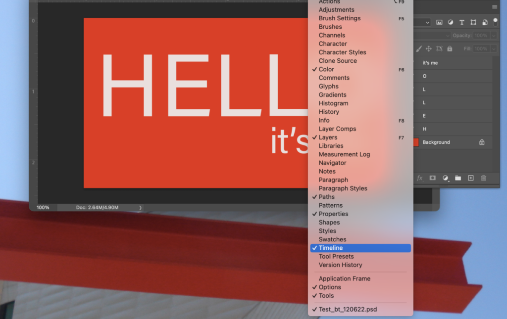
_______
Make sure that all layers are visible and then select CREATE FRAME ANIMATION.
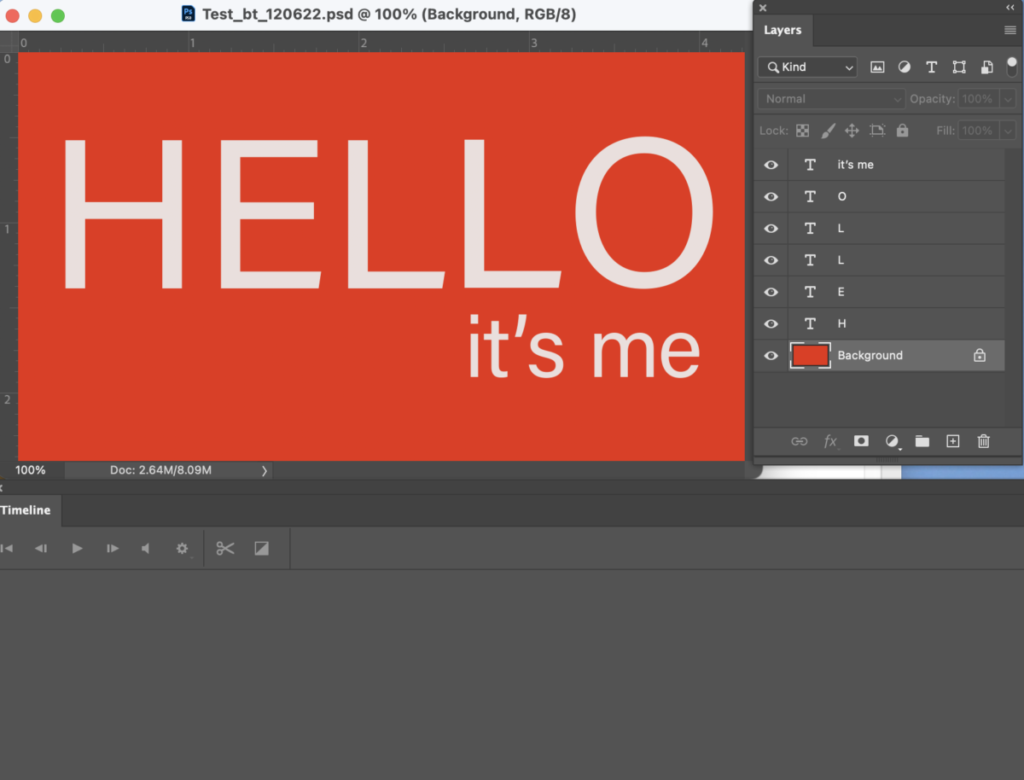
_______

You should see a frame with all the components of your design.
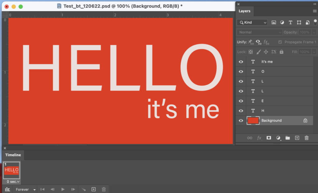
_______
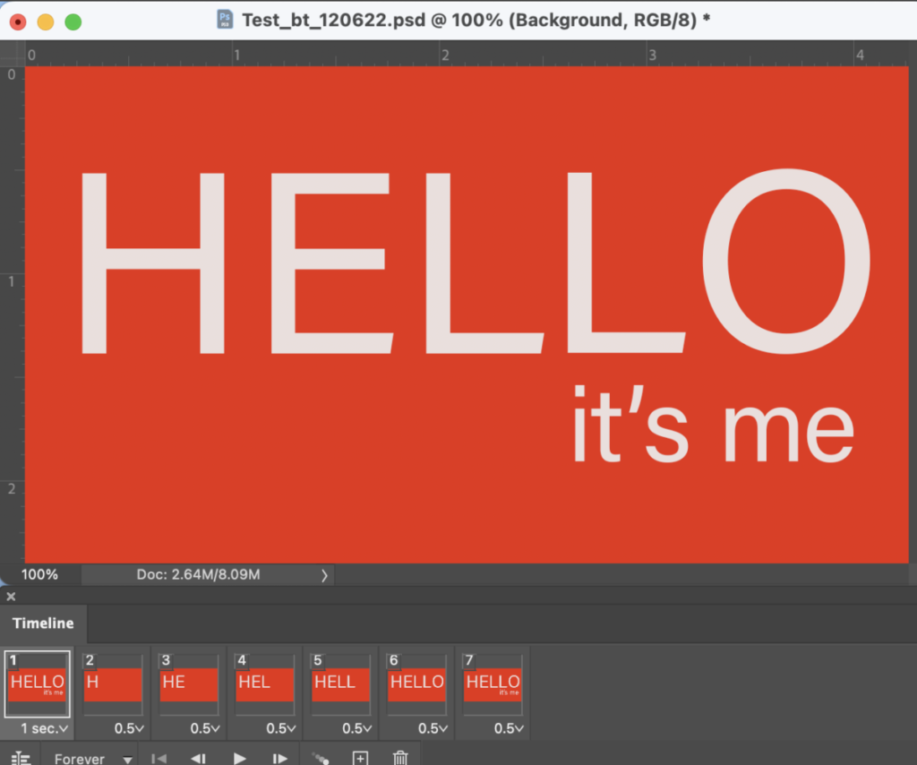
Select the first frame and then duplicate it 6 times. You should now see 7 frames.
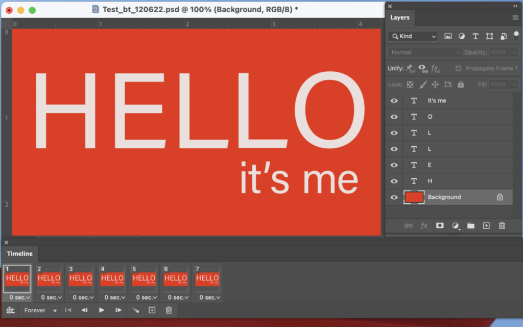
_______
Select frame 2, go to the layers panels and make the background and the letter “H” the only visible panels.
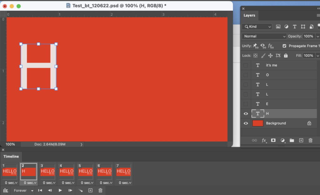
_______
Select frame 3, go to the layers panels and make the background and the letters “H” and “E” the only visible layers.
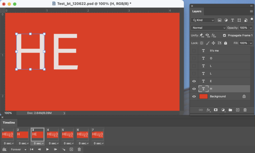
_______
Select frame 4, go to the layers panels, and make the background and the letters “H” and “E” and “L” the only visible layers.
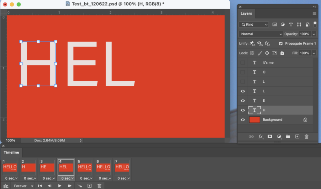
_______
Select frame 5, go to the layers panels, and make the background and the letters “H” and “E” and “L” and “L” the only visible layers.
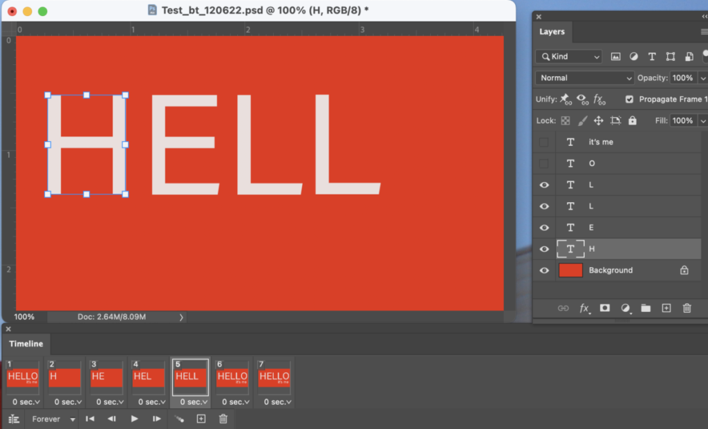
_______
Select frame 6, go to the layers panels, and make the background and the letters “H” and “E” and “L” and “L” and “O” the only visible layers.
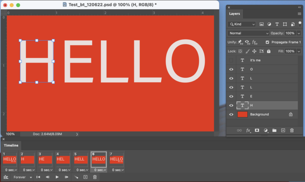
_______
Select frame 7, go to the layers panels, and make the background and the letters “H” and “E” and “L” and “L” and “O” and “it’s me” visible.
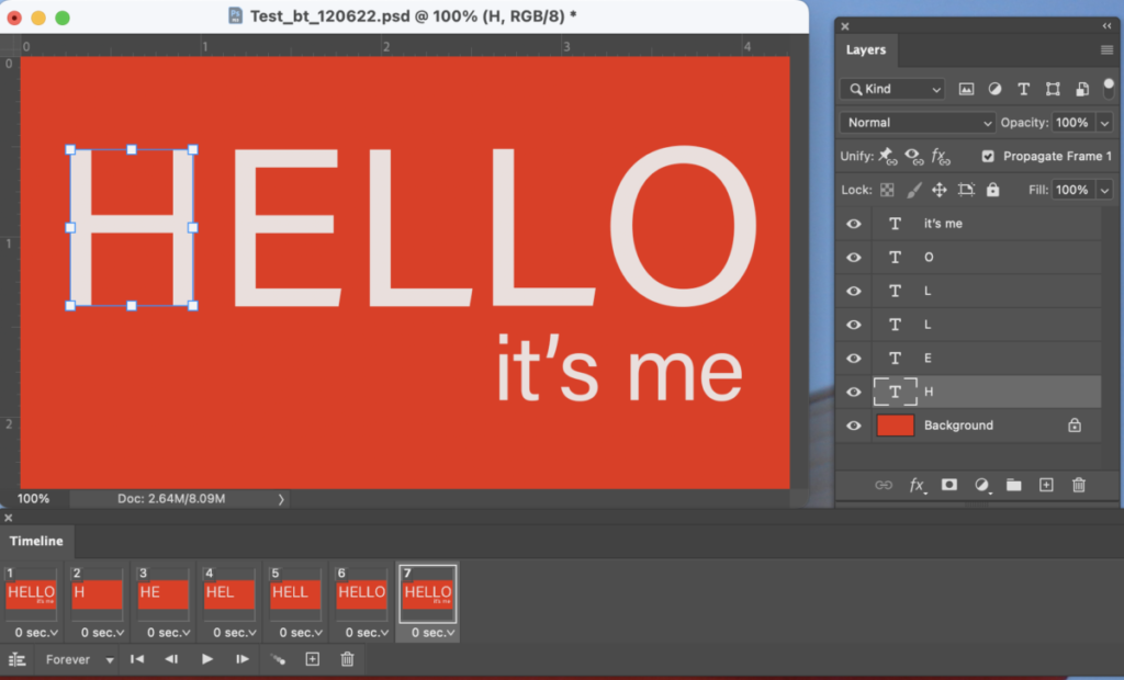
_______
Select frames 2 to 7 and change the delay frame time to .5 (as in half)
Select frame 1 and change the delay time frame to 1.
_______
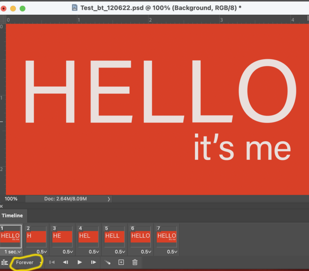
Select looping options and change to “Forever.”
_______
SAVE as:
lastname_animation_113023 (it will be a psd file)
_______
Now, go to FILE > EXPORT > SAVE FOR WEB.
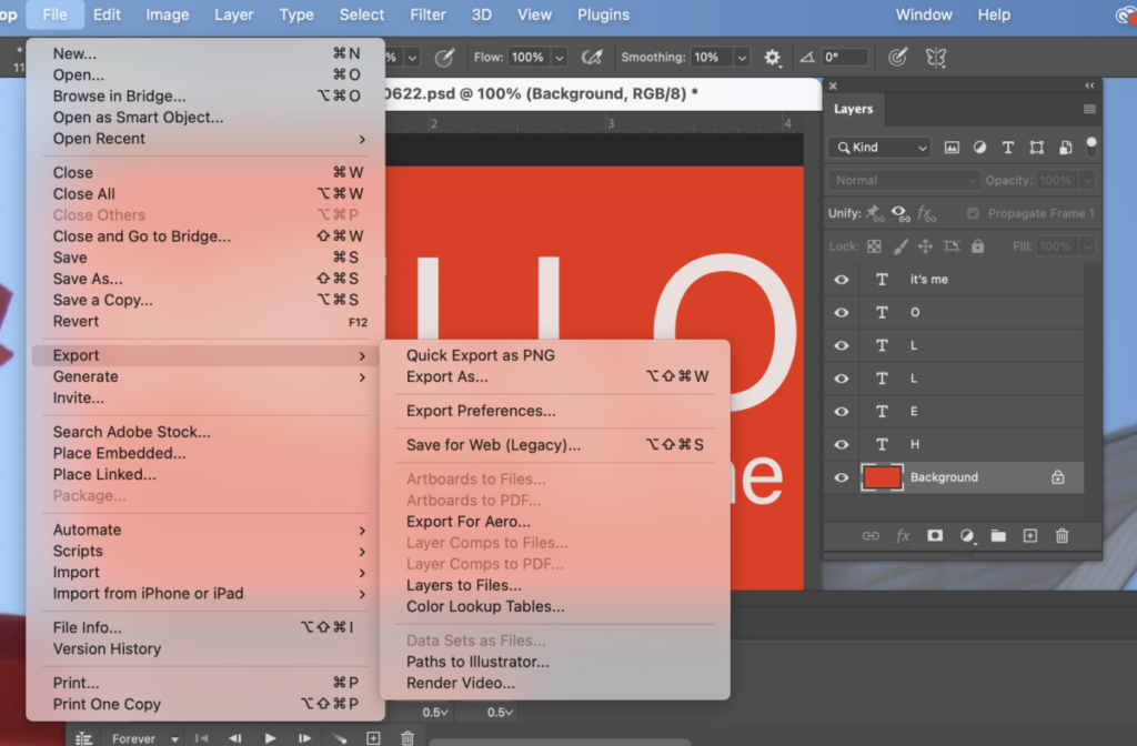
Make sure the preset is GIF.
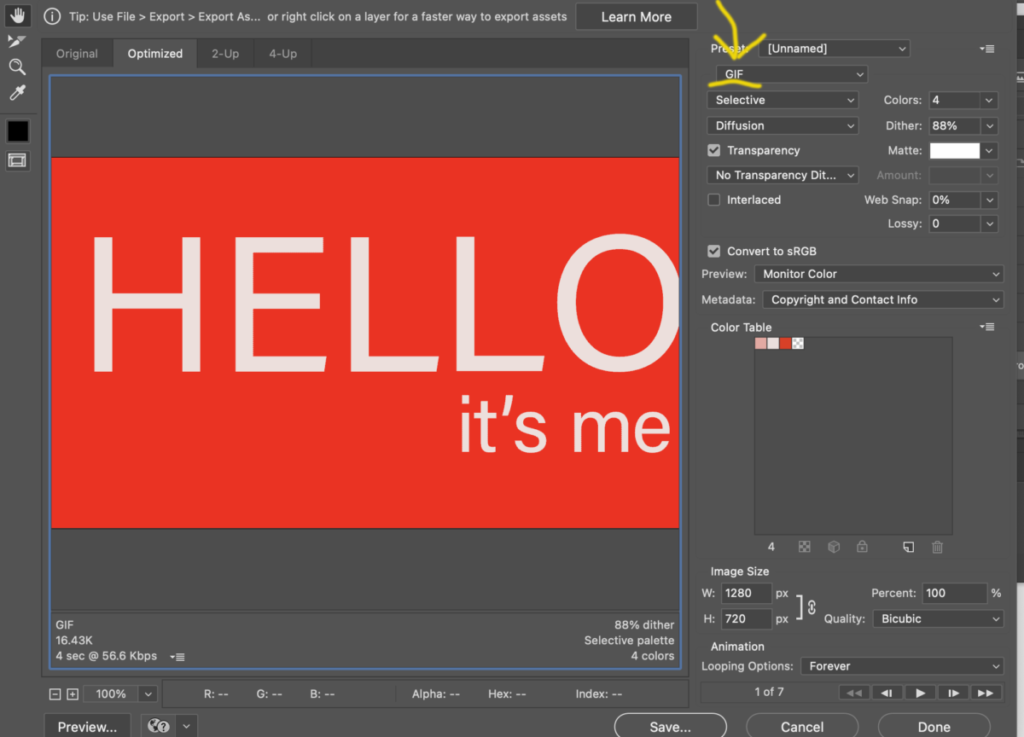
To make your file smaller, change colors to 4 or 8 depending on the amount of colors you have. Choose the minimum amount (of colors) that will not alter your design. SAVE.
Make sure the preset is GIF.
Name your GIF:
lastname_animation_GIF_113023
DRAG your GIF into a browser to test it.
_________________________________
Activity 4.
- Practice making an animated GIF.
- If you’ve completed the exercise using the words
“HELLO / it’s me” then do an animation for your peeve. - Select one of your Social Media Posts, bring into (or recreate in) Photoshop and create an animated GIF. Make an animated GIF with the main word of your peeve. Some of you have long concerns, so you will have to edit your title.
_________________________________
Assignments (To-Do After Class)
- Refine your posters (InDesign, 11 x 14 inches). Upload PDF to Dropbox. Lastname_Posters_113023
- Refine your Social Medial Posts (Illustrator, 1080 pixels square). Upload PDF or PNG to Dropbox. Lastname_SocialPosts_113023
- Continue to work on one of your Social Media Posts, bring into (or recreate in) Photoshop and create an animated GIF. (Follow same steps as class demo above). Save your file in Photoshop and as a GIF. Upload GIF to Dropbox.
- Save as: lastname_GIF_113023
- STUDENT POST > TYPE TALKS (2 of them!)
- Complete Type Talk about posters done in the beginning of class. Student Posts > Type Talk. File name: Lastname_TT_PosterInspo_113023
- AND
- Poster/ Promo. Look at the animation and the poster in this Instagram promo. Describe what you see in the poster and promo, created for the 2023 Architectural League Prize for Young Architects and Designers by Michael Bierut and his team at Pentagram. What principles, learned in class, are shown here? Is the word “Uncomfortable” shown successfully? Student Posts > Type Talk. File name: Lastname_TT_PosterAnimation_113023


Leave a Reply