Class Info
- Date: Thursday, October 26, 2023
- Meeting Info: In person, Pearl 116, 8:30 to 11:00am, followed by Professor’s office hours from 11:00am to noon in Pearl 116.
Announcements
- Grades are on Blackboard. Codes are: P (Passing), N (Needs work), SA (Stopped Attending). I can tell you what your letter grade would be—if the school posted letter grades—through mid-term, based on Project 1, Attendance, Participation, and work on Project 2 through Class 15.
- Our OpenLab site now has more space. You can resume posting Student Posts on OpenLab.
- The One Club for Creativity is hosting Where Are All the Black People on Oct. 26 (today/virtual) and Oct. 27.
- Type Drives Culture event Nov. 10–11 explores Typography for Native Languages from Latin America.
Topics
- First. Review Student Post > Type Scavenger Hunt: 1 example of Sans Serif Gothic and 1 example of Halloween-like Gothic based on Blackletter.
- Second: What did you learn from the Readability Exercise from Class 16?
- Third: Type Talk.
- Fourth. Stand-alone assignment: textures and readability.
- Fifth. Project 2: Continue refinements and progress on Parts 1 and 2.
Overview:
- Proj. 2, Part 1. Expressive Typeface—i.e. 4 Expressive words using a Typeface (Done in Illustrator)
- Proj. 2, Part 2. Expressive Lettering—sketches, then choice ONE lettering solution showing your favorite food, show, movie, pastime.
- Proj. 2, Part 3. Typographic solutions with 3D (TO COME). To do Oct. 31.
- Proj. 2, Part 4. Explore typographic solution on a mockup (TO COME). To do Oct. 31.
- NOTE: In Classes 18 and 19, we’ll go over format for presenting Project 2 and in Class 20, you’ll present your work on Project 2.
Today: Activities
Activity 1. Type Talk.
Go to the Type Directors Club site for the Type Drives Culture Conference. Look and read through the site. Discuss the graphics and typography on the site. What do you observe about the typography, the colors, the topics? Take a screenshot of what seems most interesting or arresting to you. Make sure to credit your screenshot to the tdc (Type Directors Club). It’s important to credit all work and, ideally, use copyright-free images.
Post to Student Posts > Type Talk. Lastname_TT_102623
Sarah pointed out that she deployed the Adobe color analyzer to test readabilty on the document from Class 16 on Oct. 24.
Activity 2. Color in Typography. Legibility and Readability.
Open the document created during last class.

used CREATE GUIDES to divide the one-page document into 4 squares.
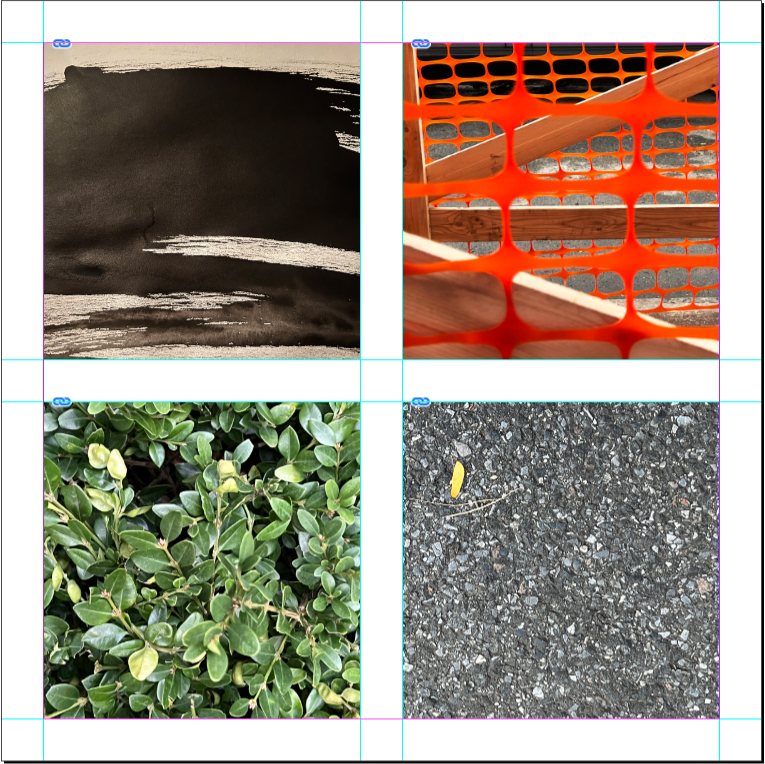
- Place textures (Most of you have done this step).
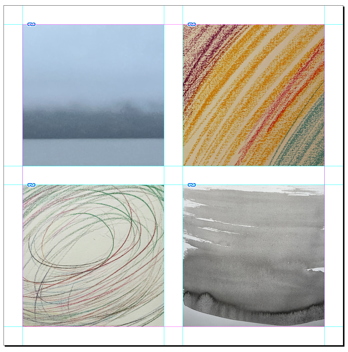
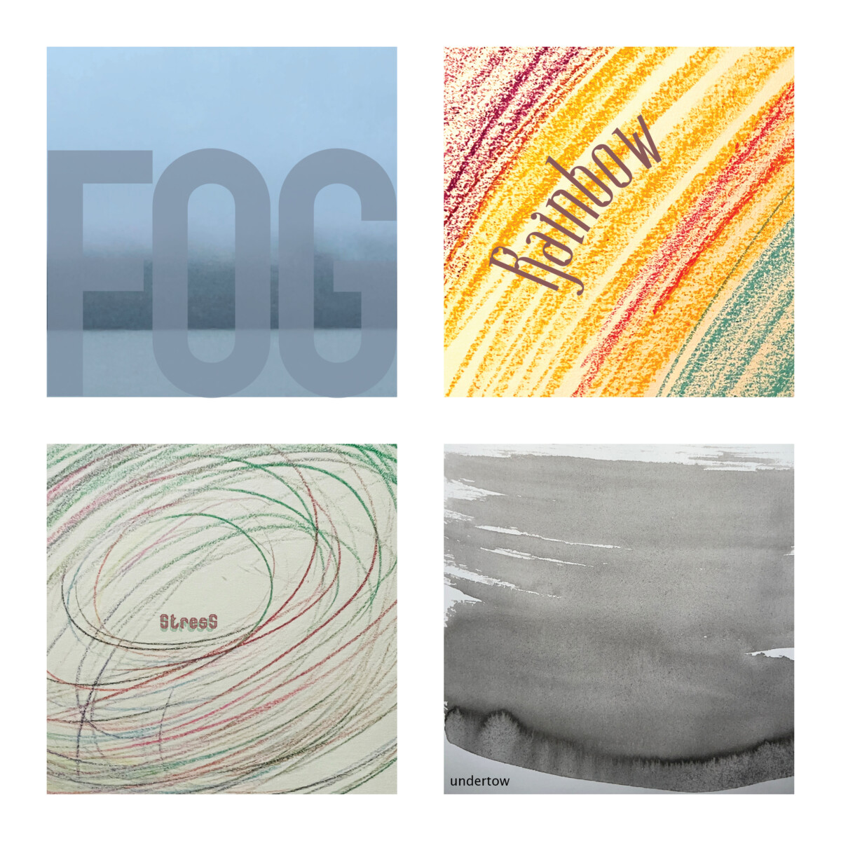
- WORD ASSOCIATION. Choose 4 words (thing/concept) that each of your four image calls to your mind. Words for the first four textures above could be: ”fog,” ”rainbow,” ”stress,” and ” undertow.” The example below the Color Theme instruction uses “OIL SPILL” (Scroll down to see).
- Think about the image itself and how the word could be designed to represent it. The WORD(s) must be legible (and ideally readable).
- Place these words over your texture (one word or thing per texture)
- IMPORTANT: Think of typeface (Go to Adobe Fonts or Google Fonts), and choose variations of type style. Consider size, case, word spacing, placement, meaning, color and contrast.
- COLOR CONTINUITY: How to use colors that relate to the actual image, rather than the default colors from InDesign.
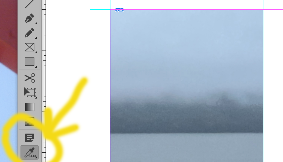
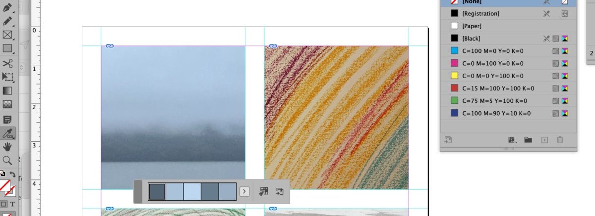
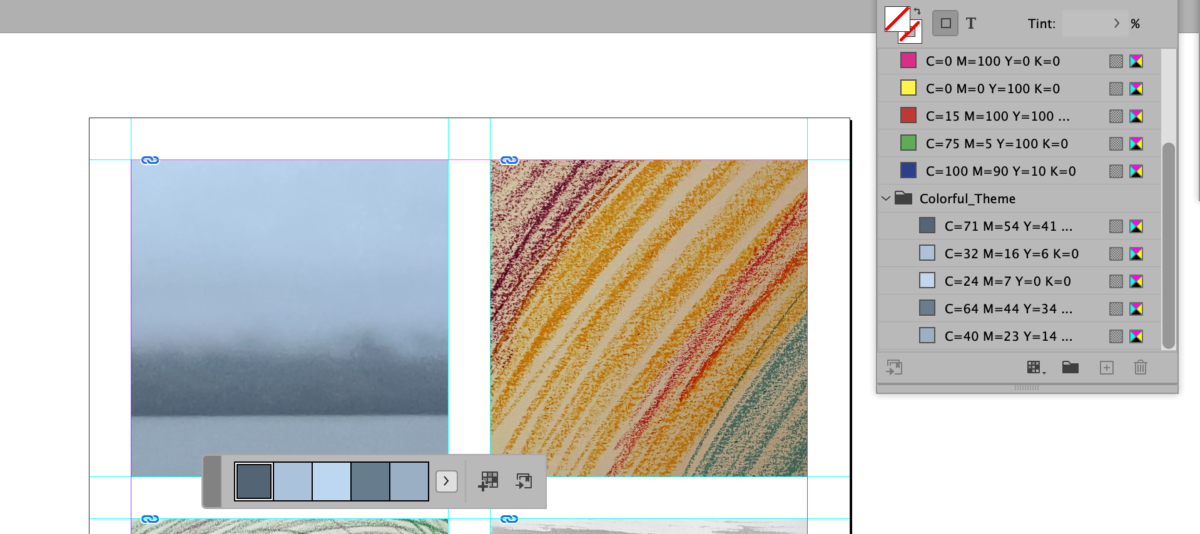
HOW and WHY to get actual colors from a photograph and place them in the swatch panel

- Go to Window: color > swatches
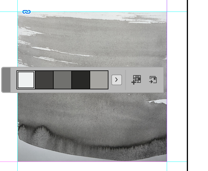
- COLOR THEME TOOL
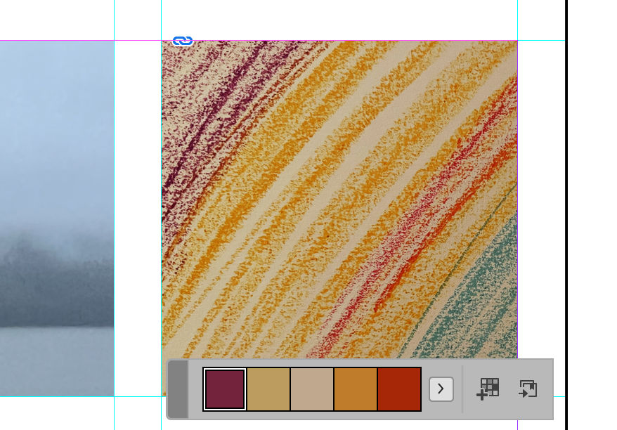
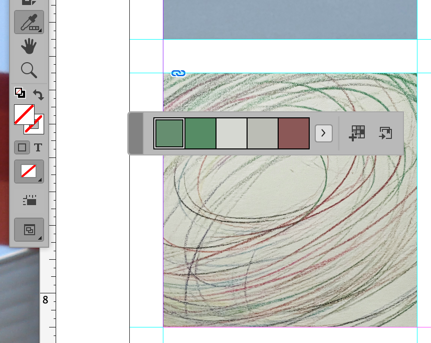
On the toolbox> go to the EYE dropper tool and switch it to the COLOR THEME tool - Click over the image with the COLOR THEME tool. You will see a strip of colors (and variation under the little arrow right next to it).
- Select the following icon to ADD this THEME to SWATCHES
- Finally you will see your colors on the swatch panel and you can use them to make a more cohesive design and relate the typography color to the image.

Below are images that give the same instructions for using the Color Theme Tool as above.
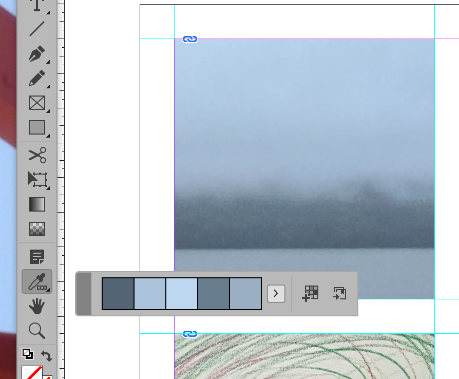
“Opt-click to add selected color.”
You can follow the same instructions for all of your images.
For all for images, choose a (different) appropriate face and insert over you image in your document, using color or surprinting or dropping out white. Do what works best/is most readable.
Below is a jpeg with words, type, and colors chosen to be appropriate and legible.
Activity 3. Work on your lettering.
If you’re working in Adobe Illustrator, explore 3-D tools in Typography.
RECAP: DURING CLASS:
- Work on you texture/color/Word Associations.
- Individual meetings with all.
- Continue to work on your lettering. Next week, you’ll apply your lettering to an object (a 3-D object / package).
Assignment / To Do After Class
- Complete InDesign document using image/word associations. Save as a jpeg. Filename: lastname_color_legibility_102623
- Upload progress on your lettering for Project 2. Filename: Lastname_progress_102623
Progress for lettering must be uploaded to DROPBOX by Monday night, October 30.
Again, here’s the link to the Adobe color analyzer which Sarah used to test readabilty on the document from Class 16 on Oct. 24.
________________
Looking a bit Ahead
Info shown below applies to Class 19 in prep for Class 20 when you’ll pull everything together to upload PRIOR TO and PRESENT DURING CLASS 20.
- More lettering and Word Experimentation.
- Continue lettering project as per individual styles and approaches.
- Make all corrections and edits
- Start preparing for final presentation. Preparation is due by the end of Class 19. Package your InDesign documents by Class 19 (Nov. 2). Make sure your Illustrator documents are saved with outlines.
- PRESENTATION IS CLASS 20 (Nov. 7).
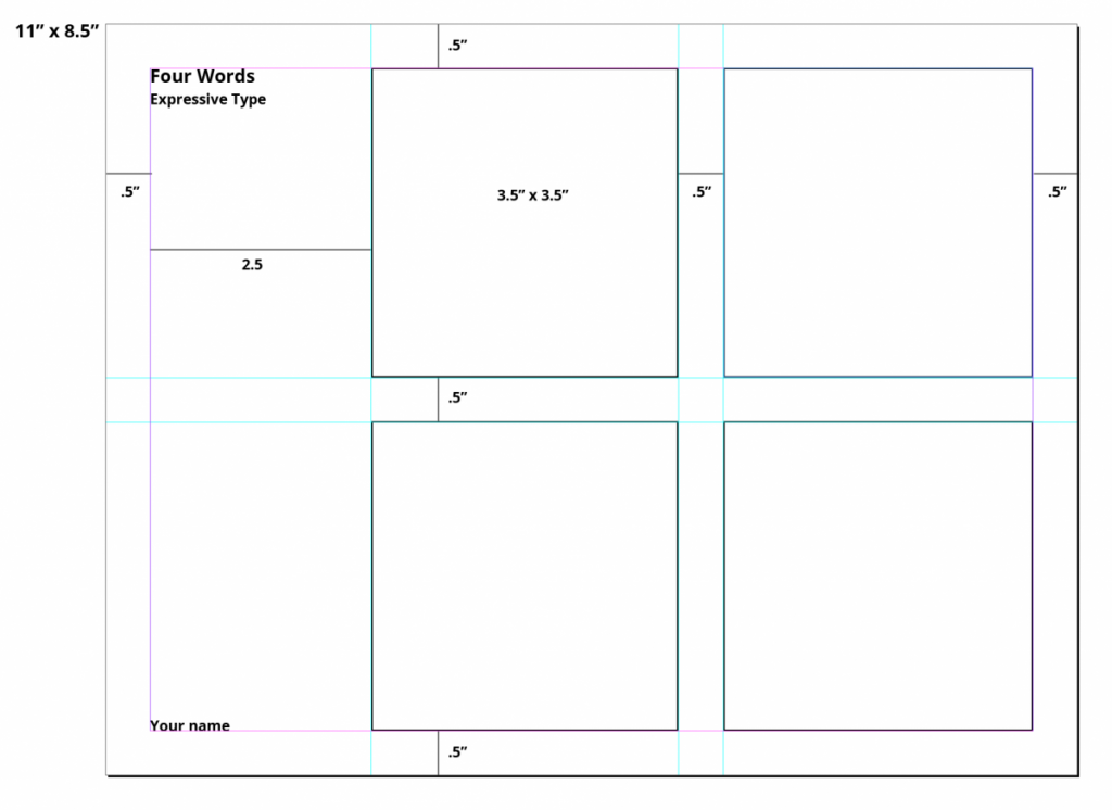
- InDesign Document. 11 inches wide x 8.5 inches high.
- .5 margins all around (see below for additional measurements and use those measurements
- Final versions of the four words (expressive type assignment—using a typeface)
- Final version of the lettering assignment with images of process—creating expressive type not using an existing face (sketch and process).
- Your lettering applied to an item.
Below is page 1 of your multi-page presentation for Class 20 (November 7). More to come in Class 18 (October 31).
_______________________________________________________________________________________
Grading Note:
Project 3: Steps/ progress not done by due dates (-15 per step)
Upload to Dropbox as instructed.
_______________________________________________________________________
Graphic Assignments are always due the day before class at 8:00 pm, and must be placed in class drive unless indicated otherwise. Assignments uploaded during class on the day that they are due are marked as late.
Participation Activities (Scavenger Hunts, Type Talks and Type Challenges) are due during class or the day before class at 8:00 pm if indicated by instructor.


Leave a Reply