Class Info
- Date: Tuesday, October 24, 2023
- Meeting Info: In Person. Pearl-116. 8:30am–11:00am, followed by office hours in the same room.
Today’s Plan
STUDENTS WILL LEARN MID-TERM STATUS BY TODAY
- Project 2. Continue working on corrections and refinements, per one-on-one discussions of work so far on Project 2: Expressive 4 words and Lettering. Your work is due in Class 19 (November 2) for presentation in Class 20 (November 7).
- Stand-alone assignment: Explore color contrast and legibility in type.
- Another Stand-alone assignment: Textures
Sidenotes
- A. Great Resource: The People’s Graphic Design Archive.
- B. Think about the importance of SPACE in clear communication. The two examples immediately below show screenshots of a Blackboard Announcement from last Fall. What do you think about the one on the left as opposed to the one on the right?

Topics
- Lettering and Word Experimentation.
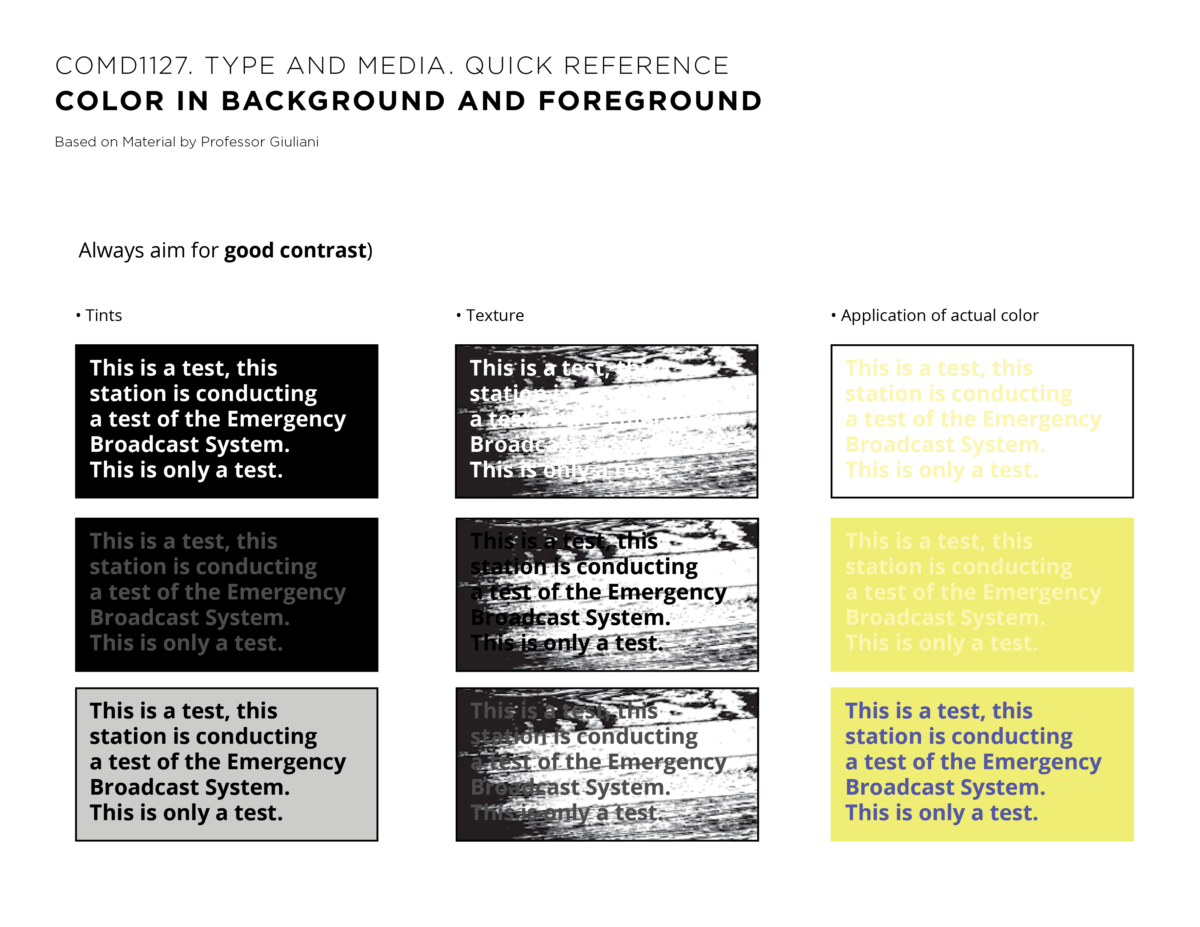
- Color and Typography Explore color contrast and legibility. See Quick Reference pdf with color information.
- Re-explore type-image relationship and typeface choices.
During Class
In addition to the links to the PDF, below are the two pages of info.

Activity 1
A side assignment about readability
- Following Quick Reference PDF with color information, use text provided below and experiment with background using an Old Style Typeface in 11 point. Use only 11pt. but vary the weights and the space between lines. Do the same with a Sans Serif face in 11pt.
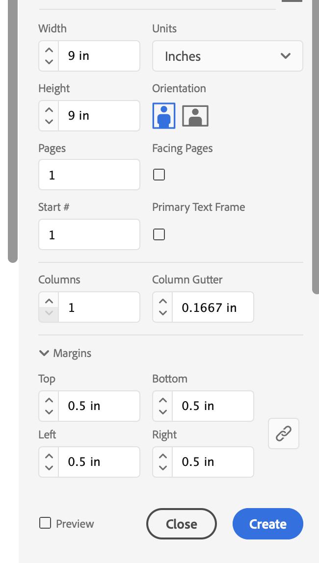
- Show in an InDesign document at 11 inches wide x 8.5 inches high, 3 rows, 3 columns, 9 text boxes for both Serif and Sans, 1 pt frame around each box.
- Use the two sentences of text below. Set Flushed left, Unjustified Right.
Serif Old Style typefaces date from the 15th century onwards. William Caslon (known for designing an Old Style Serif) designed a Sans Serif face in the 19th century, but Sans Serifs didn’t become popular until later.
- See how the Old Style differs from the Sans Serif.
- You do not need to include textures but DO include colors.
- Note the text you’re using for your experiment points out that an early Sans Serif was designed in 1816.
Work with colors and textures, as shown in class.
Export PDF and upload to Dropbox.
File name: Lastname_readability_102423
Activity 2
More work with textures
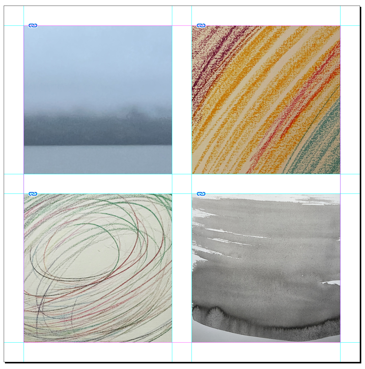
In Preparation for our next assignment (This is a stand alone assignment and not part of Project 02), we will create multiple abstract textures during class.
Create various abstract textures
- You can use paints: acrylic, watercolors, gouache, markers, photographs, etc.
- Do not find them on the computer, create your own.
Aim to have a variety of textures and colors. - Scan or take a picture of your textures. (If you need to adjust colors of image in Photoshop, do so before placing jpgs in InDesign)
then
Create a new InDesign Document

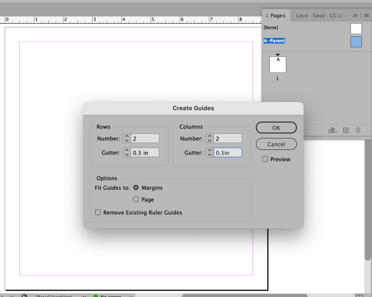
Enter: 2 rows, 2 columns, .5 inch margins.

- Then you will place the textures in InDesign
Activity 3
Project 2. Your Hand Lettering. Continue to work on your Lettering. Start to think about how you would apply it to a surface.
Assignments / For next class
A. In class you uploaded your PDFs with type and readability studies.
See instructions above. Also, see folder in Dropbox with InDesign file from today. Note: the Indd file doesn’t have many color studies.
Remember to save your file as File name: Lastname_readability_102423
1. Project 2
Continue working on Corrections and progress for Project 2
Make sure to show progress every class. Upload your most recent version to Dropbox.
Lastname_lettering_progress_102423
PLUS
2. Complete jpgs of textures and save
lastname_texture1_102423.jpg
lastname_texture2_102423.jpg
lastname_texture3_102423.jpg
lastname_texture4_102423.jpg
Alternatively, you can save your entire page as one jpg
Lastname_textures_102423
Upload to Dropbox in your folder.
PLUS
3. Type Scavenger Hunt. Gothic vs. Gothic.

Gothic type can be total opposites.
Wikipedia (and other sources!) notes that: Before the term “sans-serif” became standard in English typography, a number of other terms had been used. One of these terms for sans-serif was “grotesque”, often used in Europe, and “gothic“, which is still used in East Asian typography and sometimes seen in typeface names like News Gothic, Highway Gothic, Franklin Gothic or Trade Gothic.
Gothic also calls to mind type on caps, hoodies, and Halloween items. Its origin is less edgy: it’s based on Blackletter, also known as Gothic Script, which was used for manuscript, books, and documents throughout Europe.
Out in the world, find 1 example of a Sans Serif Gothic AND 1 example of Gothic (really, Blackletter). Upload your description of where you found your examples to
Student Posts >Type Scavenger Hunt.
Lastname_TSH_Gothic_and_Gothic_102423
If you can’t upload your small jpeg, then upload to Dropbox.
_____
Grading Note:
Project 3: Steps/ progress not done by due dates lose points.
Graphic Assignments are always due the day before class at 8:00 pm, and must be placed uploaded to the appropriate folder in Dropbox unless indicated otherwise. Assignments uploaded during class on the day that they are due are marked as late.
Participation Activities (Scavenger Hunts, Type Talks and Type Challenges) are due during class or the day before class at 8:00pm if indicated by instructor.
____________
Print this page


Leave a Reply