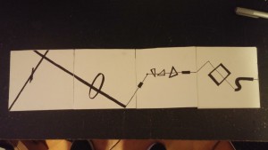
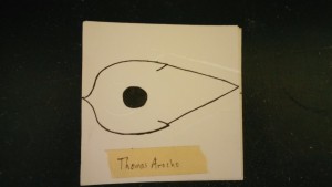
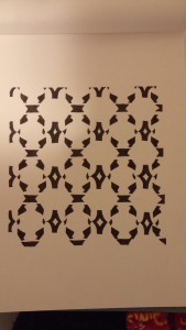
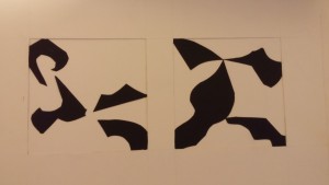
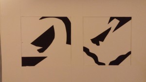
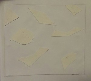
This project helped me learn how to make visual rhythmic representations. It was a lot easier than it sounded. Making the book in the proper dimensions was one battle, but the visuals were simple and even interesting to make. It also taught me how important form is. To think up the rhythm is one thing, but to create something that acrually makes sense is another. That took up the most amount of time because I did not want to make anything senseless.
Author Archives: Thomas Arocho
Virtual Reality’ Potential Displayed at Game Developer’s Conference
I find this article to be interesting because design is what virtual reality still somewhat struggles to grasp. In game shading is not perfect, spatial depth is strainuous on weak processors, and even simple design aesthetics like pattern and texture can sometimes appear to be lacking due to lack of goggle quality. Such technology has been tinkered with for decades and it has yet to be perfected, which intrigued me.
http://www.nytimes.com/2015/03/09/arts/video-games/virtual-realitys-potential-displayed-at-game-developers-conference.html?ref=video-games
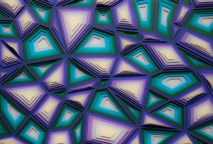
Successful Layering
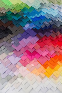
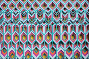
These layers succeed in layering because it feels as if one is looking at different kaleidoscopes. Each layer has a unique color or shape that leads to all of the other unique layers rather than just combining shading to make one object. In a way, the layers in these works are their own individual objects that complement one another in succession to bring us very spontaneous designs.
Source:
http://www.demilked.com/layered-paper-art-maud-vantours/
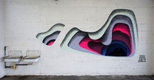
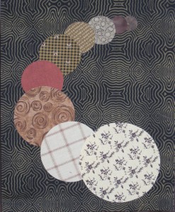
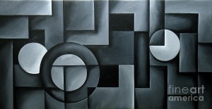
Successful Spatial Depth
These three images succeed in using spacial depth for one common reason: despite appearing to be simplistic, they have a very complex design look that keeps people’s attentions. Just by looking at these designs, it keeps people wondering if there is more to see if they analyze them at varying distances.
Sources:
http://1.bp.blogspot.com/_wwL03lhNnEA/S_mzrXKgwWI/AAAAAAAABjk/RnCc6IgNsCA/s1600/depth.jpg
http://images.fineartamerica.com/images-medium-large/illusion-of-depth-14-uma-devi.jpg
What I Learned from Project 1 (COMD1100)
This first project had taught me two things: how to make meaning out of nothing and that I should use a pencil with light lead when marking projects up. It is relatively difficult for me to find meaning out of something without purpose as I’m a rather straightforward person. However, trying to patiently analyze shapes (for once in my life) has given me the time to actually come up with my own definitions of visually random compositions. As far as marking up my projects goes, I now know to use lighter lead so that my craftsmanship can look somewhat better without eraser marks.
Process of Making Project #2
So far, the process is going well. I already decided on which compositions to use. All that’s left is to finish the 8th panel of the soundbook so I can implement the chosen compositions. I would have been done already if only Blick would cut their bristol pads properly instead of curving their cutting in a lackluster manner. Hopefully it will all work out well. :'( 🙂
Visit To MOMA (Making Music Modern: Sound for the Ear and Eye))
Original Visit: 10/07/2015
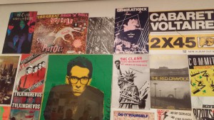
Visiting the Making Music Modern exhibit was very interesting. It was also a very peculiar experience for me as I did not originally understand how sounds can become an art form. After seeing instrument designs, music videos, and various posters, I came to a conclusion that the “art” portion of music comes from the both appearance and feel of the music. It can appear shocking or mellow and have cover art to match the preferred style. I could go on to explain the feeling in detail, but it is better to see it up close for an opinion.
Inspiring Music
Music makes it a lot easier for me to concentrate when completing assignments as well as my own drawings. I have here some of my favorite inspirational songs.
