-
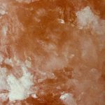
- Tint Progression
-
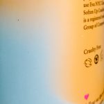
- Color Progression
-
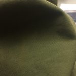
- Shade Progression
The tint example was found on a rock salt in my house. The pinkish-orange color of the salt gets lighter in different parts and this is an example of tint which is when a color gets lighter with the addition of white.
The color progression example was found on a bottle. The light blue and the yellow-orange fade and blend into each other and this is an example of when two colors mix as they progress into one another.
The shade example was found on Vision’s sweater. The deep green color of the sweater gets darker in in the shadow and this is an example of shade which is when a color gets darker with the addition of black.
Time spent: about 1 hour


Recent Comments