Fall 2017 | COMD1100_LC08 | Prof. Spevack

Author: Stan (Page 1 of 3)

Little message from Stan again

For anyone that still uses this site, hi again. I’m probably not going to appear often in the coming months, but Happy New year to you all. Just remember that if you want to visit me again, you can find me on Facebook right here. If you are liking part of my drawings, the one above is similar to my previous profile picture, but I made them cosplay two characters from a game called Kingdom Hearts. Eventually, I will make an art website very soon to make it easier, but have a good day to you all.

Quick Message from Stan again

Hi everyone; again! I know a lot of people saw my happy holidays post, but since a lot of students are posting a lot of work today, here is a shortcut for the post if you want to see it again. It also has my social links so check it out.

Happy Holidays from Stan (Cause why not)

And once more again, Happy Holidays, especially Sage which is my favorite partner and Professor Jenna Spevack as my all time professor for my first semester.

I also have a shortcut to Facebook right here if you want to friend me ASAP: “Stanley Quach

Color Harmony: Phase 4

Overall with this project, I learned plenty of interesting things with Color Harmony from the use of shade progression to tint progression that we see in most things. Sadly, I didn’t have enough time to complete Phase 3, but I tried my best to complete Phase 1 and 2.

Here are the phases:

Phase 1

Phase 2

Color Harmony: Phase 2

In this phase, I used my cherry blossoms from Microsoft Paint I drew a year ago. With my drawing, I created my color inventory which mainly involves only a few two color progressions, mainly the cherry blossoms. I tried my best to create a proportional color inventory as possible. This includes most of the colors that I drew.

Color Harmony: Phase 1

Shade Progression (Black to Tint Blue)

This was a picture I took on some interesting English textbook from middle school. It seems like a wild book of tint blue and black, but the progression starts in the middle bottom to spread out to the top.

Tint Progression (White to Green)

This was a simple picture I found. The progression changes from White at the right to turning Green when looking left.

Two-color progression (Dark Pink to Tint Pink)

This was a really hard part to find any Two-color progression and I chose this. The Cherry Blossoms has the progression change from dark pink at the middle of some flowers into turning tint pink when spreading out from the middle.

Happy Holidays from Stan (Cause why not)

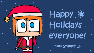
 [#1] Just Happy Holidays to everyone

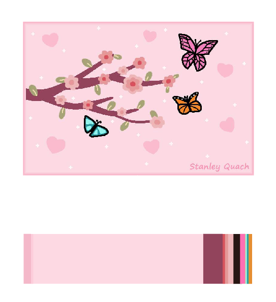
 [#2] My New Profile Drawing

First off, this has nothing to do with any course projects or anything interesting I learned from college. I just want to say happy holidays to every one of you. Even if I am not like a social person to most of you, I’m still happy for you to get to know me. And hopefully, you can talk or chat with me if you are interested in my life or my artwork like above.

By the way, I actually drew these artworks above on Microsoft Paint, so I’m not like an expert on drawing yet; just a hobby that I have for my whole lifetime. I had used Photoshop sometimes for my drawings, but mainly for tilting and shading. Some of my drawings are references to games that I like, even though I do not play a lot of different games for a weird reason. Other times, I just draw things that I have an idea on. Mainly, these two characters which I call them BB (Balloon Boy on the left) and BG (Balloon Girl on the right), are just the characters I love to draw over and over again cause I love cute things and the way I like to draw characters.

Follow me on these social sites if you like to stay in touch with me: (I generally recommend Facebook cause I use it often)

  • Facebook: “Stanley Quach” [Link here] (The one I use every day and the only one that contains over 400 drawings I did)
  • Twitter: “Stanley Quach”
  • Instagram: “Stanleyq6309” (Sadly, I use Instagram very rare)
  • Devianart: “Kirby6309”

(This are just most of the social sites I use, please ask me if you want to know more)

Hopefully, I can see you in the next semester or in the future. And again, Happy Holidays from Stanley Q (Stan).

Color Interaction Pairings: Phase 3

This is a project that I worked with Tracy. The left side is suppose to represent me (in this case, Stan), while the right side represents Tracy.

This project took roughly a total of 2 to 3 hours to complete this; especially this is one of my first few times using Illustrator and it took a while to find the perfect sketch to draw the middle.

Color Interaction Pairings: Phase 1

During research, Color Interactions is the idea of using the same color in the middle and leaving background color for our eyes to see the color slightly different than usual. “In visual perception a color is almost never seen as it really is — as it physically is. This fact makes color the most relative medium in art”, said by Josef Albers. It has to do with the “The relativity of color, a color has many faces, and one color can be made to appear as two different colors.” When looking at it you may see that the middle color isn’t the same, but it is actually the same color. This is because our eyes sees it differently when it comes with background colors. It all has to do with our vision and colors.

« Older posts