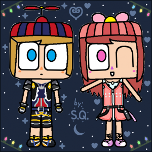
For anyone that still uses this site, hi again. I’m probably not going to appear often in the coming months, but Happy New year to you all. Just remember that if you want to visit me again, you can find me on Facebook right here. If you are liking part of my drawings, the one above is similar to my previous profile picture, but I made them cosplay two characters from a game called Kingdom Hearts. Eventually, I will make an art website very soon to make it easier, but have a good day to you all.
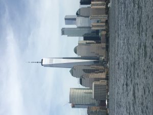
Project 1: Urban Artifacts
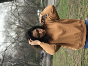
Project 3: Value-Added Portraits
Project 4: Saturation Studies
Project 5: Color Interaction Pairings
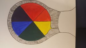
Project 6: Color Harmony
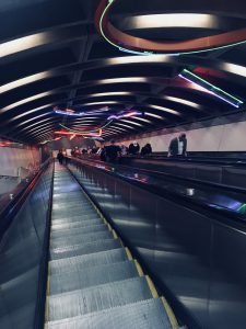
Project 2: Sound Visualizations is incomplete.
Thanks for the great semester, Professor Jenna. You taught us so much and I had a lot of fun with these projects. Also, a shoutout to all the wonderful, talented people I met in this class; we all did an awesome job and learned so much and had a blast along the way!! Happy holidays and a happy New Year !!
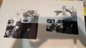
Value-Added Portraits: Phase 1
Value-Added Portraits: Phase 2
Value-Added Portraits: Phase 3
I learned a lot about the different terms for value such as high key/low key and broad/narrow range. It was new vocabulary that is needed in this field. I wish I had more time to study the vocabulary and had more/better examples that we’d have to come up with, just for the sake of practicing it more.
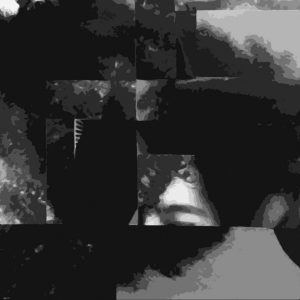
I really liked the chance we had to digitalize our images. I tried to stay as true as I could to the original details and layout of the image but I looked for certain areas were I could blur the lines between the specific squares so I could create and even better flow and unity. I believed that the eye would automatically complete the lines mentally if I correctly lined up the different spaces.
Time spent: 1 hour
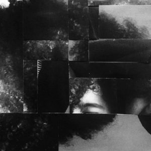
I chose to have the eyebrow as the focus of the piece because it had a very high light when compared to the rest of the image that is full of dark tones and black. I tried to unify the image by the texture of my hair that you see in multiple areas around the piece. The piece has a broad range because of the small high light/white moments, but the image is very low key because it is mostly composed of dark tones and black.
Time spent: 1 hour 30 mins
Working on this project was a bit of a challenge because I couldn’t find the right orientation for my squares. Due to this challenge, I learned that placement is very important to how the art flows. I feel that if I had the patience I could’ve done the painting a little bit better


Recent Comments