
narrow range

broad range
Fall 2017 | COMD1100_LC08 | Prof. Spevack
narrow range
broad range
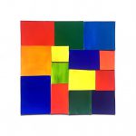
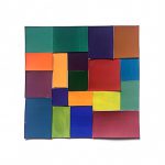
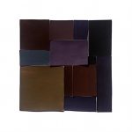
This was my favorite project this semester. Not only was I able to use everything I had learned in the last couple of months in one big project, but I was also given the freedom to do an illustration of my own. The color proportion inventory is an amazing tool to creating and studying color palettes of images and stills and that is definitely something I plan to do more of in my spare time. I wish I had a little more time to do the illustration though because looking back on it I see somethings that I could have changed or even a different image I could have presented that had a more accurate representation of certain proportions. All in all this was definitely the best project in my opinion. I’m very glad I made the decision of continuing into Phase 3.
This project had to do a lot with the illusions that colors can make and I feel like the best part about it was seeing not only what kind of tricks we could play on our own eyes but also the combinations that other people chose and how they chose to pair colors up to make illusions. Something I liked about this project was Phase 3 when we were paired up and had to work together to not only make a color/symbol pair that represented a different person, but create one that fit with ours. It was really cool to see the other people’s images of you represented in color and symbols. I wish we had more time to work with that app during Phase 1. I feel like there was a lot more I could have learned through those apps and I am looking forward to getting them for myself.
This was the first time I was able to study color as a subject. As an architecture student in the past I was never able to experiment with things like paint or hues and I found it insanely freeing and informative to work with this concept as well as this medium. Since it was my first time using paint, specifically gouache paint, it was a little weird to learn how to use the paint and my craft wasn’t what I expected it to be at times, but the more I practiced the better I got and now I’m determined to use the paint as a medium for things in the future.
This was probably the project I learned the most from over the course of the semester. I’m very new to painting and it was my first time using colors in a study in which I was mixing them for myself and not just getting them off a palette I found online. My favorite one to work on was the muted palette because there was a such a diversity of color. I liked to see how by adding red blue and white I got lavender, then adding that lavender to a bright orange, made from yellow and red, made a softer orange-brown color. I experimented by adding a little more of this or a little more of that, creating different shades and tints and jumping around the color wheel. The chromatic grays were also a fun one for me because it was my first time seeing how by adding colors from different ends of the color wheel you were able to create these really dark and desaturated colors. It gave me a new perspective on how colors mix with each other. The prismatic one was a little uneventful because it was just taking colors straight from the bottle but it was great to compare it to the muted palette to visually see the difference between a very bright prismatic hue and a more muted one.
Time spent: 4 hours
low key
high key
I really enjoyed this project. I found it enjoyable to walk around and look at the things I would normally walk past. I learned that it is important to pay attention to the world around you and how difficult it can be to take a good picture. If I was to do something differently I would have taken more pictures when I had the time.

tint progression

two color progression

shade progression
https://openlab.citytech.cuny.edu/spevackcomd1100fa2017/2017/12/11/colorpairings-phase-1-3/
This project made me really use my eye muscles. At first it was difficult to see a change in value or hue. After training my eyes, and knowing more about the theory of color, it was easier to identify. This skill will definitely help me out in the future projects and gives me a more open mind when it comes to color. Everything isn’t always what it seems, Thanks Professor Jenna.
Hi everyone; again! I know a lot of people saw my happy holidays post, but since a lot of students are posting a lot of work today, here is a shortcut for the post if you want to see it again. It also has my social links so check it out.
Happy Holidays from Stan (Cause why not)
And once more again, Happy Holidays, especially Sage which is my favorite partner and Professor Jenna Spevack as my all time professor for my first semester.
I also have a shortcut to Facebook right here if you want to friend me ASAP: “Stanley Quach“
© 2024 COMD1100 : STUDENT BLOG
Theme by Anders Noren — Up ↑
The OpenLab is an open-source, digital platform designed to support teaching and learning at City Tech (New York City College of Technology), and to promote student and faculty engagement in the intellectual and social life of the college community.


Recent Comments