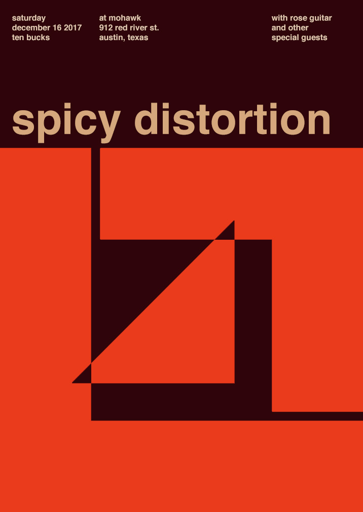
My partner and I chose the Nirvana poster and ended up with the warm color palette. This was a bit of a challenge for me because I had a much clearer image of what I wanted to do with a cool color palette so this was a little push out of my comfort zone. My partner and I actually struggled for a while trying to come up with not only the palette but the name for the band. Once we landed on the word “spicy” as a sensory word for taste, we had to connect it to a type of sound and ended up with “spicy distortion”. Choosing a color palette for the word “spicy” proved simpler than when we tried to just find warm color palettes in general. I also decided to add my own flair on the actual components of the poster by shifting of the inner triangle, because the original design looked too organized for a band with the word “distortion” in it. The info on the revenue was actually kind of cool to search for – I just looked up “50 best concert venues in America” and chose the one that looked the most indie/underground like setting that I felt fit for what I imagined our sound to be. So if you’re ever in Austin, be sure to check out, Spicy Distortion.
Time spent: 2 hours


Leave a Reply