Fall 2017 | COMD1100_LC08 | Prof. Spevack

Author: Garnet Garcia (Page 2 of 3)

Project 6 Phase 2: Color Harmony

Color Proportion Inventory

How to Train Your Dragon is one of my favorite movies and this was one of the first the promotional stills when the movie came out in 2010. Despite the movie have breathtaking scenery and stills, I chose this image because it had a strong dominant color and a strong subdominant color and various accent colors that complimented the image very well. I started off with filtering the image to take out details and just leave me with color and it left me with this image:

From this I was able to focus on the colors and from there created a palette.

I chose to study out the tints and shades and proportion the circles according to how much of it there was on the image. I then took the colors and set them up in the bar format to create the final inventory.

Time spent: 1 hour 30 mins

Color Interaction Pairings: Phase 3

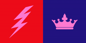
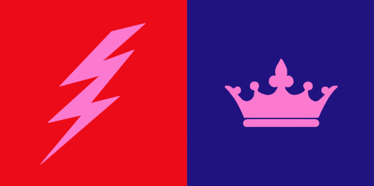
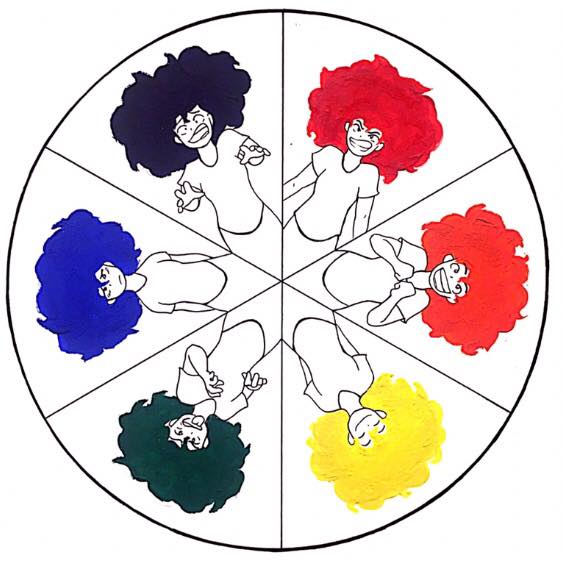
This project was rather quick but it was because my partner and I had very solid ideas of the colors we had in mind for each other. My partner was Ebony and she immediately thought of me as being a bright red for my energetic, outgoing and passionate personality. When she asked me what symbol was a good representation of myself I said the sun, but when she suggested lighting because of its electrifying presence that made you pay attention to it right in that moment, I was both flattered and fully convinced that it matched me way better. For Ebony I has always seen her as a very strong and well grounded person but one that carried themselves with elegance. She still had a very cool and playful personality, so I saw a deep blue-violet as a color that represented all these things. I suggested the symbol of the crown not only because deep blues and violets are usually associated with both power and elegance but also because I felt that it paralleled the lighting bolt in the theme of power. Both colors are very saturated and bold even though one is on the warm side of the wheel and the other is on the cool side, and the symbols both represented a powerful commanding presence, one in a loud, immediate way and the other in a firm and authoritative way.

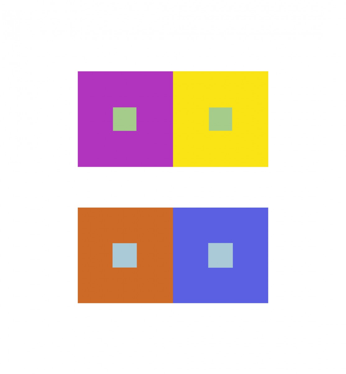
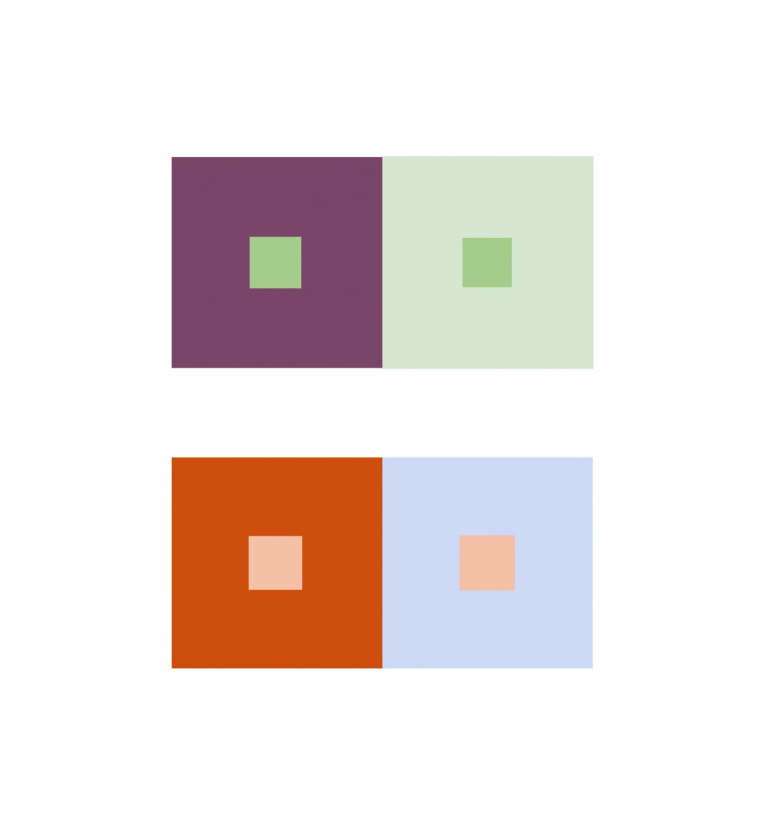
The color interaction of this piece had to do with the a change in hue but not value, for the background colors. The effect on the common color, pink, was that against the red background it appeared to be cooler in contrast while on the blue it appeared to be warmer. This is because the very prismatic hues create the illusion of the icon having the “filter” of their complementary color. Against the red, the lighting bolt appears more green/cool. Against the blue, the crown appears more orange/warm.

Time spent: 1 hour

Saturation Studies: Phase 3

My partner and I chose the Nirvana poster and ended up with the warm color palette. This was a bit of a challenge for me because I had a much clearer image of what I wanted to do with a cool color palette so this was a little push out of my comfort zone. My partner and I actually struggled for a while trying to come up with not only the palette but the name for the band. Once we landed on the word “spicy” as a sensory word for taste, we had to connect it to a type of sound and ended up with “spicy distortion”. Choosing a color palette for the word “spicy” proved simpler than when we tried to just find warm color palettes in general.  I also decided to add my own flair on the actual components of the poster by shifting of the inner triangle, because the original design looked too organized for a band with the word “distortion” in it. The info on the revenue was actually kind of cool to search for – I just looked up “50 best concert venues in America” and chose the one that looked the most indie/underground like setting that I felt fit for what I imagined our sound to be. So if you’re ever in Austin, be sure to check out, Spicy Distortion.

Time spent: 2 hours

Color Interaction Parings: Phase 1

Today we studied Josef Albers and his experiments in color relationships are used throughout the world in the study of design and color. One of the cool things about this study was how you through switching through different hues and values and saturations you were able to see which combinations created more intense interactions. At first we studied with simple things like the rectangles and squares that had the same color on the inside square/rectangle but varying colors on the outside ones, but the ones that I really enjoyed were the more complex ones where you were able to create color combinations that created illusions. There would be one main color in the middle that overlapped two colors on the top and bottom. Then, a final color would go on top of the main color to show a split across the whole image. Through changing the difference in value and hue, you could make it look like the main color was actually two different colors against the top and bottom ones. Such color interactions are extremely interesting when you look at them in the context of design because a simple change in one color could make another look completely different when it goes through the human eye. We also used this app called Huedoku which was actually more complicated than I thought. It was cool to see two colored that you didn’t think were related suddenly be a combination of two colors and you have this moment like “wow I didn’t know that’s how you could get that color”.

Time spent: about 30 mins

Saturation Studies: Phase 1

I was very excited to do this project for multiple reasons. The main reason though was because of the clear mental image I had of how I wanted to portray the color wheel. As someone who works with character designs and storyboarding, I think a lot about the emotions I want to set for different characters, scenes, and interactions in the story and a lot of that has to do with color. Even changing the color of a characters hair can cause a shift in how the viewer sees them, and that’s true even in real life when people dye their hair different colors to create a “mood” or “image” that’s more them. I chose to take each color and study it for the emotion that it is known to portray and even though the same color can represent multiple emotions especially if you change the saturation or value, I chose to stick to basic ones that were very familiar so I could create a simple and concise message with every character and have the most diversity of emotions possible. Of course inspiration for the hair came from myself and even though I could have chosen to color the shirt or the individual backgrounds instead, I felt that it showed a more unique way of showing a character “surrounded” by the associated color/emotion while still keeping the color to a small, neat area.

Time spent: 1 hour 30 mins

Value-Added Portraits: Phase 1

I took a picture of a Mac computer mouse with the light coming through the window. The already white and glossy surface of the mouse was made even more bright against the darker surface of the desk. The image itself is high-key with a pretty broad range. The contrast of the pure white against the darker more decorated desk (because of all of the marks and chips of the surface) creates a pretty good contrast but not one that is too intense. Part  of the mouse fades into the shadow and almost flows into the darker values of the desk, allowing a sort of flow between the contrasting values through the mid tones.  All in all, I think the lighting was able to make this a much more interesting and dynamic picture.

This plant was by the window of the gallery room on the 11th floor. Originally, it wasn’t that interesting of a picture because the greenness of the plant didn’t allow for such an intense contrast or really emphasize the value of the picture. However, in changing it to black and white with a filter I was able to get this really dark black as the main value of the composition. This is a low-key image with a broad range with high contrast with a not a lot of mid tones when compared to the image of the mouse above. One thing I really likes about this picture was how it captured all these little dots on the plant even in the really dark areas of the leaf in the front. It added a nice detail that I didn’t think I was going to be able to include and even though the spots aren’t big enough to create any real change to the value or composition or balance of this picture, I did like how the dots contrasted against one of the darkest areas of the image.

Time spent: 30 mins

Sound Visualizations: Phase 1

I am a big fan of 80s music. One of my favorites is “Africa” by Toto, and one of the reasons why I chose this song was because I felt like it had a very good mix of staccato beats and legato tunes. The song starts off with lots of soft drum beats along with other percussion instruments, but has this space-y melody (probably played on some type of synth-keyboard) and soothing bass strum accompanied by vocals that layer and harmonize. When drawing a visual for this I wanted to keep the feeing of having lots of different layers in sound.

Song: Africa
Artist: Toto

Urban Artifacts: Phase 4

Obvious Figure-Ground Relationship (Final)

Total time: 25 minutes

Ambiguous Figure-Ground Relationship (Final)

Total time: 1-1 1/2 hours


Chipped Paint – Organic Shapes

I learned a lot about what makes a stable/obvious figure ground relationship and what makes an ambiguous one, but also how some times it could be argued as both. I learned about how orientation, cropping, and how much detail you want to include can make difference in either. The only thing I would have liked to do better is perhaps get a second inking pen; I was not ready for how much ink I was going to need. One of the most important critiques I got was on the orientation of the Obvious Figure-Ground Relationship piece and how in putting it vertically, I could create a more concrete relationship with that of the Ambiguous piece.

Phase 1: Discover
Phase 2: Define
Phase 3: Develop

Urban Artifacts: Phase 3

These sketches were my way of testing out both the orientation and placing of the figure on the ground. I also wanted to test out how the “chipped area” would look in black as opposed to white.  This part relates to the last phase of the project because it takes my previous idea and tries to make it better through trial and error as well as critique.

Total time: 30 minutes


This was done on a much larger scale compared to that of the previous sketch. I wanted to make sure I was creating the correct sense of an ambiguous figure while also creating a sense of unity between the two parts.

Total time: 25 minutes

« Older posts Newer posts »