


Total time: 30 mins
Fall 2017 | COMD1100_LC08 | Prof. Spevack
Total time: 30 mins

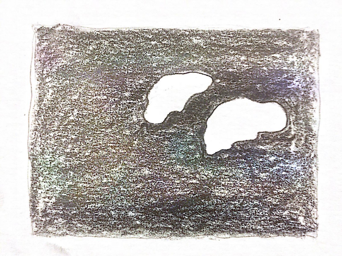
Obvious Figure/Ground
A bright orange wall that was more than pleasing to the eye. With time, movement and life grazed and scratched away at the surface, leaving behind only their memory with scratches, dents and scrapes. The smooth orange surface slowly chipped away to reveal an underlying white.
The shape of the white paint is rough and irregular, resulting in an organic shape. The contrast between the white and orange and the ratio between the colors creates a stable figure/ground relationship. I chose to keep the color to better show the contrast.
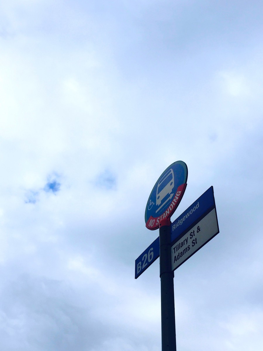
Obvious Figure/Ground
The Brooklyn City Railroad opened up the Fulton Street Line between 1915-1956, and even earned itself an article in the New York Times in February of 1950, entitled “New Bus Line in Brooklyn”. The B26 bus route begins at the Jay Street-Borough Hall station in downtown Brooklyn, ending with a loop at the Myrtle Wyckoff Avenues subway station on the border of Brooklyn and Queens.
The sign is made of smooth metal, designed with blues and whites and a dash of red. It is made of geometric shapes such as circles and rectangles, which results in an interesting figure when shown from this worm’s-eye-view. The image has a stable figure/ground relationship because of the ratio and focus of the singular figure against the soft blue, white sky.
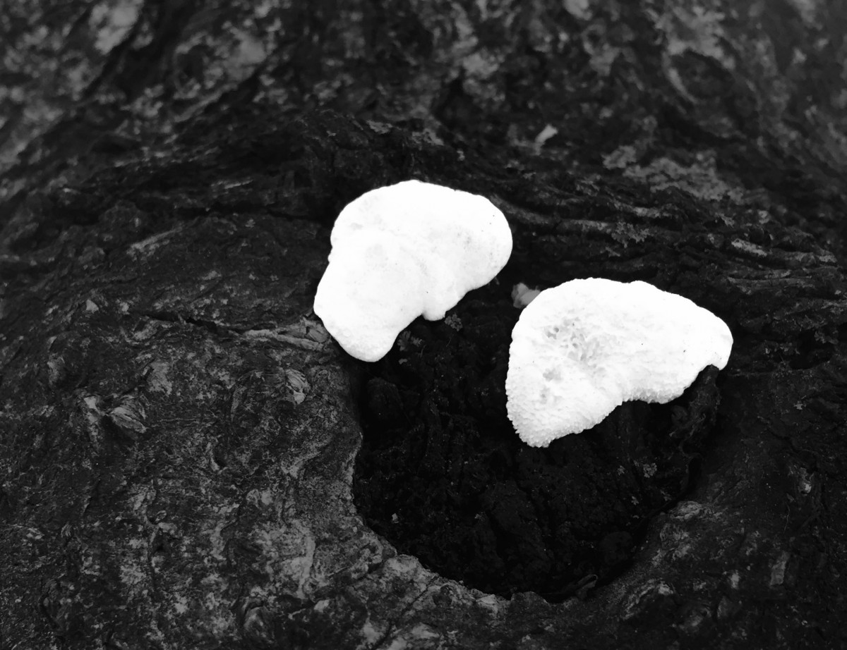
Obvious Figure/Ground
Fungus grows everywhere, They usually live in a symbiotic relationship with their environment, growing in moist, damp areas with rich nutrients. It would be interesting to know what type of fungi they were, and if they grew in the same spot every year. I imagine they grew over the summer when the air and bark were warm and damp, thus providing the nutrients needed for the little fungi to grow.
These particular patches of fungi caught my eye because of the stark contrast between the milky white color and the dark bark they were growing on. While the brown bark created a good contrast against the white, I felt like the black was a better way to emphasize the negative space and the stability of their figure ground relationship. They are organic shapes, purely made by nature itself. Also, I like how they look like little slugs.
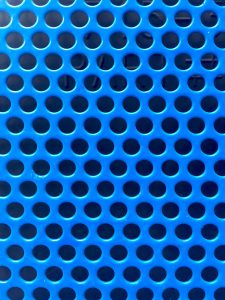
Ambiguous Figure/Ground
I won’t even lie: I don’t remember where I took this picture. The blue just grabbed me. It was such a striking hue, and whether or not the person who chose this color had the intention of catching people’s eyes when they passed by, it caught mine. If you look closely, you can make out words in the spaces of the metal grid; something that looks like a “P” and an “A” and a number symbol. Perhaps the blue grid is supposed to protect a piece of machinery, and the exterior designer wanted to make the look more appealing to the eye. Then again, like I said, I don’t remember.
The shapes that make up the image are clearly geometric. The pattern and grid formation of the circles and the 50/50 ratio between the circles and the metal forces the eye to move back and forth, unable to decide on a singular subject and making it ambiguous.
Ambiguous Figure/Ground
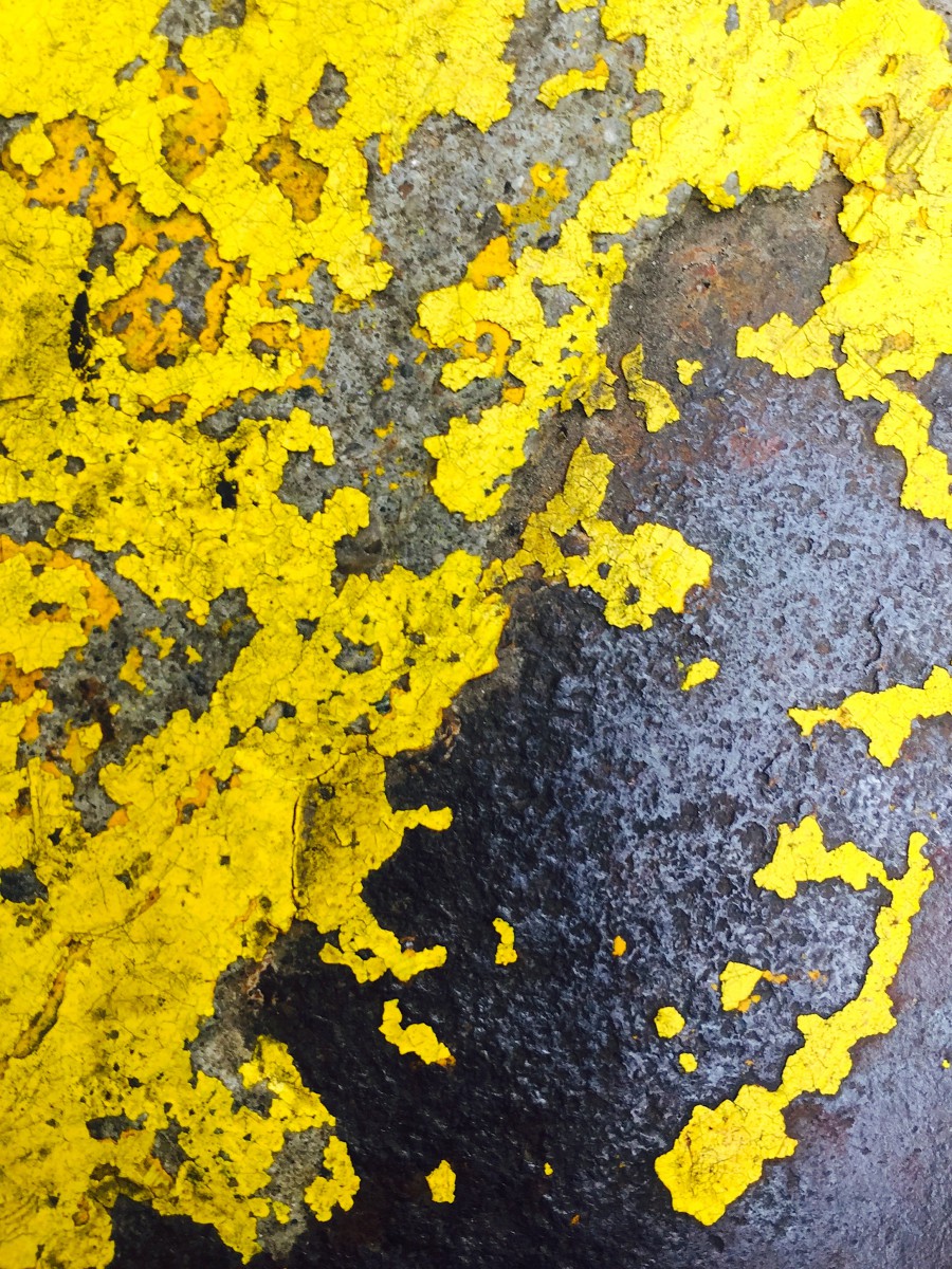
Yellow is the color of happiness, joy and positivity. However, when seen on signs or road signals it means caution, to both drivers and pedestrians. Most paint on the roads are made to last at least a year, and depending on how much wear it is exposed to, it can last way longer. So many days of cars and bikes and foot, rain and snow and wind to erode the chemicals away, chip by chip.
The patches and exposed layers of older paint coatings against a textured cement floor created a beautiful ambiguous figure ground relationship. The shapes are very organic, created over time by the environment.
Ambiguous Figure/Ground
© 2024 COMD1100 : STUDENT BLOG
Theme by Anders Noren — Up ↑
The OpenLab is an open-source, digital platform designed to support teaching and learning at City Tech (New York City College of Technology), and to promote student and faculty engagement in the intellectual and social life of the college community.


Recent Comments