Fall 2017 | COMD1100_LC08 | Prof. Spevack

Author: Garnet Garcia (Page 1 of 3)

Phase 4 Masterpost

Project 1: Urban Artifacts

Project 3: Value-Added Portraits

Project 4: Saturation Studies

Project 5: Color Interaction Pairings

Project 6: Color Harmony

Project 2: Sound Visualizations is incomplete.

Thanks for the great semester, Professor Jenna. You taught us so much and I had a lot of fun with these projects. Also, a shoutout to all the wonderful, talented people I met in this class; we all did an awesome job and learned so much and had a blast along the way!! Happy holidays and a happy New Year !!
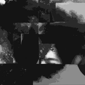
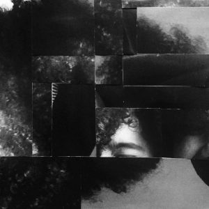
Value-Added Portraits: Phase 3

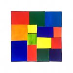
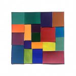
I really liked the chance we had to digitalize our images. I tried to stay as true as I could to the original details and layout of the image but I looked for certain areas were I could blur the lines between the specific squares so I could create and even better flow and unity. I believed that the eye would automatically complete the lines mentally if I correctly lined up the different spaces.

Time spent: 1 hour

Value-Added Portraits: Phase 2

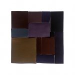
I chose to have the eyebrow as the focus of the piece because it had a very high light when compared to the rest of the image that is full of dark tones and black. I tried to unify the image by the texture of my hair that you see in multiple areas around the piece. The piece has a broad range because of the small high light/white moments, but the image is very low key because it is mostly composed of dark tones and black.

Time spent: 1 hour 30 mins

Project 6 Phase 4: Color Harmony

Project 6 Phase 1: Color Harmony

Project 6 Phase 2: Color Harmony

Project 6 Phase 3: Color Harmony

This was my favorite project this semester. Not only was I able to use everything I had learned in the last couple of months in one big project, but I was also given the freedom to do an illustration of my own. The color proportion inventory is an amazing tool to creating and studying color palettes of images and stills and that is definitely something I plan to do more of in my spare time. I wish I had a little more time to do the illustration though because looking back on it I see somethings that I could  have changed or even a different image I could have presented that had a more accurate representation of certain proportions. All in all this was definitely the best project in my opinion. I’m very glad I made the decision of continuing into Phase 3.

Color Interaction Pairings: Phase 4

Color Interaction Parings: Phase 1

Color Interaction Parings: Phase 2

Color Interaction Pairings: Phase 3

This project had to do a lot with the illusions that colors can make and I feel like the best part about it was seeing not only what kind of tricks we could play on our own eyes but also the combinations that other people chose and how they chose to pair colors up to make illusions. Something I liked about this project was Phase 3 when we were paired up and had to work together to not only make a color/symbol pair that represented a different person, but create one that fit with ours. It was really cool to see the other people’s images of you represented in color and symbols. I wish we had more time to work with that app during Phase 1. I feel like there was a lot more I could have learned through those apps and I am looking forward to getting them for myself.

Saturation Studies: Phase 4

Saturation Studies: Phase 1

Saturation Studies: Phase 2

Saturation Studies: Phase 3

This was the first time I was able to study color as a subject. As an architecture student in the past I was never able to experiment with things like paint or hues and I found it insanely freeing and informative to work with this concept as well as this medium. Since it was my first time using paint, specifically gouache paint, it was a little weird to learn how to use the paint and my craft wasn’t what I expected it to be at times, but the more I practiced the better I got and now I’m determined to use the paint as a medium for things in the future.

Saturation Studies: Phase 2

This was probably the project I learned the most from over the course of the semester. I’m very new to painting and it was my first time using colors in a study in which I was mixing them for myself and not just getting them off a palette I found online. My favorite one to work on was the muted palette because there was a such a diversity of color. I liked to see how by adding red blue and white I got lavender, then adding that lavender to a bright orange, made from yellow and red, made a softer orange-brown color. I experimented by adding a little more of this or a little more of that, creating different shades and tints and jumping around the color wheel. The chromatic grays were also a fun one for me because it was my first time seeing how by adding colors from different ends of the color wheel you were able to create these really dark and desaturated colors. It gave me a new perspective on how colors mix with each other. The prismatic one was a little uneventful because it was just taking colors straight from the bottle but it was great to compare it to the muted palette to visually see the difference between a very bright prismatic hue and a more muted one.

Time spent: 4 hours

Project 6 Phase 1: Color Harmony


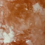
The tint example was found on a rock salt in my house. The pinkish-orange color of the salt gets lighter in different parts and this is an example of tint which is when a color gets lighter with the addition of white.

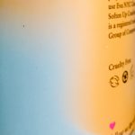
The color progression example was found on a bottle. The light blue and the yellow-orange fade and blend into each other and this is an example of when two colors mix as they progress into one another.

The shade example was found on Vision’s sweater. The deep green color of the sweater gets darker in in the shadow and this is an example of shade which is when a color gets darker with the addition of black.

Time spent: about 1 hour

Project 6 Phase 3: Color Harmony

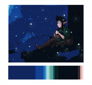
Fireflies by Garnet Garcia

I feel like the most difficult part of this part of the project was keeping the colors proportional to the original image. I had a very clear image of what I wanted to do and where the colors would go, but I found myself having to get creative with how much of each color I used, for example how much skin was showing. I also had to find a away to include the green/mint shades which I accomplished with the fire flies. This project was also special to me because it allowed me to use one of my original characters from my work and incorporate it into the illustration. All in all, it was awesome to see these colors work so harmoniously together in a completely different context.

Time spent: 4-5 hours

« Older posts