I know I want an internship in graphic design. I do some graphic design where I am currently employed but that’s not my primary responsibility. With that in mind, I looked for companies that are hiring interns for graphic design. I started with a basic Google search and went from there. I thought it’s best that I don’t apply just yet. I want to get my resume polished before applying. My resume is due for review in next week’s class. I looked at other design resumes to get an idea of what I should be doing. After looking at some inspiration, I wrote out and designed my resume with updated information. My resume is ready for review for next class’ meeting. I also bookmarked the companies that I’m interested in working for.
Portrait Lighting
Looking a this photo I find it to be a good example of broad lighting. The position of the light allows certain parts of the subject to capture light and other parts to cast shadows. The right of the subject is where the shadow is cast, which allows a triangle to form. This is an indication of broad lighting done well. I also found the lighting to work well with the subject’s subtle expression.
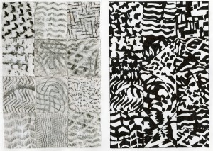
Texture
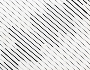
This is the first project that as assigned for this course. This assignment was fairly easy. We had to use lines to show movement. I came up with several ideas on how I was going to do this. I considered the placement, weight and spacing of the lines. As far as the movement aspect of the project I thought of waves. Waves are a representation of constant movement and so I thought that was what was best for this. At first I drew the waves horizontally but after looking at it I saw that it was boring and predictable. So I had to change that.
I then drew it diagonally and it looked a lot better. For the spacing, I kept it all the same between each line. There is only two distinct weights of lines in the project. The heavier weight was be where the wave is. In the end I thought that project was successful. During the critique of my project my professor didn’t feel that that was the strongest way to represent movement and suggested that I had created a more random movement of the wave.
Line/Movement
This is the first project that as assigned for this course. This assignment was fairly easy. We had to use lines to show movement. I came up with several ideas on how I was going to do this. I considered the placement, weight and spacing of the lines. As far as the movement aspect of the project I thought of waves. Waves are a representation of constant movement and so I thought that was what was best for this. At first I drew the waves horizontally but after looking at it I saw that it was boring and predictable. So I had to change that.
I then drew it diagonally and it looked a lot better. For the spacing, I kept it all the same between each line. There is only two distinct weights of lines in the project. The heavier weight was be where the wave is. In the end I thought that project was successful. During the critique of my project my professor didn’t feel that that was the strongest way to represent movement and suggested that I had created a more random movement of the wave.
Transparency
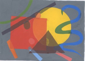
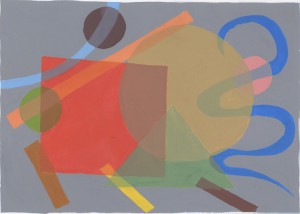
This purpose of this assignment was to show our understanding of transparency. I had to created a composition that consists of various elements. The assignment called for three dashed, three dots, one line, one circle, one triangle, one square and one arch. They had to be arranged so that they overlap. After arranging the elements I had to figure out what colors I would use. For my first composition I decided to paint the biggest elements all primary colors. I would then the smaller elements secondary colors. In order to show transparency in where the colors overlap we had to mix the paints to get the right value.
After finishing my first composition, it was bought to my attention that the yellow circle was too overwhelming to the whole piece. It was then suggested that I change the color to a more earthy or dull tone of yellow. I also changed the composition because two of the dots were completely covered so the true color of the element wasn’t present. After applying those changes, I noticed a huge difference and the piece looked more professional and neater.
Welcome!
This is the first post on your Learning Blog. Edit or delete it, then start blogging!
The ePortfolio is both a Learning Blog and an Academic Career Portfolio. Use the Learning Blog to document your learning experiences and class assignments each semester. As time goes by, add content to the Academics and Career sections to show your department, graduate institutions, or future employers how well prepared you are for your chosen career.
NOTE: Remember to add appropriate Categories and Tags to your posts. This will help your professors and other visitors find the content they are looking for. The Categories “Coursework” and “Field Trips” and the Tags “OpenLab” and “City Tech” have already been applied to this post. Feel free to make changes!
