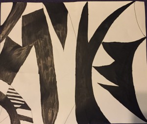
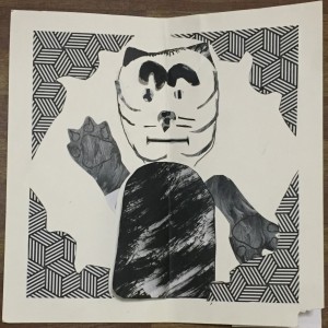
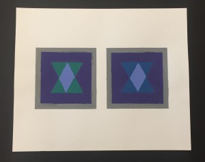
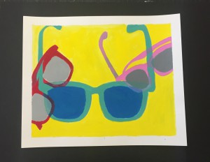
In this project, I created a ligature out of my initials, to represent my brand as a designer. This ligature will be used for my ePortfolio banner.
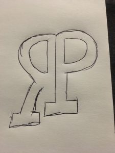
Idea #1: Using Shared Strokes
I choose this design for my initials because I realized that the letter R and P share similar strokes so i decided to combine both. The challenge was figuring out which letter should be more present. what worked was the placement of how i reflected the R horizontally.
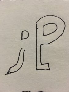
Idea #2 : Reverse the Field
This was one of my options because i like using negative space and showing a contrast of light to dark. The challenge was how could i get the R to be more visible. still trying to figure out what works and doesn’t.
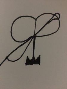
Idea #3 : Interlock
I chose this design because since I like apparel design, I was investigating on how to use the letters as a needle and thread. Drawing wise there wasn’t much of a challenge. What works is the thin script font which makes it look like a needle.
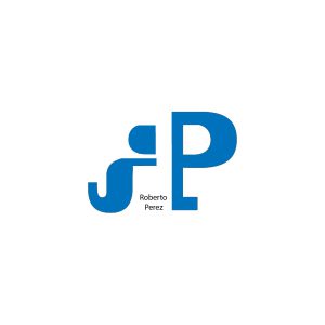
Final Design
This ligature works best for my initials because I feel that it is legible and shows how I used the reverse the field technique. This design shows my understanding of the technique and how i used negative space to make it positive.

