The Bell Jar Project
1
Cover 1

cover 2 
The Bell Jar by Sylvia Plath is a story of elapsed time. The protagonist Esther Greenwood starts off as a normal college student but over time she starts to act differently. She goes under pressure in life. She doesn’t know who she wants to be and exactly what she wants in life. Over time people around the world started designing covers for the story. Some are very hard to understand and some pin point the main points from the story. I believe that the cover should portray the story’s theme. It should also reflect the symbols that are used in the story. So when I was looking for book covers I was looking for something with the theme and symbols I had in mind. The symbol I had in mind was a jar. The themes I would like to discuss are expectations leading to disappointments and the regrowth or rebirth from suffering and pain. The first cover I chose was published in 1963 in London by Heinemann. The cover has the author’s name on the top and the title on the bottom middle in bold pink letters. The cover itself is black and white. On the cover there is a girl sitting on a chair resting her head on her hand. There is a bell jar and it seems like the girl is inside the bell jar. The second cover I chose was published in New York in 1971 by Harper & Row. The cover is a hand letting go of a rose. I look at the letting go of the rose as a rebellious act. Throughout Esther’s life she acts in rage. Her actions are very rebellious.
In college Esther starts to date Buddy but does not have a sexual relationship with him. Her mother approves Buddy and expects her to marry him. Later in time she bumps into a professor at college, Irvin. She loses her virginity to him. The whole situation of being married and having a family worries Esther because she won’t be able to be a poet. She is a successful poet with college education and does not want that to go to waste. This situation worsens her madness. The first cover reflects Esther trying to decide what she wants to do. What decision she is trying to make. This cover is shown in a way that she is trapped inside the jar. With so many responsibilities and hobbies Esther doesn’t know which one to carry on with. In a sense she feels trapped. When Esther comes home from New York she was rejected from a writing course she wanted to get into. That was one of the disappointments Esther faced. Esther was highly disappointed by her boyfriend who wanted her to stop writing and be pure. Buddy lectured Esther on the importance of being pure and clean. Right after that he told her he had sex with a waitress over 30 times. Esther faced such a huge disappointment after hearing that from Buddy.
“I sank back in the gray, plush seat and closed my eyes. The air of the bell jar wadded round me and I couldn’t stir” (Plath, Chapter 15). Esther explains how she is feeling and what she feels like she’s going through. She feels that she is trapped and there’s no way out. She’s breathing the same air, the air filled with negativity. This quote reflects the body posture of Esther inside the bell jar. Esther was very disappointed in life. She didn’t know exactly what she wanted.
Coming across this cover I realized it portrays the restrictions put on women in America in the 1950s. Women in the 1950s were expected to get married and raise a family. In this cover Esther is slouching, and with such body posture it is very predictable that she is worried. “A man doesn’t have a worry in the world, while I’ve got a baby hanging over my head like a big stick, to keep me in line” (Plath, Chapter 18). Esther thinks that a man doesn’t have anything for worry about. They have all the rights and freedom. Meanwhile if she gets married she is expected to have a baby. Esther worried that once she gets married she would have to choose either her married life with children or her writing career.
There was the symbol of a fig tree throughout the novel. The fig tree stood for the options and choices Esther had in store for her. “I saw myself sitting in the crotch of this fig tree, starving to death, just because I couldn’t make up my mind which of the figs I would choose. I wanted each and every one of them, but choosing one meant losing all the rest, and, as I sat there, unable to decide, the figs began to wrinkle and go black, and, one by one, they plopped to the ground at my feet” (Plath, Chapter 7). Esther struggles when it comes to men. She doesn’t know who she should go for or who to seduce. Esther imagines each fig represents a different life. The only problem is she can only one fig. Esther becomes very indecisive, and starts to think very hard. Meanwhile the figs are rotting and fall to the grounding. With the choice in life Esther becomes very overwhelmed. She begins to worry. On the cover Esther’s body posture is slouched with her head resting on her hand. I look at this as a posture people are in when they are stresses, overwhelmed and worried.
The biggest rebellious move is when Esther tries to commit suicide. Esther gives up in life overall and tries to get away from all the problems and the options she has to choose from. This led her in the hospital. From shock therapies to get medicine, Esther was constantly in and out the hospital. Being there is only a forearm on the second cover, I see this is weakness. People tend to slit their wrists when committing suicide because if the cut it deep enough it leads to death due to the artery connected to the heart. Esther rebels against her own life. But she fails to do so. In this cover Esther’s arm looks very weak. I can relate this to when Esther was going through her shock treatments. “But each time I would get the cord so tight I could feel a rushing in my ears and a flush of blood in my face, my hands would weaken and let go, and I would be all right again” (Plath, Chapter 13). Esther expresses her weakness she goes through and asks for mercy to be relieved from the pain.
“Then my hands jerked free, and I fell back onto my mother’s bed. A small hole, blackened as if with pencil lead, pitted the center of my right palm” (Plath, Chapter 12). This quote is when Esther was getting shock treatments by Doctor Gordon. After the treatment was done for the day, the doctor asked Esther how she was feeling. Although she said she was fine she was in pain. In this quote Esther explains her pain in great detail. This quote can also be applied to the cover because of her description when her hands were free.
“That afternoon my mother had brought me the roses. “Save them for my funeral,” I’d said. My mother’s face puckered, and she looked ready to cry. “But Esther, don’t you remember what day it is today?” “No.” I thought it might be Saint Valentine’s Day. “It’s your birthday.” And that was when I had dumped the roses in the waste-basket” (Plath, Chapter 16). During this scene Esther’s mother brings her roses for her birthday at the hospital. Esther throws the roses out. This scene is what came to my mind when I saw the second cover. It shows how Esther didn’t appreciate her mother or her mother’s feelings. Esther begins to rebel her mother’s care for her.
Part Two
I have chosen this cover for many reasons. It shows the theme of hospital and blood. Hospitalization and blood are repetitive themes throughout the book. Esther was in the hospital for shock therapy, going to visit a doctor about her problems, and when she was bleeding. Esther was hospitalized after overdosing on sleeping pills, in an attempt to commit suicide. Blood has an important throughout the novel as well. Blood was caused from the pain and harm she was put through or she put herself through. When Marco tried to rape her, Esther punched him leading him to bleed. When Esther was getting suicidal thoughts, she began to practice cutting her calf to get ready to cut her wrist. While slashing her calf she was bleeding and there was blood in that scene as well. Another scene where Esther bled was when she lost her virginity to Irvin. She refuses to be comforted by Irvin and heads to the hospital. The blood represents the scary experiences that Esther faced during her lifetime. This picture can also reflect when Esther went to Dr. Nolan, who gave her talk therapy, insulin injections and shock therapy, all in the comfort of one hospital and under one doctor’s care. On this picture the blood is drawing the heart rates. The heart relates to the scene where she tried to kill herself but her body strives to survive. Since the waves are not flat in the picture it resembles when Esther’s heart does not give up on her and wants to live. The image can only be seen as a rebirth from all the trauma Esther went through. Her ability to live regardless her countless attempts to kill herself. This cover has many scenes within and can definitely be used as a cover for The Bell Jar.
Part 1

The first edition, 1963

Perennial Edition, 2000
The cover of a book has the power of making customers purchase something they normally wouldn’t, or it can make them ignore a title they probably would enjoy reading. As a prospect reader walks down the aisle of a bookstore, the cover of a book has normally very limited time to capture someone’s attention. In a sea of different color schemes, materials and shapes, a cover has to have that extra “something” to catch people’s attention. Many books succeed at being picked up by using bright colors and shiny paper, but fail at transmitting the real essence of the title.
Sylvia Plath’s “The Bell Jar” certainly isn’t a book that can easily be summarized with a cover. The novel portrays the journey of a young lady, Esther, who walks down a rather troubled path in her life. Throughout the story, she deals with different types of disillusion, which lead her to acute depression. At first, one may think she has everything going for her: she’s smart, funny; her professional life seems to be going well. As the story develops, it’s clear that Esther’s take on life is a rather tortured one. She doesn’t seem to be able to enjoy her achievements and can’t seem to relate to what is going on around her. Throughout the novel, Esther shares thoughts that support that idea, such as: “The trouble was, I had been inadequate all along, I simply hadn’t thought about it.” (Plath 70) That’s only one example of how the lack of empathy towards the world is a part of her life. She never seems to find a group she truly fits in and she hasn’t been able to acquire long-term friendships either.
“The Bell Jar” was first published in 1963 and, since then, it has featured over 30 different artworks for its cover; and the first edition published has a very interesting one. The cover is composed of a black and white picture of a woman sitting at a desk in what seems to be a bedroom or a home office, as the background. From what can be seen from a lateral view, she rests her elbow on the desk and her hand on the chin. On the foreground, it is possible to see a bell jar, which gives the impression that the woman could be in it. The glass distorts the image of the woman behind it, and it makes her figure look a bit warped. The idea of a bell jar, also present in the title of the novel, is a reference to an analogy that Esther uses several times to describe her feelings: “I would be sitting under the same glass bell jar, stewing in my own sour air.”(185) This “bell jar” symbolizes her struggles in life, which always suffocate her in low self-esteem form and it makes her never feel satisfied with what she achieves. That’s clear when she says, “I was supposed to be having the time of my life.”(2) She acknowledges that she should be happy, but she’s unable to properly feel that way.
In this first edition’s cover it is only possible to see her dark silhouette against a well-lit background, which gives the artwork a sinister feel and supports the subject of the novel. Alongside the dark colors of the photograph, the typography follows that same imagery. Both title of the book and name of the author (“Victoria Lucas”, Plath’s penname) are portrayed in a shade of purple. The title of the book appears with a large point-size, all caps and centered at the bottom; and it takes up almost the entire bottom half of the cover. The other typographic addition is the name of the author, up top, with the same purple, but written in cursive typeface, giving it a more delicate motif. The typographic choices add up to the dramatic atmosphere that the story inspires.
Another cover that succeeds at capturing the essence of “The Bell Jar” is the “Perennial Classics” version, from 2000. It also features a woman in a black and white photograph. This time, the woman is outdoors in what seems to be a backyard. She is wearing a white dress, against a dark background formed by trees. That brings up an element that played an important role in the novel: the fig tree reference.
“I saw my life branching out before me like the green fig tree in the story. From the tip of every branch, like a fat purple fig, a wonderful future beckoned and winked. One fig was a husband and a happy home and children, and another fig was a famous poet and another fig was a brilliant professor, and another fig was Ee Gee, the amazing editor, and another fig was Europe and Africa and South America, and another fig was Constantin and Socrates and Attila and a pack of other lovers with queer names and offbeat professions, and another fig was an Olympic lady crew champion, and beyond and above these figs were many more figs I couldn’t quite make out. I saw myself sitting in the crotch of this fig tree, starving to death, just because I couldn’t make up my mind which of the figs I would choose. I wanted each and every one of them, but choosing one meant losing all the rest, and, as I sat there, unable to decide, the figs began to wrinkle and go black, and, one by one, they plopped to the ground at my feet.”(77)
That is a very important, since it touches a major issue for Esther—the lack of assuredness in her life. She is an intelligent woman who would easily be able to follow a successful career path based on her academic records, but isn’t able to do so due to insecurities and, again, the lack of self-esteem. This “Perennial Classics” cover speaks to that as it has the face of the woman blurred out, as a way of conveying lack of identity, something Esther deals with. She can’t decide what she wants for her future and isn’t able to make crucial life decisions, which frustrates her even further.
This artwork also features purple typeface for the title of the book, but it’s in a lighter tone compared to the first edition, which makes it look more girly and adds to the innocent feel that the white—and somewhat short—dress also suggests. The name of the author (this time her real one) is written in white lower-case letters; also suggesting a soothing and young theme.
The fact that the woman appears in the back of the photo, reading as some distance from the foreground, and the way she’s pictured alone, play with the concept of solitude and indecisiveness once again. Here’s a quote from the novel that supports that thought: “The same thing happened over and over: I would catch sight of some flawless man in the distance, but as soon as he moved closer I immediately saw he wouldn’t do at all.”(83) Just like in this quote, the woman in the picture looks almost lost, looking for something or someone; but at the same time she doesn’t look like she’s about to go anywhere. Esther feels that way in many different moments, such as in this following one: “When they asked me what I wanted to be I said I didn’t know.”(101) She didn’t even know who she was, or what she wanted to be—let alone which direction she wanted her life to take; and this version of the book cover dialogs with that idea.
Both covers here discussed—the first edition and the “Perennial Classics” version—do a great job conveying the main points of the novel. The first one dabbles more deeply with the gloomy aspect of depression, by portraying the woman in a distorted way and in dark colors. This cover also features a more obvious reference to the bell jar, having the actual object as part of the artwork. The “Perennial Classics” cover is subtler in its references, leaving more to be further analyzed. This latter one focuses more on the lack of self-identity Esther struggled with throughout the novel—hence the woman’s blurred face, just standing still in a garden. The imagery of this cover is a more youthful one, as it brings up the notion of Esther’s unpreparedness to deal with life’s challenges.
It’s hard to decide which one has more efficient results. The two covers have similarities: both have black and white photographs, feature a woman, have purple typography, and play with light/dark. It’s interesting to see that they were made 37 years apart and yet have a lot in common. It’s left to be wondered of the first edition had its cover design authorized by the author, since she was still alive when it was published. It summarizes the idea of the novel very well, and so does the “Perennial Classics” version.
Not all of the various cover designs for “The Bell Jar” had such positive outcomes. Many missed the point in portraying the Esther Greenwood’s gloomy personality and her hardships in life. It’s hard to imagine how an artwork featuring bright colors and festive typography can be faithful to a story that narrates the experiences of a woman dealing with depression. With a few exceptions, almost all cover options have, rightfully, dimmed colors and a serious approach.
As mentioned before, “The Bell Jar” isn’t an easy novel to be translated into a book cover, but the two ones here analyzed perform the job really well. Whoever sees these artworks are able to at least have an idea of what the novel is about, and that’s exactly what you want from a book cover.
Part 2

My cover
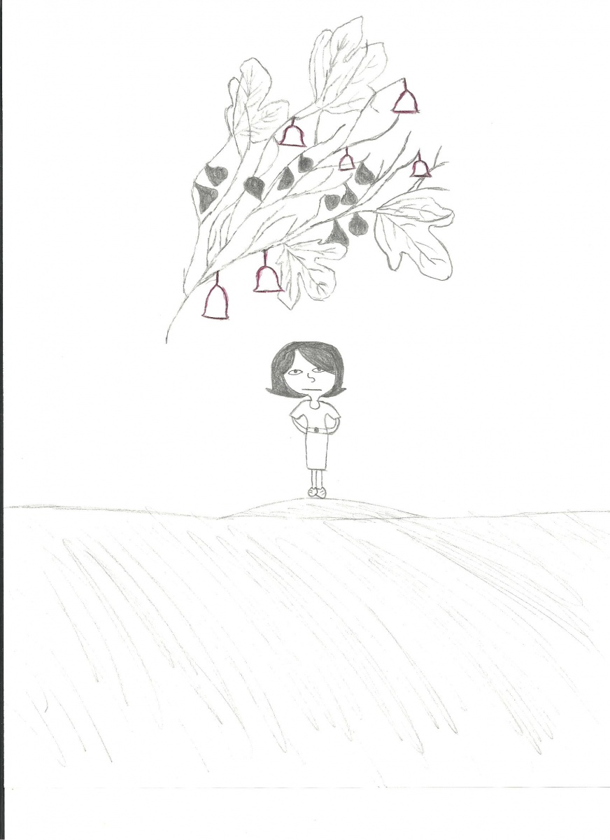
For the creation of my own cover, I used two major references in the novel: the bell jar and the fig tree metaphors. The first one appears in various moments of the story and it symbolizes Esther’s fears, frustrations and pain. She feels trapped inside this bell jar that keeps her from enjoying life. “To the person in the bell jar, blank and stopped as a dead baby, the world itself is a bad dream.”(237) She is talking about herself, who suffers from depression and can’t seem to be able to enjoy life.
The other reference, with the figs, is an allusion to the many different goals she wants to achieve, but doesn’t think she will. She says: “I saw myself sitting in the crotch of this fig tree, starving to death, just because I couldn’t make up my mind which of the figs I would choose. I wanted each and every one of them, but choosing one meant losing all the rest, and, as I sat there, unable to decide, the figs began to wrinkle and go black, and, one by one, they plopped to the ground at my feet.”(77) Esther has so many possible ways to succeed in life, and yet she’s overwhelmed and can’t follow any plan in depth.
The cover was put together with the thought of having the figs trapped inside the bell jar, representing two main ideas:
– The figs, or her dreams, were there within reachable distance and she could get them if she wanted, but something was keeping her from doing so: depression.
– Her goals, or her expectations in life, were also suffocating her, just like the bell jar.
I went with that typographic choice because it’s delicate and dark, just like Esther’s mind. I distorted the figs to give them the same gloomy feel Esther describes in the story. I made them look darker so it seems like they’re going bad and Esther is running out of time to eat them, translating into the nerve-wrecking scenario she’s living in.
Now that Project #2 posts are starting to appear, offer your classmates some feedback on their book-cover or image creations. Choose one and reply with a comment, approximately 150 words, even if you haven’t finished your own project! Reviewing what your classmates have achieved might help you finish yours if you haven’t already.
It would be great if when you post, even if you’re linking a file for the written work, to include the image for Part 2 in your post, so that it’s easy to see. It can entice us to click your link to read more about your cover.
As you complete Project #2, I’m sure you’re eagerly reading the excellent stories selected for this week. They’re in two pairs, and I’ll post a homework assignment soon for you to complete for Thursday. We’re moving into our most contemporary literature–enjoy!


There are many covers around the world that distinctly represent their respective novels. The novel, “The Bell Jar” by Sylvia Plath had several covers since it was first published. At the time, Sylvia also went by the name Victoria Lucas. There are two specific covers that stand out to me the most. The first, is the cover published by Bantam Press on April 1972. The other cover is the novel’s newest 50th anniversary edition by Faber and Faber published in 2013. Both novel covers portray their own messages which relate back to the story and the main character Esther.
The first novel cover was published by Bantam Press on April 1972. It is a dying rose, or based on the novel, a lifeless rose. I chose this because it lacks a connection from the title of the book and also represents a feminine essence. In the novel, Cee hands Esther a paper rose from the hat she was wearing. “When they asked me what I wanted to be I said I didn’t know. “Oh, sure you know,” the photographer said. “She wants,” said Jay Cee wittily, “to be everything. I said I wanted to be a poet. Then they scouted about for something for me to hold. Jay Cee suggested a book of poems, but the photographer said no, that was too obvious. It should be something that showed what inspired the poems.” (Plath, Chapter 9) In the novel, Esther, was on the verge of tears when her picture was about to be taken. In the previous chapter she had even tried hurting herself during her trip with her boyfriend. I believe the rose represents something very meloncholy. The rose in the novel and the cover depicts that moment of sadness and also represents Esther’s lack of inhibition when she was asked what she wanted to be which is constantly mentioned throughout the story. In the bottom of the cover it says, “The Heartbreaking Story of a Talented Young Woman Who Descends Into Madness.” This is what the entire novel is typically about, a character with a promising future who who dwindles into insanity.
In the cover of the novel by Bantam, the rose is held by a dark hand. The hand is holding the dead rose down towards the bottom. This can be interpreted as a certain darkness that holds her in her life. Esther is symbolized as the dying rose. The dark hand which is holding her is pointing her downwards like the direction which her life is going over the duration of the novel. Like the rose which looks hurt and abused, I assume Esther is hurt mentally from her attempts at meaningful relationships. Through society expecting her to lose her virginity after a healthy marriage, she seeks to take her future into her own hands by embarking on a sexually experimenting journey. After a turn of events, she is unable to seek out her desires as the man she pursues does not pursue her back. Slowly, a madness is descending upon her. After Ester’s first shock treatment, she was unable to recognize the woman in the reflection of an elevator she was in, even though the woman was her. She perceived the lady in the reflection as another woman in the room. Esther, very much like the rose on the cover of the novel is abused, and held downwards towards her end as several of her suicide attempts cause her to be locked into a mental illness hospital. She could not even recognize her bruised and discolored face in the mirror, and could not tell if the “creature” she saw in the reflection was a man or woman. She is neglectful towards her mother as Esther does not see the damage she is causing her, which is a symptom of her mental illness. The dark hand which is holding Esther, the rose, symbolizes this mental illness which slowly consumes her throughout her journey.
The second cover I chose is the 2013 version by Faber and Faber that caused a lot of controversy for the novel’s 50th anniversary edition. It misintereprets the true meaning of the book by displaying a very bright cover with a woman holding a compact case to her face. The aspect of the novel that this cover supposedly relates to is the beginning when Esther starts working as an intern for the woman’s magazine company over the summer and it also represents the 1950’s, the time in which this story took place. The cover is ultra feminine, I suppose to represent her working along other women throughout the summer. “So there were twelve of us at the hotel, in the same wing on the same floor in single rooms, one after the other, and it reminded me of my dormitory at college. It wasn’t a proper hotel — I mean a hotel where there are both men and women mixed about here and there on the same floor.” It is a very girly cover, perhaps trying to convey to the readers that this is about a woman, a woman with style. The scene where this part of the cover is mentioned is when Esther discusses all her gifts. “I still have the make-up kit they gave me, fitted out for a person with brown eyes and brown hair: an oblong of brown mascara with a tiny brush, and a round basin of blue eyeshadow just big enough to dab the tip of your finger in, and three lipsticks ranging from red to pink, all cased in the same little gilt box with a mirror on one side. I also have a white plastic sunglasses case with colored shells and sequins and a green plastic starfish sewed onto it. I realized we kept piling up these presents because it was as good as free advertising for the firms involved, but I couldn’t be cynical. I got such a kick out of all those free gifts showering on to us.” (Path, Chapter 1)
Another way one could interpret this cover is by assuming that the woman adjusting her make up has two faces. She has a face she adjusts for the whole world to see. A face and image that is very different from how she is feeling within. This is the case with Esther through the beginning and middle of the story. She keeps up a facade and her thoughts are different from her behavior. I believe this cover is very misleading because it doesn’t effectively represent what the book is about thus all the controversy over it. According to many websites and blogs, people may get the misconception that this is a chick lit, not about a woman with depression because of the bright red coloring. The cover isn’t very creative and lacks depth compared to all the other ones. Another thing I noticed is that in the 50th anniversary cover, the woman has her eyes closed as she is applying make-up from an empty make-up pallet. She also seems to have a very mild frown on her face. This part of the cover image can be interpreted as how her life throughout the beginning of the novel was depressing for her. In this part of The Bell Jar, she is not content with the lifestyle she is living as she compares herself to the other women living in the hotel with her. She sees herself in the mirror and does not feel that she wants to be the woman that everyone else wants her to be. Perhaps the empty make-up pallet resembles how she is done with putting on a cover and is ready to act in the way she feels she should, not what society “makes-up” for her.
After analyzing these two covers I learned that covers given to a novel are not always easily comparable to what their meanings are or how they portray towards the novel itself. “The Bell Jar” is a novel about the journey of a young woman who sees the flaws of society in her time, who behaved unconventionally as her “dark passenger” started to take the wheel. The covers given to this book by both The Bantam Press and Faber and Faber, each had their own hidden messages. For the Bantam Press, the cover was a depiction of Esther herself as a rose who was once very much alive during her childhood, but in time, after being held by darkness, slowly shriveled away into a deathly state. As for the Faber and Faber cover, Ester is a modern-like girl who sees her reflection and does not seem to approve of what it looks like.

Roses are beautiful life!
Part 2
I chose to create this cover because it reminds me of the story of Esther Greenwood in The Bell Jar. The rose is red and fiery which represents the inner Esther. Flowers are life , without the proper care a rose will die. The background is scenic, but camouflaged through the off white petals. That scene represents the beautiful death that Esther imagines as she is trapped inside this bell jar. The beautiful rose is suffocating, as Esther Greenwood in The Bell Jar.

Then and Now
The Bell Jar by Sylvia Plath has many themes. The themes for this novel were expressed in the novel through words as well as through the illustrations on the cover. The Bell Jar has had many covers since it’s first official publication.
The Bell Jar, first Heinemann edition, was published on January 14, 1963 under WillIam Heinemann Ltd. . This Novel was published under the pseudonym Victoria Lucas. Sylvia Plath used this fictitious name in an attempt to avoid hurting the people she cared for in America. Sylvia Plath actually requested that The Bell Jar never be published in America. Sylvia Plath died , said from suicide, shortly after the release of this novel. Hughes gave permission to have her name revealed. Sylvia Plath attempted to publish her novel before William Heinemann Ltd. . The Bell Jar was rejected by Eugene F. Saxton fellowship , affiliated with Harper and Row. They were said to be disappointed in the manuscript. The novel which first names were “Diary Of A Suicide” and “The Girl in The Mirror”. This novel was said to be juvenile and overwrought by Eugene F. Saxton fellowship. Though rejected in the past by Harper and Row, Heinemann Ltd. Saw something special in this novel.
A bell jar is a bell shaped usually glass vessel designed to cover objects or to contain gases or a vacuum.(www.https//:merriamwebster/belljar)The cover of the first published novel of The Bell Jar has interesting artwork of a woman sitting in a chair, inside of a bell jar. This to me is symbolic to one or more of the themes in the novel.
One theme that comes to mind in comparison of the illustration on the cover of the first published edition of The Bell Jar by Sylvia Plath is suppression. The fact that this woman on the cover of the novel is closed inside of a bell jar is metaphorical to Esther being trapped inside the world that she lives in. Esther was unlike any of the other girls that she stayed in the all girls hotel with in New York. More times than not she would suppress her thoughts and true feelings in fear of judgement from others.
Another theme that comes to mind when analyzing the cover of the first publication of the novel is death. This death would be through suffocation. It is all symbolic to the death of the person who appeared to be Esther and the person Ms.Greenwood really was. “Death must be so beautiful . To lie in the soft brown earth, with the grasses waving above one’s head, and listen to silence. To have no yesterday, and no tomorrow. To forget time, to forgive life, to be at peace. ” Life and all that it involved, to Esther seemed to be suffocating and the thought of death would be more peaceful.
The woman inside the bell jar on the cover of the first publication has body language displaying stress and grief, being suppressed, and suffocating inside a glass jar. The illustration of the cover depicts this moment in the story by displaying such disgust with life that she feels that whatever death had to offer must be beautiful. Esther Greenwood wold bet that death was better than life. This cover was just the beginning of the many covers to follow.
In 2013 the 50th Anniversary edition of The Bell Jar was published. This edition was done by Faber and Faber. This illustration of The 50th anniversary edition was criticized by many of the readers and followers of Sylvia Plath’s poetry. This cover was said to glorify the story of depression and suicide that was initially being told by Sylvia Plath. Critics say that this cover will attract only a female group of readers due to the bias art on the cover. Many of Ms.Plath’s readers suggest that Sylvia Plath would herself be unsatisfied with this new cover published by Faber and Faber.
This cover has a picture of a woman looking into the mirror of a compact makeup palette. This woman looks suspenseful, and is applying bright red lipstick . The background is also in a bright red color. Though the red color will bring attention to the book itself , the illustration may stray some readers away. True Sylvia Plath followers understand what’s conveyed in the book as opposed to what is on the cover.
Faber and Faber stands behind the publication of the 50th Anniversary Edition . Faber and Faber’s intention was to keep backlist novels like ” The Bell Jar” in the hands of new readers. They believed that the new packaging of the novel was to draw new readers to old writing.
The Bell Jar by Sylvia Plath has many themes. Amongst these themes would be depression, suicide, suppression, and death. Freedom, liberation, and women’s independence are rarely discussed in reference to “The Bell Jar”. Though Esther Greenwood lived in a time of oppression mentally, her conscious was aware. It seemed that her depression may have originated subconsciously as a result of her upbringing, and mentality. Had Esther not held this stigma of mental Illness her aspirations may have reached their full potential.
In the 1950’s Esther interned at a magazine in New York. While Interning Esther stayed at a hotel called the Amazon. She had initially rejected those women who lived at the all women’s hotel . That rejection was in fear of rejection from these well to do women. Esther felt that she was different. Though thoughts of freedom to be liberated exist the pressure of being who everyone else would expect was over baring.
Esther Greenwood did not like the idea of being overpowered or protected In a world where she was expected to do just that. “To the person in the bell jar, blank and stopped as a dead baby, the world itself is a bad dream”. Her liberation was thought, but never enacted. Esther had been held so long to the preservation of being protected and thought for, she feared the security of a man. “That’s one of the reasons I never wanted to get married. The last thing I wanted was infinite security and to be the place an arrow shoots off from. I want change and excitement and to shoot off from a Fourth of July rocket”.
Red is a noun, one of its meanings are , emotionally charged terms used to refer to extreme radicals or revolutionaries(dictionaryapp). Not only is the cover of the new 50th Anniversary edition of The Bell jar red, but the woman on the front is applying bright red lipstick as well. The cover of this new edition seems to be a bit misleading. You will get a different idea from the cover then the actual story being told. Women were actually assumed to be domestic beings, and in accordance with the prospect of being what society thought them to be.
The new cover for The Bell jar has a conspicuous suspiciousness. The first cover of the Bell Jar published in the UK in 1963 had a more apparent look. When you looked at the image of this woman being stuck inside of a bell jar like an ornament, you get the sense that she is suppressed. I understand the controversy and ambivalence about the new cover for The Bell Jar.
The new cover states excitement, mischief and mystery. The fact of the matter is that The Bell Jar by Sylvia Plath is a manuscript about a woman who is depressed and trying to fight the demons of suicide. Esther Greenwood was dreaming of freedom and liberation, while suffocating in that glass jar from oppression. The new cover makes The Bell Jar appear to be a new and different story.
There is a big difference in the cover of the first published edition of The Bell Jar by Sylvia Plath, published under the name Sylvia Lucas in comparison to the 50th Anniversary cover published in 2013 by Faber and Faber. The first cover tells the story , the most recent cover is deceptive. Overall throughout all of the controversy and the changing covers of The Bell Jar by Sylvia Plath, the story of “Esther Greenwood” remains the same. The different covers just represent the perceptions of novel “The Bell Jar”.
www.wikipedia.com/sylvia plath/thebelljar
www. Fabero.co.uk/about/press/bell-jar
The OpenLab is an open-source, digital platform designed to support teaching and learning at City Tech (New York City College of Technology), and to promote student and faculty engagement in the intellectual and social life of the college community.