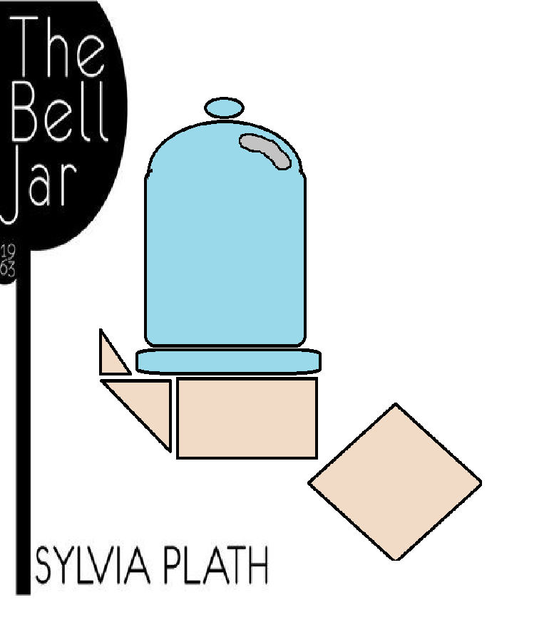
 Cover 1: Harper perennial classic edition, 1999 publication
 Cover 2: Faber and Faber, 2013 publication
Andreu Gonzalez
5/01/14
Sylvia Plath’s the bell jar is somewhat of a dark novel depicting the journey of a young woman’s journey into depression. The novel has many dark themes like suicide and questionable sexual conduct and themes. Though one should never judge a book by its cover, the purpose of the cover is in fact to attract new readers as such it is very important that the cover addresses major events with in the novel, an overarching theme, or major motifs in the plot.
The Harper perennial classic edition, 1999 publication of the bell jar depicts a young girl in a white dress standing in front what looks to be either small trees or shrubs with the most visible objects being the white dress and the branches of the shrubs. The cover seems to be depicting one of the major turning points in Esther’s life; the country club ball esthete is set up on a blind date with a Peruvian man named Marco. “It doesn’t take two to dance, it only takes one.” Here Esther is asked by her date to dance but Esther is immediately reluctant, Marco than imposes himself on her by throwing away her drink and forces her to partake in the party grabbing her hand hard enough to leave marks. After the dance she is taken outside by her captor Marco proceeds to then to shove her down and fore himself upon her. One can interpret the cover taking place before or after these traumatizing events as her outfit does match the occasion.
The clothes depicted in the cover may be the very outfit lent to her by her friend Betsy. The cover is foggy or aged as if to give a feeling of uncertainty or degradation like that of an old mistreated picture. After the party Esther returns to her stay and begins to empty out her wardrobe leaving only the one piece of clothing she had on
The fact we can’t see the cover girls face also plays to Esther’s Esther emotional instability.
The Faber and Faber, 2013 publication sparked controversy for its questionable decisions in illustration the cover depicts a woman using a pocket mirror to apply makeup with a vibrant red background. At first glance the cover fails to convey the tone or mood of the book to the point of appearing deceitful to those who have never read it the cover does not match the tone of the book. One could argue that the cover does not convey Esther’s emotions properly, Esther is a girl suffering from social anxieties and deep depression yet the cover depicts a more confident woman who does not appear to be in the least bit troubled and seas as if she might actually enjoy the party. The image depicted in the cover suggest that whoever composed it only read the early chapters ignoring a lot of the major points in the novel. Being that the novel is about a woman continuously being drowned by the social expectations of her gender to the point of being driven to depression, yet the novel is publicized with image of a young lady applying makeup with a pretty light red background.
However the 50Th anniversary does depict a pivotal scenes in Esther’s life. “ I still have the makeup kit they gave me, …., an oblong of brown mascara with a tiny brush, a round basin of blue eye-shadow just big enough to dab the tip of your finger in, and three lipsticks ranging from red to pink, all cased in the same little gilt box with a mirror on one side.” In this scene Esther comments on the makeup kit given to her by her long ago. Though arguably not as dark as the first cover the 50th anniversary can be consider somewhat ironic depicting a normal looking or even confident woman is faced for a depressed and unstable young lady. It could also depict Esther’s struggle with identity, throughout the novel she can’t seem to decide who she is. The cover may be depicting the moments where Esther’s is having problems with identity. Identity is a major theme used in the novel as there are many times in which Esther can’t recognize herself when looking at her own reflection “If I looked in the mirror while I did it, it would be like watching somebody else,”(Pg.147).
As opposed to the second cover, The Harper perennial classic edition, 1999 publication of the bell jar feels darker, the haze that surrounds the image gives a feeling of uncertainty to the world foreshadowing the grim and tragic fate of Esther. The covers natural surroundings could be a nod to the scene where the Esther learns of a couple that met under a fig tree. She later relates the story to herself as it was similar to her relationship with Buddy, The fig tree represents the different choices she could make “I saw my life branching out before me like the green fig tree in the story. From the tip of every branch, like a fat purple fig, a wonderful future beckoned… choosing one meant losing all the rest” (page 62) In these scene Esther describes her thirst for exploring every possibility available to her but then unable to choose because picking one would close the others, This was a major moment in the development of Esther’s character the cover mirrors this by having a the trees behind her take such a large amount of the portrait and having Esther stand bellow her.
Though different, booth covers play to the different strengths of the novel depicting defining moments or themes that characterized Esther’s struggles using its dark themes and symbolisms to create an image that can represent the novel in a great way. Sylvia Plath’s the bell jar is a dark novel depicting the journey of a young woman’s journey into depression. The novel has many dark themes like suicide and questionable sexual conduct and themes. Though one should never judge a book by its cover, the purpose of the cover is in fact to attract new readers.it is the responsibility of the cover to give a face value representation of the subject at hand, as such it is very important that the cover addresses major events with in the novel, major themes, or repeated motifs in the plot. The Harper perennial classic edition, 1999 publication of the bell jar depicts a young girl in a white dress standing in front what looks to be small trees and shrubs with the most visible objects being the white dress. This cover is the more obvious of the two representing all the anxiety and uncertainty that Esther was trying to endure. The Faber and Faber, 2013 publication represents the Esther’s struggle with identity and the faced that she has often put in front of others. Being that identity is such a major theme in the novel there are many times in which Esther can’t recognize herself when looking at her own reflection. Booth covers choose to represent different major events with in Esther’s life but are able to hint at the major events and themes of the novel effectively.


