Using all principles of color and composition.
Project Overview
Problem: Create Abstract Composition that expresses your personality, based on data visualization.
Concepts: Hue, Saturation, Pure/Prismatic Color, Muted Color, Desaturated/Chromatic Gray, Achromatic Gray, Luminosity, Primary Colors, Secondary Colors, Monochrome, Analogous, Complementary Colors, Warm, Cool, CMY, RGB, RYB color models/systems, data visualization.
Technical Skills: Adobe Photoshop and Illustrator, Drawing, Thumbnail sketching, graphic tools.
Outcomes:
- Ability to recognize and define major color properties: hue, value and saturation (chroma)
- Ability to see individual hue in terms of it’s value, in relation to other hues.
- Ability to identify and create Gradation and Contrast in color relationships.
- Study of Bauhaus Design, Modernist and 20th c. art history, apply abstract principles of composition, geometry and picture plane to create balance and unity.
- Use of color palettes, including monochrome, analogous, complimentary, triads (primary, secondary) etc, .
- Understanding representation of information in a graphic format.

Process:
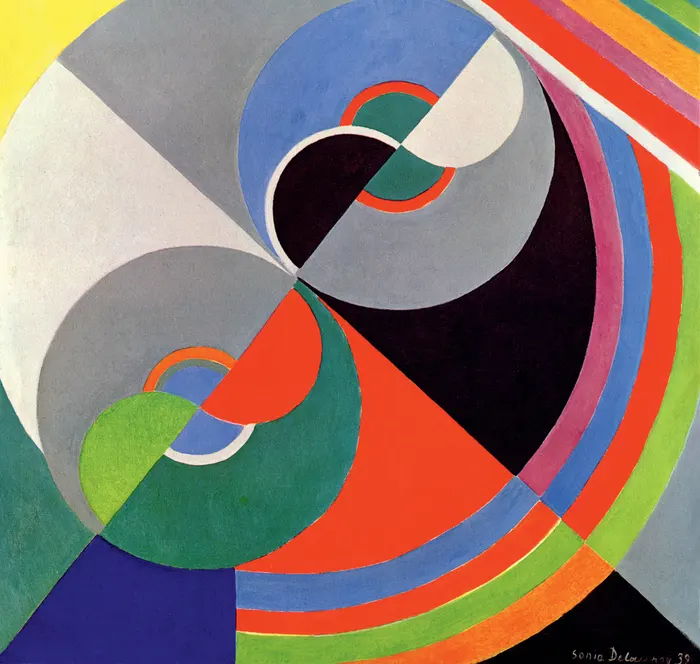
- Research for inspiration Modernist Artists Sonia Delauney and Johannes Itten and the vernacular Gees Bend Quilters, and others for inspiration.
- Start with analyzing your data. Consider the pictures in your phone from the last 30 days, and create categories to organize them. Categories can be – color, subject, location, use of filter, how much you like the picture etc. Come up with 6-10 such categories. One picture may belong to more than one category.
- Thumbnail Sketching
- Come up with interesting graphical representations for these categories, using shapes and colors. Compose these into a square composition.
- Use bars, stripes, circles, arabesque, triangles, and overlaps, repetitions, scale, with Ambiguous Figure/Ground relationships and an interesting dynamic.
- Use straight division lines to separate areas in which you may use different value keys and palette choices.
- Color Process
- Decide best composition from sketches
- Recreate in illustrator.
- Choose appropriate colors for your composition.
- Palette: Your work must show use of:
- Gradation (such as a hue changing incrementally to another hue or a darker value
- Contrast: larger changes from color to color or dark to light.
- Palettes: choose 3-4 amongst Monochrome, Primary, Secondary, Tertiary, Complementary, Achromatic, analogous. Consult Color wheels and Adobe Color for ideas.
- create color strips,( small scales) for each palette; choose 3-4 for the painting.
- Consider Value so you are making decisions where to go light or dark.
- make decisions that reflect personal interests.
- In divided areas, switch from Dark hues to Light hues, and palette to palette, so that there are clear separated areas, that will also serve to create contrast and unity for entire piece.