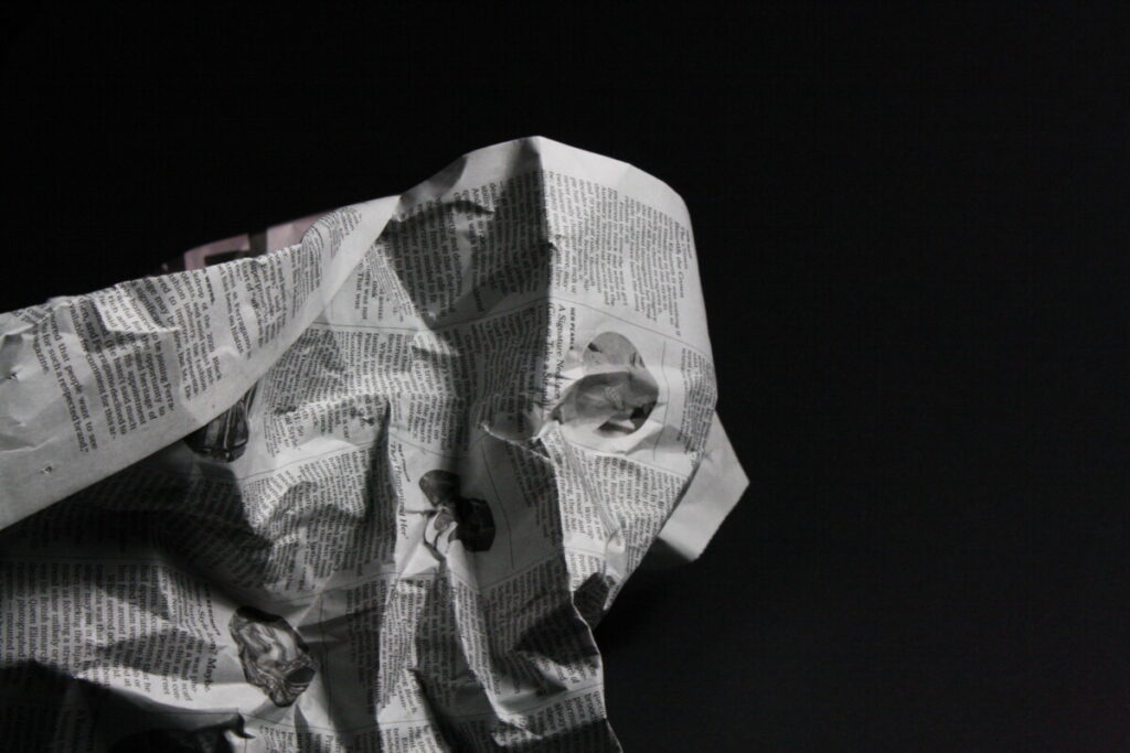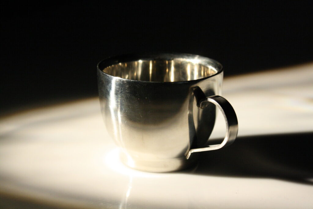
I like this one because it got great light and shadow and the negative space looks good to me.

same reason as the station1 photo

the object is clear with the lighting.

I like this one because the scale of the light and shadow looks even, and the object is in the center of the photo.


excellent use of negative space. Good dramatic lighting
Good experimentation with compositions and exposure in flickr