The theme of Renzo Reategui’s images were focused on windows, shadows and reflections. I liked how he increased shadows and exposure efficiently to decrease the transparency of the windows to show more the reflected image. His images were also symmetrical and have depth.

__________________________________________________________________________________________
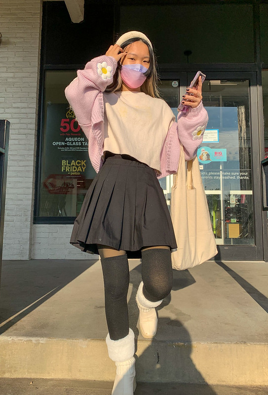
The theme of Seraphina Huangs images were self portraits.


Leave a Reply