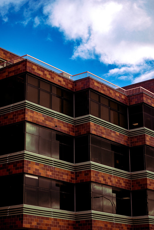
Mykyta Sheptukhin Pattern, figure/ground, and high angle

I like Sheptukhin’s picture because I like how the building has lines and repeating patterns. I also like the complementary colors of red and green. The sky is the ground and the building is the figure.
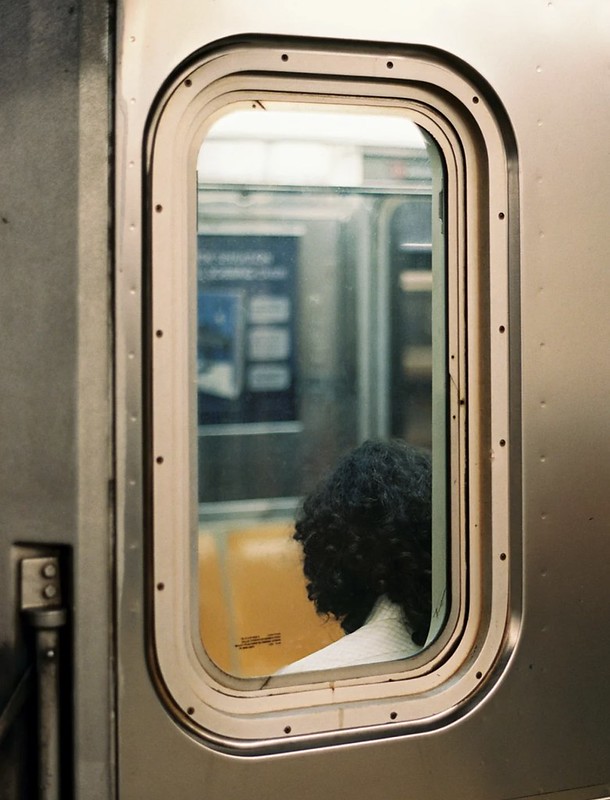
I like Wu’s picture because the train window frame helps focus on the person and the inside of the train. I like that the person is in focus and the inside of the train is blurred.


Leave a Reply