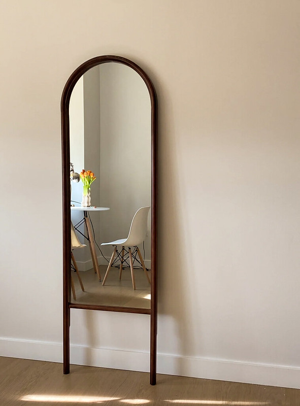
What I like about the first picture is the frame he used was a mirror, and the mirror reflected the medium shot. The light is diffused and very soft without excessive exposure. The overall photo and the reflection of the mirror match very well like a painting.

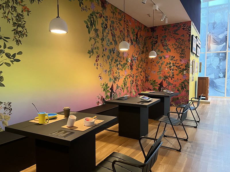
The reason why I like this photo is like the design pattern seen on the internet, very popular to look at, her shooting angle is perfect, using a long shot and a vertical angle, line of sight is at eye level. Contrast and diffused light are perfect for the color and overall photo. Image objects form a leading lines from left to right, and inside room elements enrich the photo makes colorful.


Leave a Reply