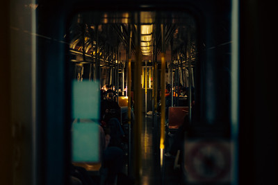

Image 1 by Mykyta Sheptukhin: I favorited this image because of the number of elements in it. Mykyta did a great job of capturing a moving scene by keeping the focus more on the train than the people. The addition of the blur on the window and eye view angle also helps the viewer get immersed into the scene. Mykyta also did a great job of filling the frame. Every corner is filled with an object or light. I also like the use of diffused light. Instead of creating hard shadows the light adds softs shadows around people and the seats to create a warm yet dark image.
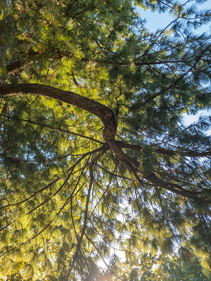
Image 2 by Jun Li: Unlike the first image Jun li image is far more brighter. Jun li like Mykyta does a great job of filling the frame. When I first looked at the image the first thing that caught my attention was the color green and number of leading lines the tree created. Not only did this peek my interest, but the leading lines led my eyes throughout the image. The image also follows rules of repetition and pattern since it is a photograph of a tree. Also because he shot this in worms eye view it gives the image a completely different look than if it was shot in eye level. The use of light and shadow also gives the image this sense of softness that follows throughout the leaves almost like you can touch them.
Final Thoughts: I enjoyed seeing each student come up and present their work as well as explain the process. Many times when looking at an image we forget the thought and edit behind it. Many of the images I saw today including the ones I mentioned looked like it took time and effort. A lot of those same images created questions in my head about “where the image was taken?” or “what made the person want to take it from that angle?” The mid-term opened me to a different world of styles and images.


Leave a Reply