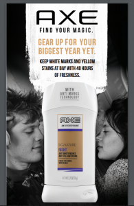
The very first big project they assigned to me was for Axe. Axe has two new products that they are releasing. They will be giving out samples of these products at certain events. They needed a two sided designed literature card that comes with the samples given out. The literature card has a headline, logo, and tagline.
At first I was excited. Axe provided a previously made literature card from last year. I was disappointed to find out while I was reading the Creative Brief there was little instruction and direction for the project. For example they didn’t provide the official vector/eps file of the logo and didn’t provide models to use for the After discussing this issue with my art director, he said don’t worry about it just work with what was given.
The hardest part of the project was trying to find the right stock image of man aged 18-24. The art director didn’t like the choices I made because the models didn’t look masculine or on target.
After providing the first round of designs. They loved the layout and design choices. One thing they didn’t approve was the model choice and was missing an element from last year. They gave feedback two weeks ago and provided the updates. And as of this the week, I sent over the print files and the products are they will be used!


