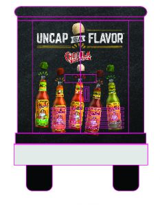
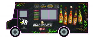
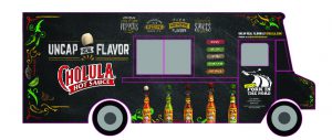
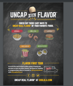
Another big project I was assigned to do was Cholula’s Activation Promotion. The art director appointed me and briefed me on the client. This was not the first time the company worked with Cholula. He showed me examples in 2015 and 2016. Then told me to study the brand guidelines. This project was assigned in early June and it is still not complete as of July.
The client asked for multiple designs. They requested a newly designed:
- Food Truck
- T-Shirt
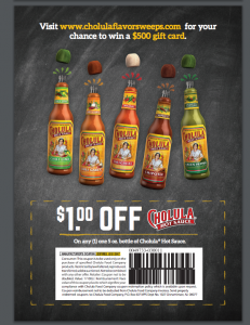
- Literature Card
- Sticker
- Usher Tray to hold product
The art director assigned the project to me and the newly hired junior designer. We supplied three versions of the truck. One designed by the art director, another designed by the junior designer and the last one designed by me. We all provided feedback to one another and tried to bring in a different element through our different design styles.
Designing this food truck was a challenge to me because it was new and the guidelines for the brand were very strict. Strict to the point I was challenged when coming up with concepts because I feel the company made many design choices for me. For example certain backgrounds had to be used and then certain elements have to be on certain backgrounds.
We all spent two entire days working on the trucks. In the end the client liked the Junior designer’s version. They liked my version but felt it was off brand. They did love the layout of my version and in the feedback were asking to combine the style of the Junior Designers as it was more on brand and the layout of elements from my design.
The art director assigned the truck to the Junior Designer. Then assigned the literature card and tray to me. Here’s how everything turned out.

