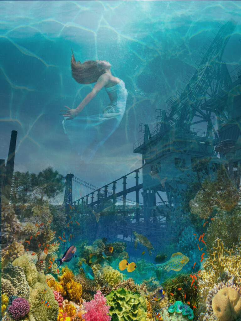
Final Transparency & Layer Composition (Photoshop) 
Underwater Sunny Ripples 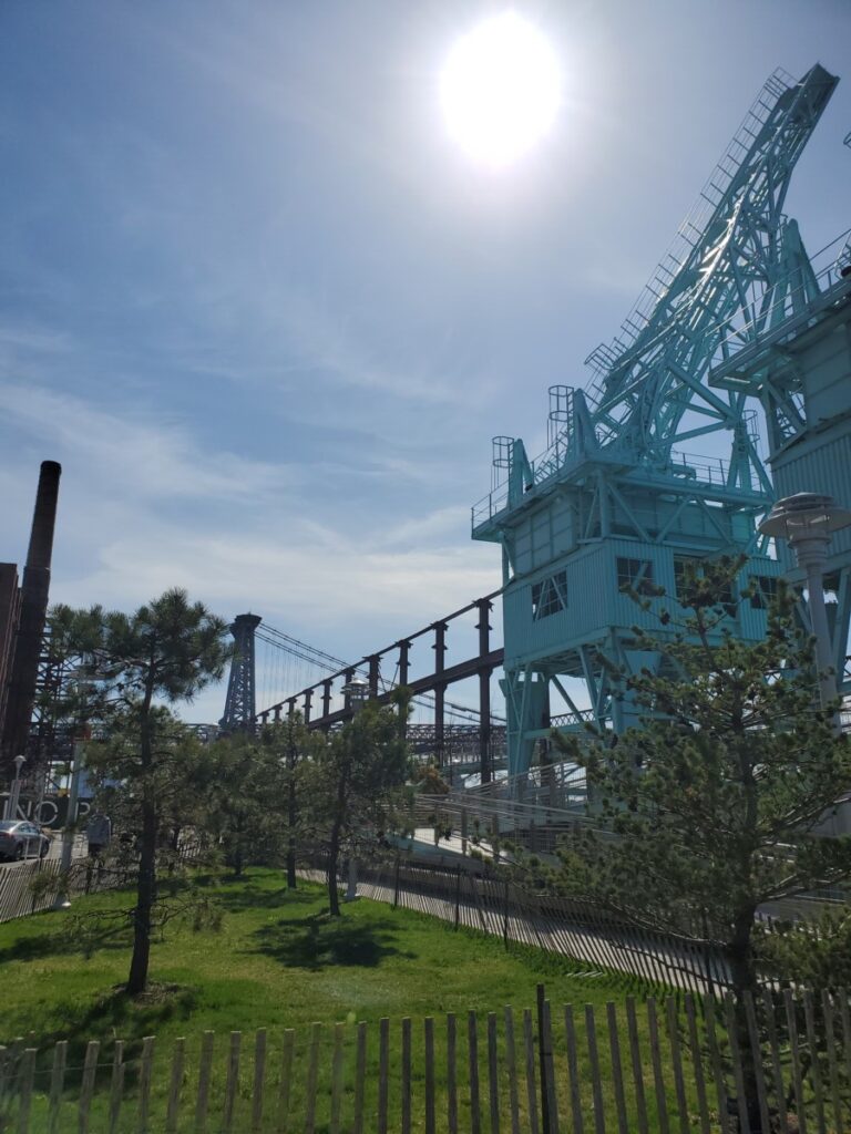
Inspiration Picture Brooklyn Waterfront 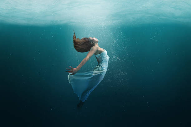
Elegant girl dancer in white dress in a state of levitation under the deep waters of the ocean with sunlight beaming on her face. 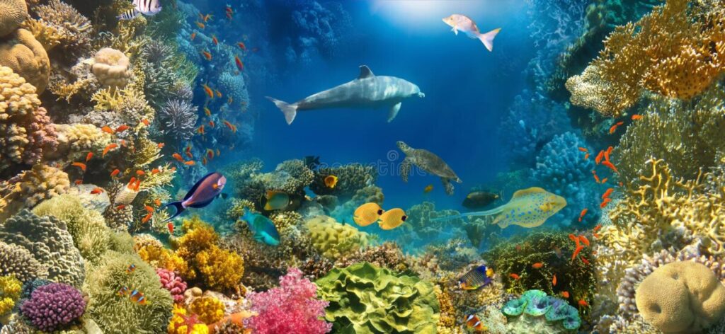
Underwater landscape Inspiration 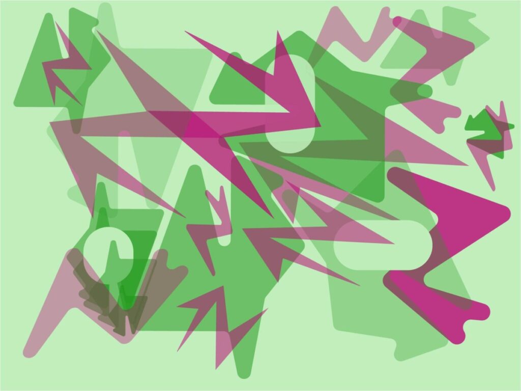
Complementary Palette (Work in Progress) 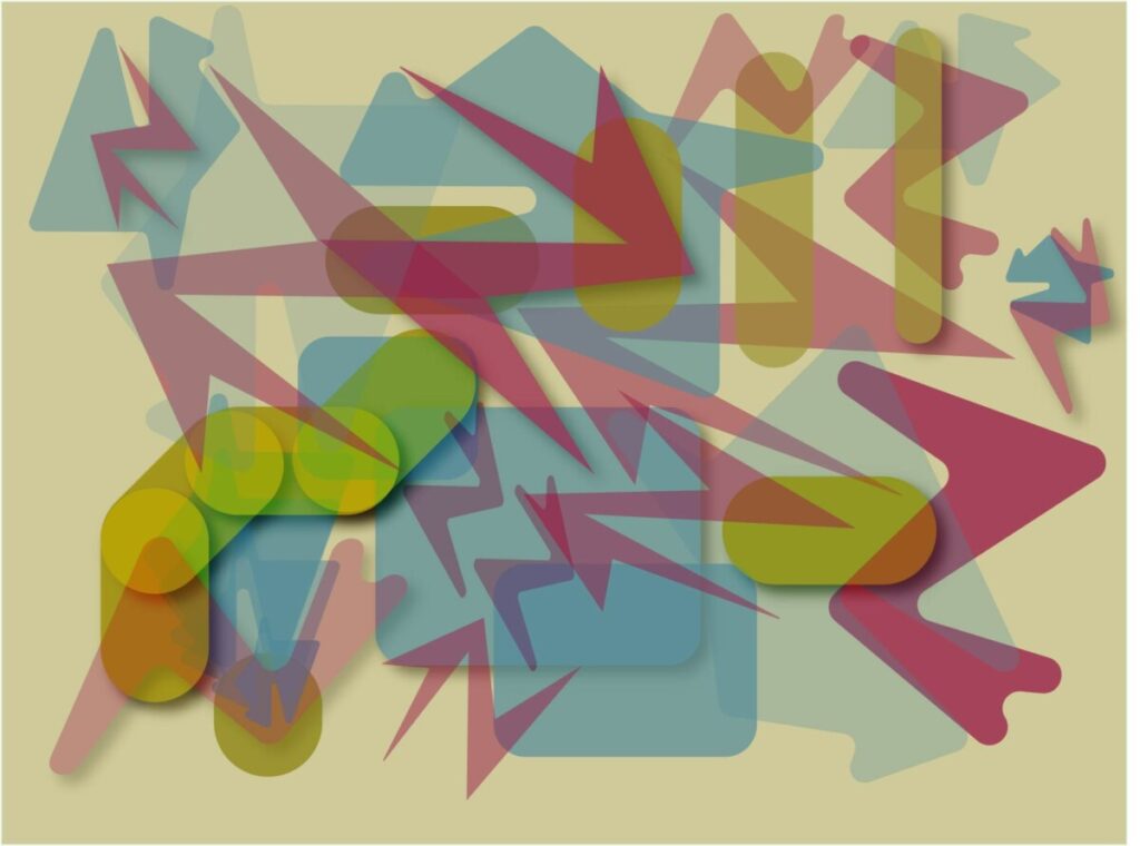
Triad Palette Transparency composition (Illustrator)
For this project we explored using layering and transparencies to push our design concepts further. We learned how to use layering to create depth in a composition and how to use shadowing to further indicate where elements are in our composition. By using transparency, you can create a composition between two or more images to push your design to the next level and combine two different concepts or ideas into one. For the first part of the project, I enjoyed using illustrator to create a collage using layering and transparencies by using a triad palette. I had seen an artist online work in only shades of grey before applying all her color later so I thought I would start with a complementary palette and use the same technique in order to lay out all of my shapes and elements before finalizing the color and then have a better understanding and control when it came to add the third color of the triad palette. I liked the idea of mapping out color beforehand and working more color into the composition as I went.
For the second part of the project, I tried to learn and absorb as much as I could since I am an extremely novice user of Photoshop. Along with my group we decided on a tropical/urban mashup theme. I don’t think I was successful in creating the original vision for the image that I had set out to do. It was extremely frustrating to work in Photoshop and it hindered my creative process to have to stop every other minute to go search for a tutorial to watch so that I could learn to do what I wanted to. I became enraged and very impatient, and I hope that my final piece is acceptable even though it is not perfect.


Leave a Reply