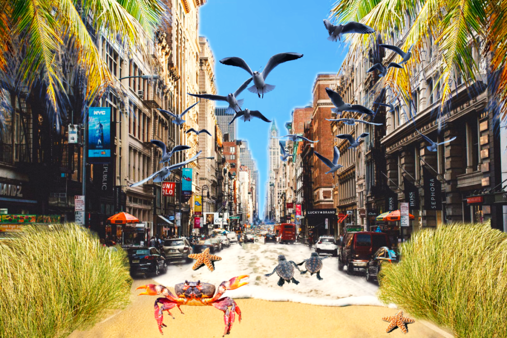
Final Digital Composition: Tropical Meets Urban 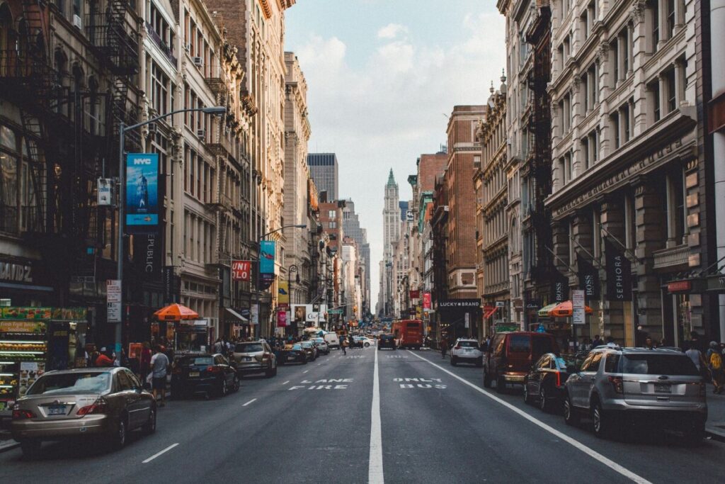
Photo of Soho that I used for background layer 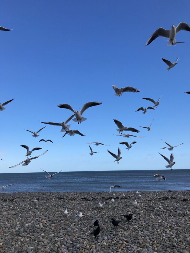
Photo of seagulls that I masked and placed into design 
Photo of sea turtles I masked and placed into design 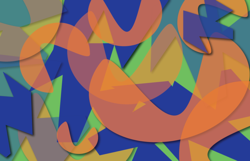
Digital Triad Palette Color Composition: Blue, Purple, Orange 
Apple iOS Photo Icon using overlapping and transparency 
Pay Pal Logo using overlapping and transparency 
Chanel Logo using overlapping
During this project I explored designs that used layering and transparency to create overlay, contrast, and continuity. After doing my independent research on the design element I discovered examples of transparency and overlapping in advertising. Companies like PayPal and Mastercard use these design elements on their logo, also the photo application on ios Apple products use overlapping to create color mixtures. Next, I went a step further by creating my own composition of abstract shapes using Adobe Illustrator using a triad color palette. I used the triad color palette on Adobe Color to give me three different hues, orange, purple, and green. Once I created my two shapes I overlapped them and changed the opacity levels to reveal color mixtures, learning how the colors interacted with each other.
In the final stage I worked in a small group where we were tasked with developing our own compositions using the element of layering on Adobe Photoshop. We chose a Tropical/Urban concept for our compositions and then we went on to find photos that fit this category. I had to watch a couple of tutorials on layer masking to understand the process, this made the beginning of my design very difficult to create but eventually I was able to get a better understanding. I also used a variety of photos to capture what it was that I intended to create, after many failed attempts to get it right I was successful in the end. I titled my final composition as “Tropical meets Urban”, it captures a beach spilling out into a street in Soho. I included smaller beach themed details such as the crab, the starfish, sea turtles, seagulls, grass, and palm trees.


Leave a Reply