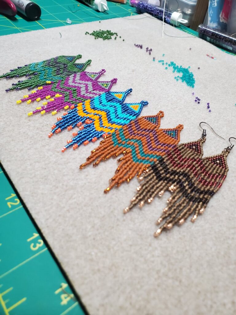
Complementary & Analogous Colors: Earrings 
Monochromatic Analogous: Sky & Ocean 
Complementary Palette: Vegan Bowl 
Sophie Taeuber: Complementary Color Paintings 
Monochrome Rows of Lego: Pencil Holder 
Complementary Color Rainbow Vegetable Tart 
Primary Colors: Color-Swap Packaging 
Primary & Secondary Color Street Mural
I have had a lot of experience with color since I was very young. My mother was going to fashion design school, and she would teach me all the names of the colors that a normal 5-year-old would never know. My grandmother was also a lover of color, she even requested that no one wear black at her funeral. Growing up in a colorful world has opened my eyes to noticing slight hue changes or even color correcting things in my mind as I walk down the street. I am a harsh judge of color choices in fashion, but I am extremely comfortable with lots of colors in any other aspect. I enjoy colors in nature the most because they are alive. A lot of color in nature also changes with seasons, time of day, or even a bird’s feathers that can reflect different colors in light that makes the color even more versatile and interesting. I learned to remember to blend colors to create deeper more interesting hues and by going back to basics using cyan, magenta, and bright yellow as a base it revamped my basic knowledge of the basic red, blue, and yellow. Taking raster & vector graphics has also helped me incredibly in understanding the color separations using the CMYK sliders and that translated to this project because it gave me more ideas of what colors to mix and what results to expect.


Hey Sebastian, I love how you were able to capture the essence of color in food! Those meals are truly a work of art.