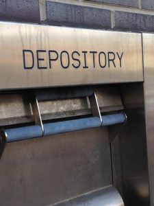
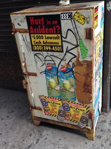
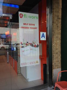
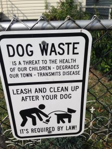
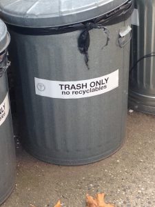
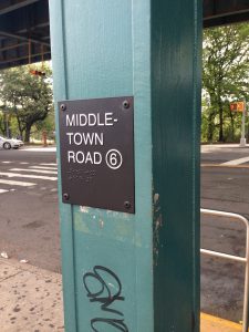
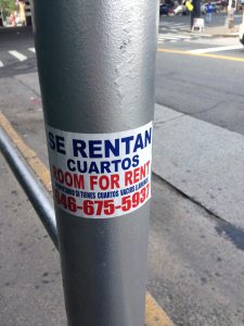
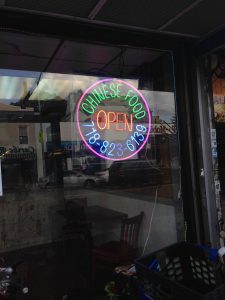
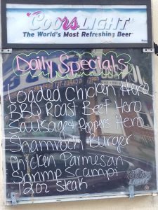
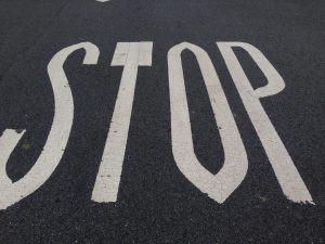
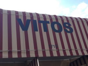
For my first assignment in COMD 1167, I was given instructions to explore my neighborhood and take pictures of any form of text and typography all around, and figure out what the typography that I find tells me about my neighborhood. At a glance, I’ve noticed that a majority of the text all around me were almost always san serif font. The kerning of many letters were inconsistent, many of the spaces between letters were either far apart or very close together. Almost every form of text was using capital letters unless there was a long sentence of instruction of some kind that went with it.
There are many stores around my neighborhood, with all kinds of different typography, using different colors and type family. But what I’ve noticed that depending on the type of store it is, will they choose to use serif or san serif type. When it comes to stores regarding beauty and art such as hair salons, fashion stores, flora, and bakery. The store tends to use Serif type within their banner. There was an exception to this, barbershops used San Serif. This made me wonder if people or at least my neighborhood, see Serif as feminine, and San-Serif as masculine.


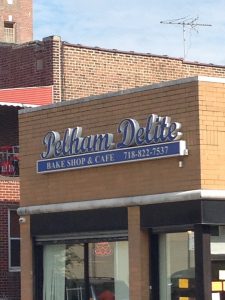

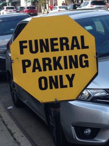
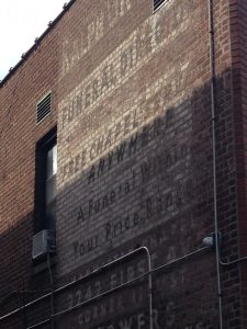
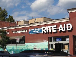
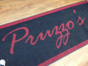

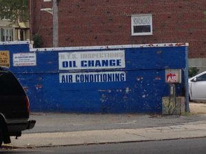
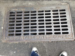
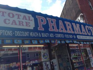
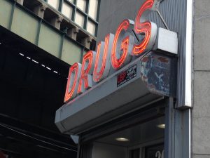
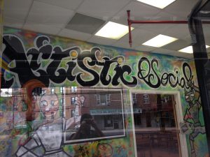
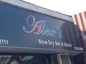


Nelson, great analysis of the trends of businesses. I also found it interesting that many times banners will include BOTH san serif and serif typefaces together, one as a header and the other for details. I think this shows that they had some degree of consultation with a designer. The idea of san serif being masculine and serif being feminine is a smart comparison; it might have something to do with serif being associated with traditional forms of beauty, humanism, and classicism. San serif is the ultimate anarchist.
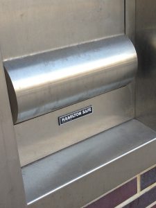
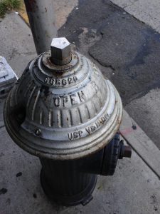
Also, great job really LOOKING at your neighborhood, I see such a variety of surfaces; in pavements, molded in iron, written, embroidered, and painted. This is so impressive.