For this assignment in Digital Media foundation, we were given the task to create a postcard, designed as a visual quote. We were free to choose any quote from any specific person. Being an aspiring game designer and graphic designer, I aimed my visual quote to be a bit more familiar in the video game industry.
“THANK YOU MARIO! BUT OUR PRINCESS IS IN ANOTHER CASTLE!”
A quote repeated several times throughout the well-known video game ‘Super Mario Bros’ for the original Nintendo Entertainment System (NES for short). A game that has sold over 40 million units since it’s debut in the year 1985. The game’s narrative is your typical save the princess fantasy. Every time a player would reach the last level of each stage, there will be a fiery battle against the big boss called King Bowser, the player would then assume their reward at the end of the level is waiting for them just after King Bowser. Perhaps a simple kiss from the princess, with a ‘Thank You!’ for saving her and becoming the hero of Mushroom Kingdom.
Back in 1985, video games were still very new to the world, so the use of a control and the game’s mechanics were fresh and strange, but the game was still fun and enjoyable with a catchy tune that would entice players to return. But because of the alien feel of a video game at its time, the first stage might take awhile for your very first playthrough, so the path to the princess feels nearly there when you first meet King Bower. However instead of the assumed reward, the player is instead met with a simple ‘Thank You!’ from the princess’s servant ‘Toad’. Telling the player that his adventure isn’t over and that their princess is another castle, off to the next stage for the player. This loop of disappointment, with the lack of a princess, continues for 8 stages.
There are many reasons why I chose this quote. The obvious reason is how relevant this quote is the video game industry, both from a game designers inspiration to making an excellent video game but also because of how iconic Mario and Nintendo is to the video game industry. However to me, this quote represents persistence, tenaciousness, perseverance. To me, this means ‘Good work! But keep it going, you’re not at your goal yet.’ The game itself is very difficult, you have to work very hard if you want to be the hero of the Mushroom Kingdom and let your fellow kids know you beat the game. So to me, the stages of the game are the difficult path that lies ahead of the reward you yourself wish to seek, whether that be the path towards a college degree or a blue ribbon in the Olympics.
There are other things to learn from this quote. But from a game designers point of view, it’s a simple tool to entice the player to continue with the promise of an ultimate reward at the end. Usually, it’s a cool ending, or a beautiful cut scene, unlockable in-game content, a mysterious fun bonus level, secret codes, etc. I have provided and designed a few simple concepts visualizing the quote below.
Concept 1
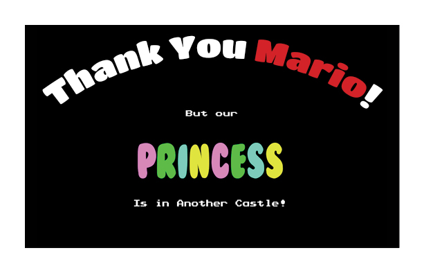
For this concept, I wanted to make a very celebration kind of ‘Thank You!’, something that looks like they appreciate you, the player or you the person that bought the postcard. I changed the color font of ‘Mario’ to isolate the importance of the person, though Mario to me represents the player not the Italian plumber per se. But I used a red colored typeface on Mario since that is the color Mario is known to wear. For ‘But Our’ and ‘Is in Another Castle’, I went out and extracted the exact font used in the original Super Mario Bros video game, a nod for the source material, a very 8-bit style font. The black background is again towards a nod of the source material, but more so to better help extract the nostalgic memories of disappointment with ‘Toad’. The ‘Princess’ font is a very bubble gum kind of font, with colors that remind me of jelly bean candy. Since the princess represents the reward or prize, I feel it’s fitting to make the reward ‘candy-like’, like when you give a child candy as a reward.
Concept 2
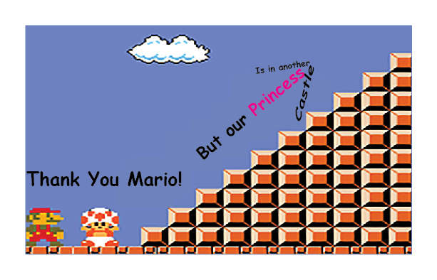
For my second concept, I wanted to use the original 8-bitstyle from that of the original game, without using the original scene exactly. I had put together the visuals myself taken in from the original source, the game itself the blocks, cloud and characters. I wanted to place a mountain or stairs that Mario is to be assumed have to deal with going in order to proceed towards his goal, to help represent the long journey of unknown distance. I put “Princess” in pink because I wanted it to stand out more, I wanted it to be less a princess and more of an aim. The typography shaped into an arrow suggesting the words to continue said by our Toad friend.
Concept 3
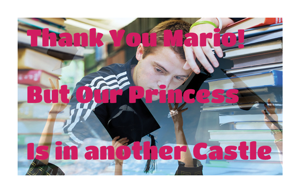
For my third concept, I really wanted to help show how relevant this quote is to me and any other fellow college student. I took a photo of a student studying and working hard, while he dreams of a success, which is obtaining a college degree. I took students throwing their graduations caps in the air and faded them out, to help represent the student’s dream goal. I used a very happy style typeface because I don’t want to stress the annoyance of the journey because the prize waiting ahead is what’s important to the journey itself. I chose the pink color due to it looking the best in front of the photographic image.
Concept 4
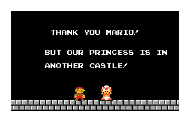
So for my fourth concept, I used InDesign, Photoshop, and Illustrator to help replicate the scene where the quote is said into postcard form. Once again extracting the 8Bit styled font from the original source itself, the exclamation point not exactly to the source but it at least differentiates itself from it. With the black background similar to that of the first concept to keep it close to the original source of the quote. This is one of my favorites due to it sticking strongly to the video game 8-bit style of the game.

