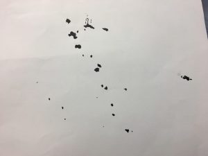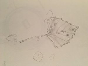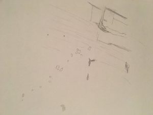
This is a stained leaf found laying on little pebbles. I can be seen as an organic shape because it’s structure is not symmetrical. The figure/ground relationship is obvious because you can clearly see the background and object.

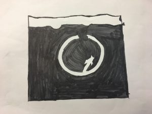
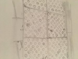
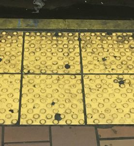
This is a Platform Edge found in the train station. It can be seen as a geometric shape because you can see shapes such as squares and circles. The figure/ground relationship is obvious because you can see that object that is being shown.

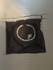
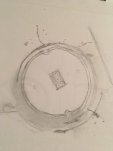
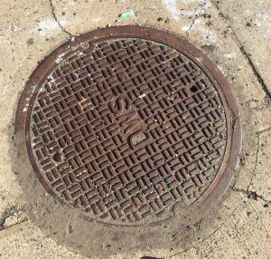
This is a Manhole Cover found on the ground. It can be seen as a geometric shape because you can see rectangles and circles. The figure/ground relationship is obvious because you can see that object what is being represented but it could probably also been seen as ambiguous because of all the details on the cover.

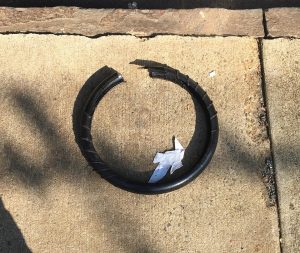
Not sure what this is, but it looks like a torn bicycle tire . It can be seen as a geometric shape because it’s round, but because it’s torn it could be seen as organic not having a clear shape. The figure/ground relationship is obvious because you can see the object.

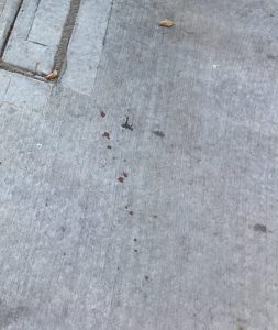
This is a floor that has dark red stains on it. It can be seen as a organic shape because you can’t tell what shape is being shown. The figure/ground relationship is ambiguous because it doesn’t have a certain shape.

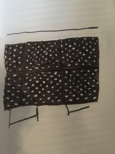
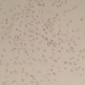
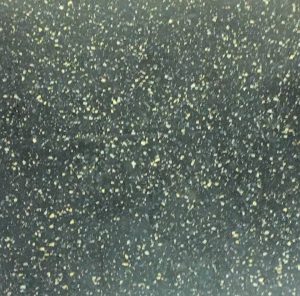
This is the floor in a train. It can be seen as a organic shape because you can’t cant tell what type of shape is being shown and it just looks to have a tone of colored dots everywhere. The figure/ground relationship is ambiguous because it is unclear and you are most likely trying to find a place of focus.

