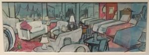

The picture on the right was a image took at the Museum of the City of New York. The photo I took was a piece of illustration drawn by Don Freeman for his famous work on the popular children’s book, A Pocket for Corduroy. The image shows a room full of chairs and bed with blue and red being the primary colors being used. The elements I find in common with this art and my design is they both are using 2 primary colors blue and a near reddish color. Some differences I see is my background is red orange and his art has a mostly blue background. Also his artwork has lost of objects in work but mine doesn’t.


