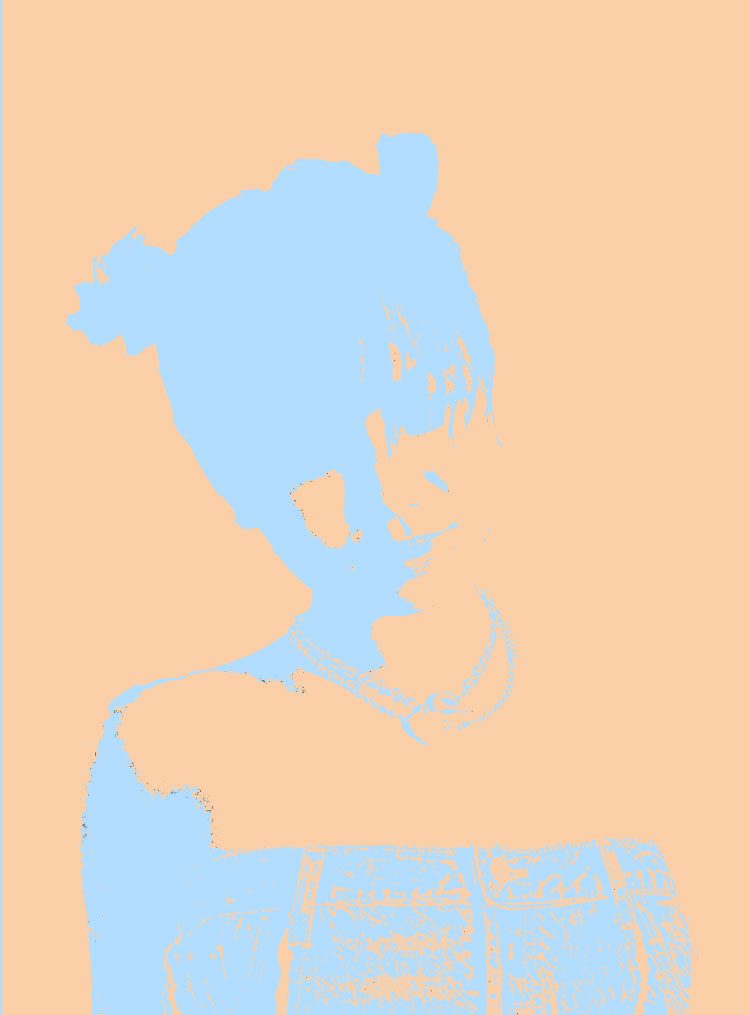
 The color I chose as my favorite color was a Blue-ish tint: Pantone 2708. Here on the left is my Complementary composition. I choose this Tint Blue because whenever I see light/regular-tone blue, I feel calm and alive at the same time. It reminds me of the bright blue sky on a mid sunny day. It reminds me of the wide blue ocean and it’s salty smelling sea. It reminds me of adventure and fun.
When I search for the different meanings and feelings with the color Blue, many say soothing, peaceful, security, authority. Sometimes sadness, loneliness, depression. Over seas in other cultures, they refer the color of Blue to immortality, good health, love and/or joy.
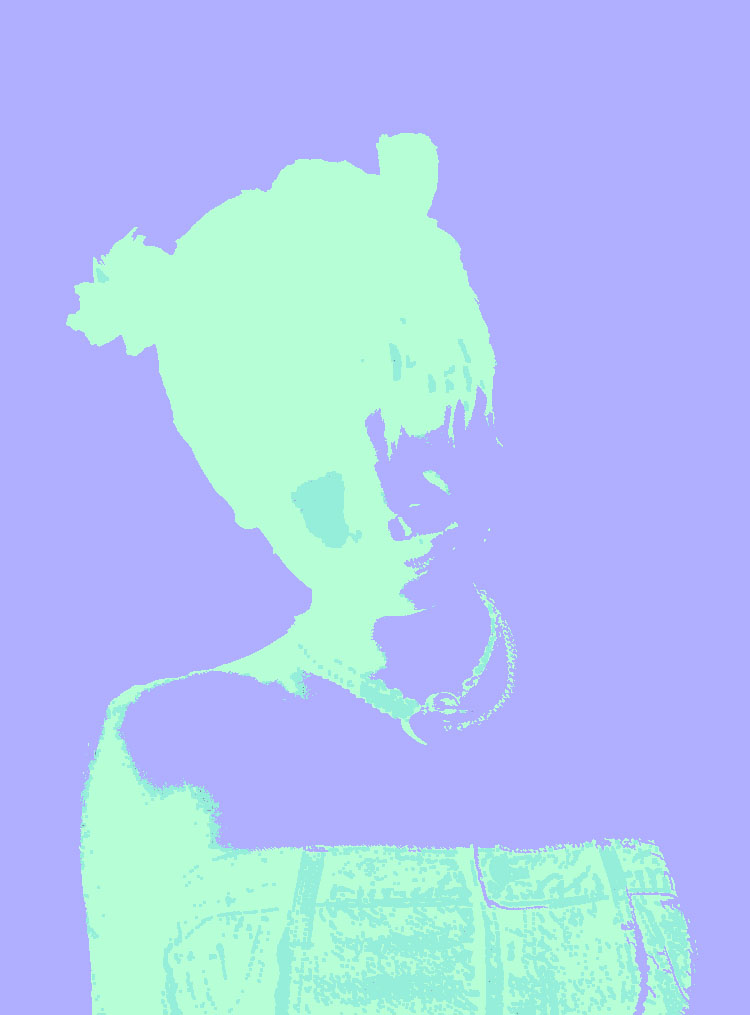 Here on the left is my Triad composition. It consists of three colors: (INSERT COLOR NAMES). I began to play around with the different colors on different areas of my selfie. I chose purple as my background to give it depth and outline for my body. The darker color gives the photo a bolder and louder look, rather than a softer one like the Complementary composition.
I chose the Pantone 2708 (Tint Blue) as the color a highlight to pop out small details. This gives it character and rugged edge to this photo. The Minty Green next to the purple displays a POP ART genre, from the two contrasting tones of the colors.
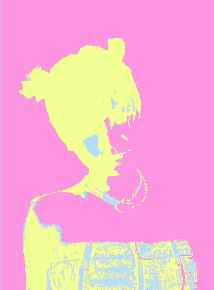 The further into the project, the more it became vibrant in tones that I chose. I really enjoyed using bright and dark contrasting colors. It makes the photo POP and become bold and loud. Here on the left is my Analogous composition. I call it Pink limonade. The highlights here are more visible compared to the Triad composition. Here it gives it interesting character in the way where one can see the tiny dots of highlight. From the first all the way into the detail of the necklace and hair.
What I enjoyed the most about this project was that we got to use the computer. I enjoyed the exploration and the experimentation of Adobe Photoshop. An aspect that was difficult was selecting specific areas I wanted to work on/color. That was in the exploration part of the project which was all cool.
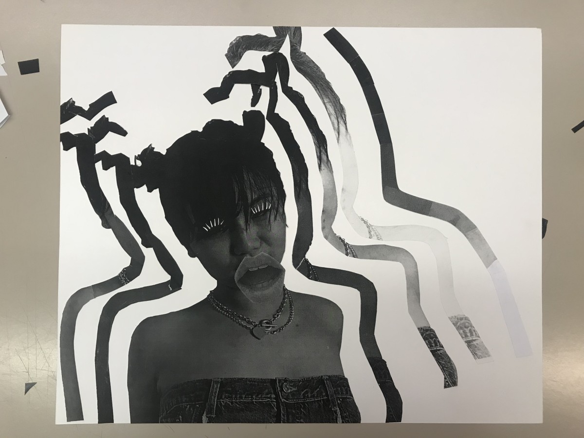

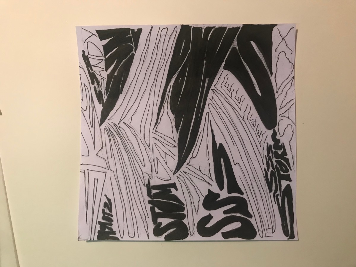

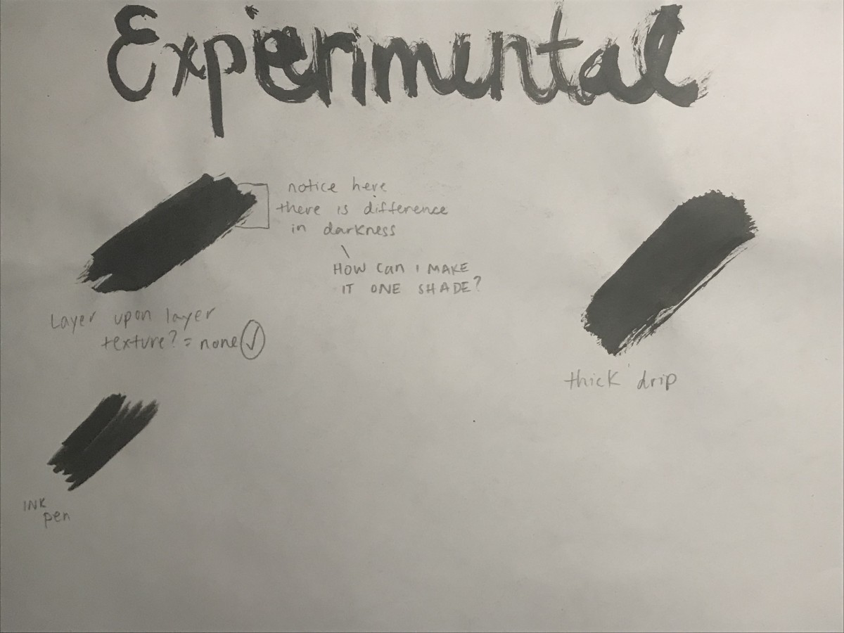
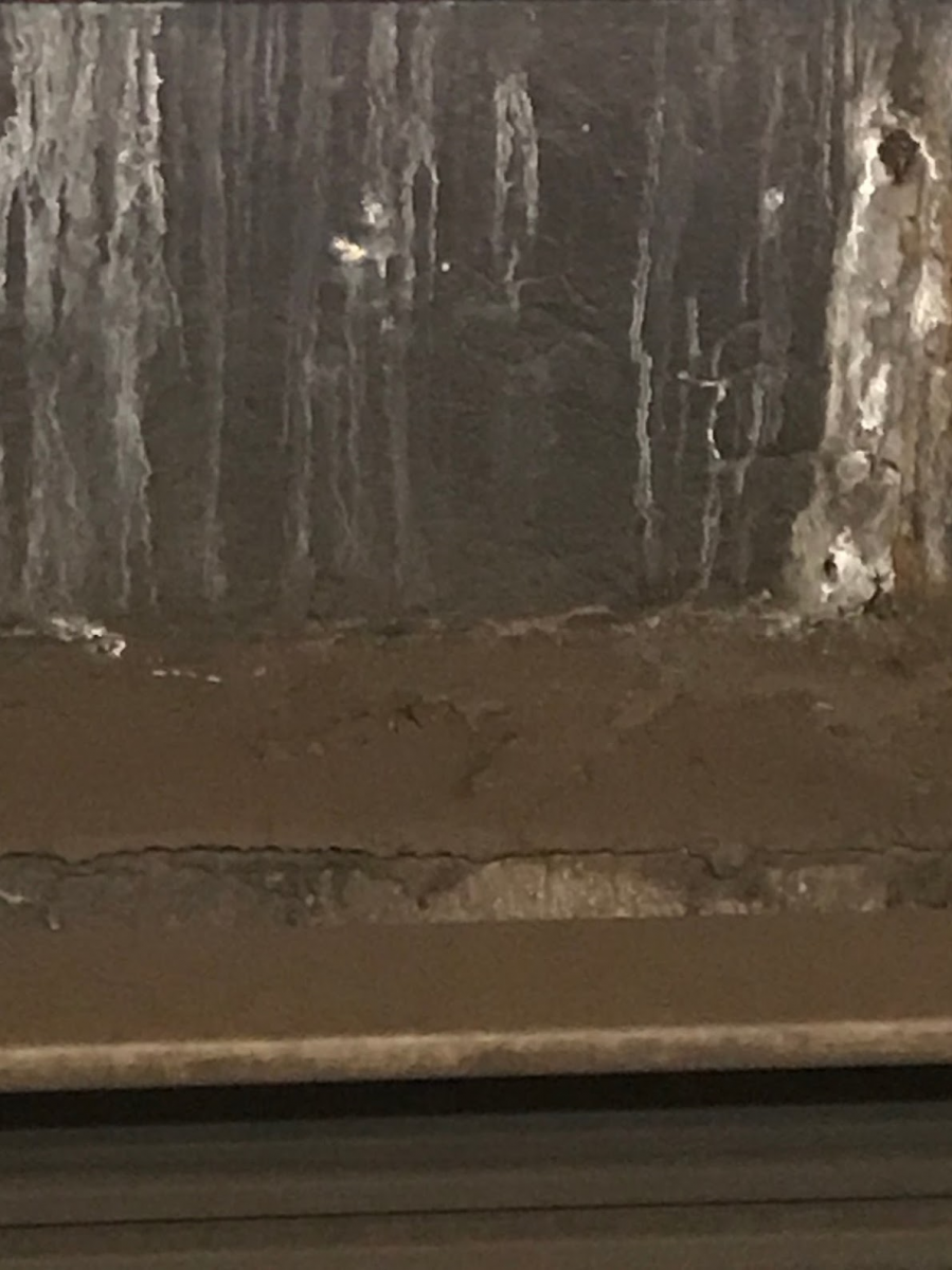 Obvious Image #1
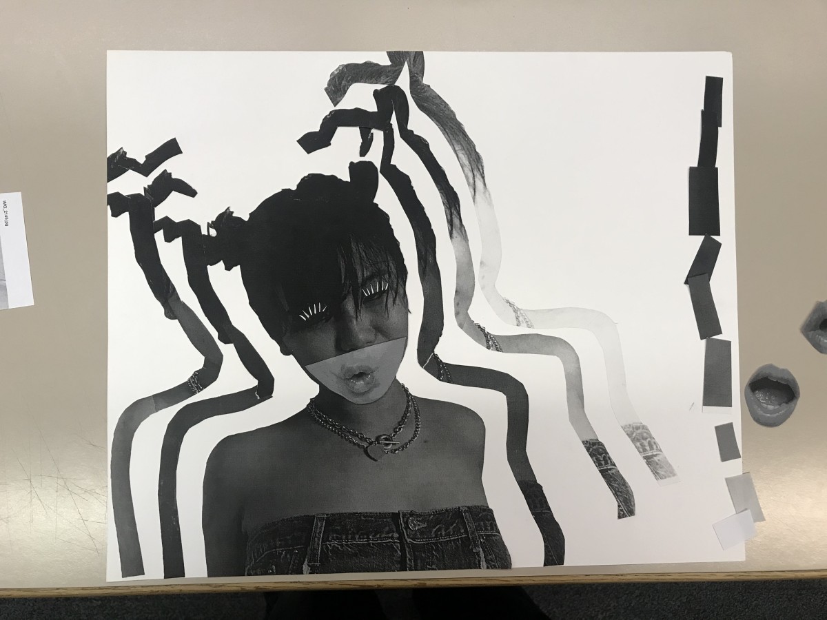
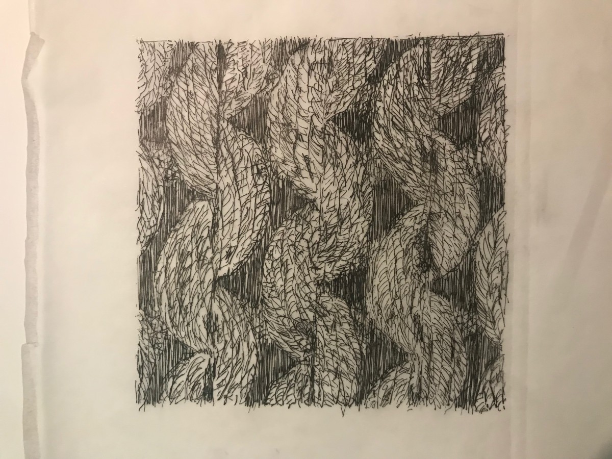
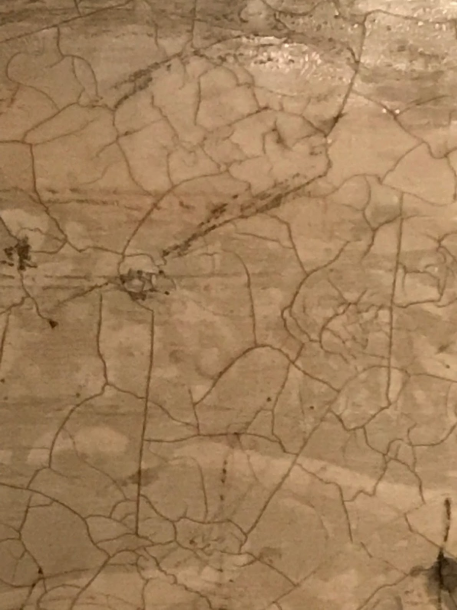 Obvious Image #2
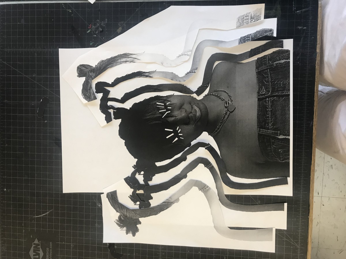
 Obvious Image #3
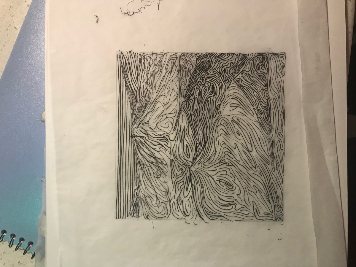
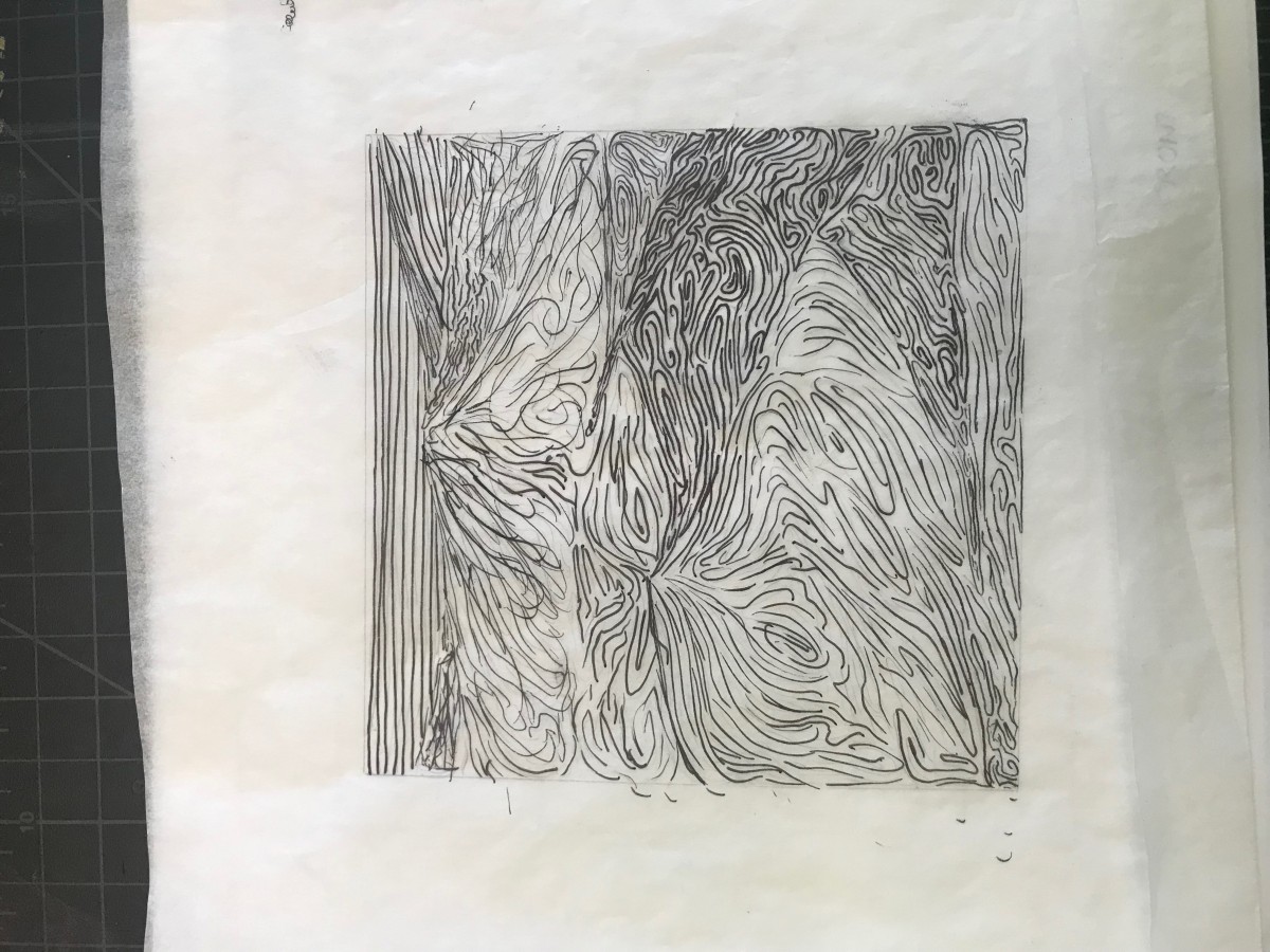
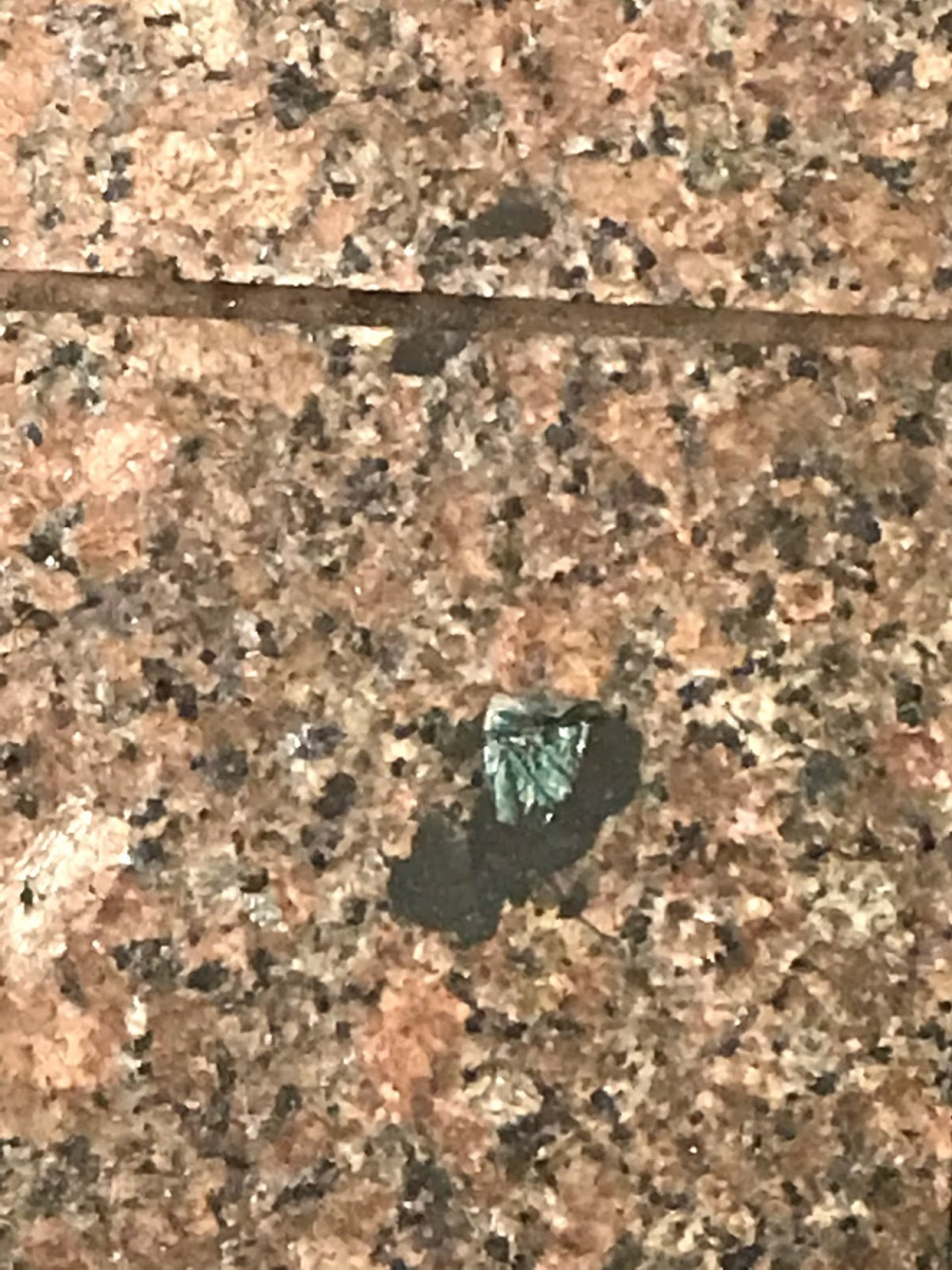 Ambiguous #1
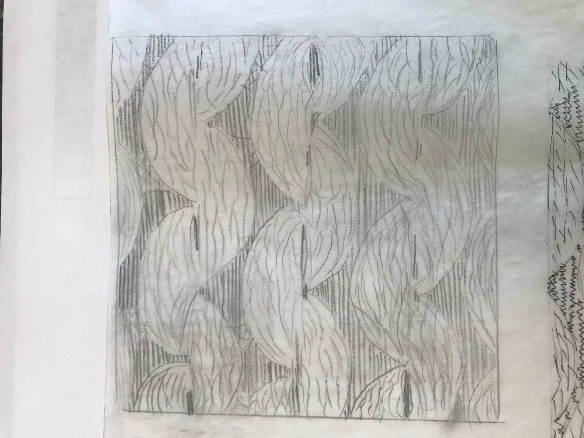
 Ambiguous #2
