Author: Mike Reyes (Page 1 of 3)
Let me start by saying that MoMA is Is an art exhibition itself. It’s a museum that embraces space versus human therefore every room in each of its passageways offers authenticity. Its circulation portrays art, because it not only has horizontal but vertical circulation as well therefore allowing the visitor to choose an make its own path. It also allows the visitor to soak in the view of motion.
Which leads me so the fact that the garden although being a private space belonging said the museum is the part of the museum that acts as a public space. although the day of my visit to MoMA I was unable to explore the garden due to the weather; I could have also envisioned the play of movement and the art of tranquility. The garden is a very modern one allowing you to taking views of the city and different perspectives of different buildings. it also serves as a place of reflection due to the small pond that’s it’s in it. I viewed upon as a mini version of a reflecting pool. I guess I embraced this belief by the colors and the presence of nature in the garden. The color of the structure mimics peace and somewhat invisibility yet knowing you’re not alone. MoMA does a great job with the interaction of interior to the exterior space. The garden is also a port of natural light into the museum and also allows visitors to see actions and reactions from inside out and from the outside in.
As a former student who has nearly reached the end of this class. I can say this is one of those classes that offered a different experience to the student. It really embraced the resources to its best capacity. In this case the resource is the city being students of New York City. It’s an architectural advantage to be able to observe, and to comprehend structures that have been built in this city throughout different periods in time. It’s a unique experience being able to enter most of these buildings and rather than reading about them, rather than seeing a picture through the internet and rather than just seeing an elevational image of a structure; we are able to understand circulation and understand performance areas and the interpretation each architect or designer had for the space. One of the most important traits of this class I would say is the comprehension of being able to comprehend how a structure could fit in with its surrounding and how it could embrace its surrounding. Also, we did not only learn about structures but about street landscape and formation. I learned about what can be criticized as bad architecture despite it’s pleasing aesthetics.
So, should more students be able to get this opportunity? I say, “definitely!”. Being in the city with arguably the best skyline in the world is something to embrace, knowledge to pass on and responsibility of being a New York City architecture student. At the end of the day if your able to understand the drives and live up to the expectations of this city, you can make it anywhere else. Observing the mechanisms of how professors direct their classes to achieve success. This class definitely expressed passion, and sacrifice but most importantly taught me the value “that whatever good things we build end up building us.”
Mike Reyes
Prof. Montgomery
ARCH 3522
12/16/19
Citicorp Research
Everything that leads to the upbringing of a building allows for unique design and inspiration. Don’t you think? NYC is a prime example of the different definitions of architectural design due to the time periods, due to the architects behind each project, due to the plot of land they had in order to build and also due to the actions of an architect and their reasoning, whether they are in it for the money or the originality the field has to offer upon society.
The Citicorp Building also known as 601 Lexington Ave is no different. It’s a structure that stands out in a city where most structures have a solid foundation. Citicorp is one of the buildings that you may like due to its authenticity or hate it due to its peculiar design. The architect for the Citicorp is Hugh Stubbins while the structural engineer is William LeMessurier (it is noted that most of the credit is given to LeMessurier). The building was built in 1977, being the seventh tallest building in the world at that specific time frame. The purpose of the structure was to be the Headquarters of Citibank although now it is currently owned by Boston Properties which is an organization that invests in office buildings. Nonetheless, Citicorp was far from perfect after all this is the skyscraper that had a design flaw which almost wiped it out.
Prior to the Citicorp Center the land was occupied St. Peters Evangelical Church. This is the reasoning why Citicorp has four large columns as its foundation. The St. Peters Church did a negotiation with Citibank for the upbringing of the structure under “the condition that it wouldn’t affect the existing structure. This meant that the entire building would need to hover above the church, nine stories above street level.” (Langdon 2018). Interestingly enough, “during the initial design, LeMessurier had wanted the steel structure on the outside of the building, thus making it an architectural feature, but the architect, Hugh Stubbins, had overruled him.” (David 2018) Despite its innovation I would still classify the design element as International style. I say this primarily due to the use of modern industrial materials which were steel, concrete and glass. Secondly since its exterior speaks honestly with its interior, meaning we can see the clarity of construction and classification of floors. After all the International Style “was renown as a symbol of social and industrial progress.” [1]
As a person strolling through the city you can quickly realize the different elements and challenges this building was faced with. However, as a person going more in depth with the study of the Citicorp Center. One can realize that this building broke that rectilinear form structures were often limited to. It allowed people to get a new sense of what could be done with the new industrial materials offered at the time. Also, it was a new era or a new model of inspiration. The forty-five-degree roof is striking and unique in NYC skyscrapers. It’s an excellent way of an architect giving a building the notion of language allowing it to speak with its attention to detail. In this case the peculiarity of its base and roof. Essentially, “Brands must become architects of community.” (Simon Mainwaring)
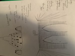
Here, we can see the magnitude of the erratic nature of the building. By observing the drawing, you question the stability, you question the foundation, and you question just how is it that such mass or weight is able to be supported by some columns especially due to the scale of the building.
However, we can see that the structural engineer LeMessurier decided to form long diagonals on the building’s facades in a V shape pattern. He did this to transfer the floor loads to the center of each face where the mega columns below are located. Interestingly the “trusses collect about half of the gravity loads and resist the entire wind loads on the building at the base of the tower.
This image gives the focus to the structure’s foundation. These columns or also known as pylons are not exactly located the edge of its rectilinear bottom form. Captivatingly they are located at the center of each edge. This is due to accommodate the design requirement. “LeMessurier conceived a structural design with columns located mid face, with six, eight-story-high V shaped bracing systems (in the form of inverted chevrons) to accommodate wind loads and to support the 22m cantilevered overhangs at the building’s corners – one of which would overhang St Peter’s Church.” (David 2018)
Embracing its angular roof Citicorp Center had different purposes for its design but in the end the engineer needed to keep looking for a back up plan as certain incorporations couldn’t happen. The original plans were intended to cover this low angled placed several penthouses retranqueados. The idea could not be carried out by restrictions in the regulations of the area.” [3] Another concept that was fed to the public was the sloping deck with solar panels. This idea was denied because it didn’t meet the requirements of solar orientation which would have most likely given Citicorp a completely different look from above. Nonetheless eventually the structural engineer decided to place a cradle of mass. It is a 400-ton device that keeps the building stable from the swaying winds that occur from the high altitude of the structure.
This is one of those buildings that required architects to do their research and study for successful execution since no other structure really compared to it at the time. An example is it’s massing. The massing is authentic since it doesn’t begin from the ground level. The bulk of Citicorp begins roughly at about 100 feet all the way till its sloping roof. The building gives the illusion as if it were to be floating. At a first glance it seems unreasonable as to how such a mass can be supported by four rectilinear columns but nonetheless it’s a standing structure that provides the element of surprise whether it’s perceived as good architecture or bad. Despite the buildings bulk It is a definite example of what a massive structure supposed to look like. Carrying out the concept with its lightweight looking façade. The composition of the building is clearly laid out providing the viewer the opportunity of differentiating floor to floor. There is also an ongoing interaction between the interior and the exterior by the horizontal glass walls and the compliance it has with the white aluminum material. The materials used give the façade a very polished look and a tone to stand out from the concrete walls that stand tall throughout the city. An elevation view from each side of the composition is minimally different. Meanwhile one side demonstrates the setback on the roof. The side views provide you with the fluidity of the structure, allowing you to see the combination of the massive entity with the Roof. Meanwhile, the back view would give the viewer a complete rectilinear façade. Overall, I feel that Citicorp is one of the buildings that began to provide the blend of being able to see from the exterior to the interior and even get a sense of the background from within its interior walls and lighting.
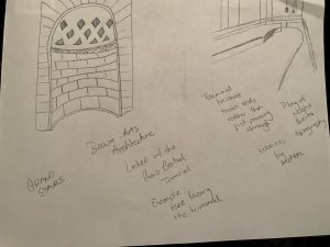
“The project has a sunken plaza, which contains an entrance to the ground level of the project’s large atrium and also to a subway.” (Midtown Book) The Sunken plaza gives the project the illusion of depth from height to floor and an authentic landscape overlay for a social performance space via the Sunken Plaza since it serves as the main entrance onto the building. Another notable feature which has significant importance is the central elevator bank core. This feature is only visible through the inside where you can also get an understanding of the V shape chevrons that connect to the central elevator bank core. The connection is necessary for the stability of the building. Like this all the tension forwards to the center of the whole which is the adequate physics property applied because of the winds that could possibly sway the winds from any possible side of the structure. Moving forward to the atrium, “The atrium not only has three entrances directly to the street, but most of its stores on the lowest level, which was the first basement level at Lexington Avenue, also had clerestory windows to permit passersby on the street to look down into the stores and also did not present deadened blank walls to the streetscape, a very nice urbanistic touch.” (Midtown Book) As years went by the retail spaces upgraded and Barnes & Nobles came in becoming, “a neighborhood attraction.” Although in 2016 Barnes & Noble “shuttered its store at the base of Citigroup Center in east midtown at the end of the month to make way for a major renovation at the property.” (Anuta 2016)
Citicorp Center is famous for being an example of a design flaw that could’ve wiped out the building for good. It really was one of those cases that could’ve been the worst architectural disaster in history.
It all started with a student named Diane Hartley, who realized by making her own calculations that the building could not withstand high speed winds. She managed to get in contact with LeMessurier, and while LeMessurier defended his project against the student via phone. After hanging up he quickly revised his own calculations since he had a little bit of doubt instilled. Therefore, this is the moment he then realized that the building was fragile against high speed winds.
Now considering the fact that the edifice had nearly a 400 ton mass damper, this damper was ineffective due to the fact that it would lose its power if a storm surged in the city meaning it would lose its purpose to stabilize and provide the building with equilibrium throughout the swaying winds. The 400-ton mass damper was needed because of the peculiar form of engineering and architecture needed to provide stability to a skyscraper of this magnitude. Because of this there were many meetings held by lawyers, insurers and Citicorp members in order to find a way to re-strengthen the structure. “At a meeting in the Citicorp tower, LeMessurier proposed a solution to strengthen 200 of the bolted joints. The solution consisted of welding 50mm thick plates across each bolted joint – essentially providing a permanent ‘band aid’ solution in the truest sense.” (David 2018) Obviously, after finding the problem and a resolution. The legal battle between Citicorp and the architect Hugh Stubbins & the engineer William LeMessurier began. This is something that LeMessurier should have seen coming as soon as the whole emergency procedure was enforced on the building since Hurricane Ella was said to be heading to New York City at the time on summer 1978.
Despite its hazardous moment in time the innovation of the building cannot be neglected. The concept of the Citicorp was just very groundbreaking at the time. The technicality in this building can be seen far more than in others. You can see the math that was made for the realization of angles and positioning that came into play in the composition of this building. Yet the biggest innovation and improvisation is the assurance of defying nature in a safe manner where the design of a building can be intricate and delicate yet still serve its purpose.
The reason I emphasize on the different nature Citicorp has is because throughout the 1960s; buildings were meant to fit the modernist criteria. Modern architecture is when form follows function, and the embracement of minimalism to the point where there was little to no ornamentation on the exterior of the building. Therefore, in the decade when Citicorp rose from the ground which where the 1970s. The 70’s in the architecture world were known for projects and concepts reacting to the restrictions imposed by modern architecture. Lutyens and Hislop describe it well by stating, “Style and the individualistic ethos of fashion design became the guiding principles.” and the 70s “represented a reaction against sleek mid-century modernism in favor of “playful embellishment and radical experimentation with form.” (Hislop & Lutyens 2009). As a result, Citicorp Center takes the spotlight with its Sunken Plaza, its 4 large foundation columns, its structural technique with the Chevron system, the Central elevator bank core, its 45-degree angled roof and with its 400-ton mass damper. All of these are reasons for architects at the time to celebrate the standing of this structure. It was a structure that broke the rectilinear mentality and still till this day it is one of those buildings that is easily noticeable on NYC skyline because of its attributes and posture.
This Midtown skyscraper gave influence on the Lipstick Building. Not in terms of shapes but of being able to break out from that box. William LeMessurier gave other architects the confidence they needed to be able to stand out. It gave them the hunger to be noticed and it also gave the impression that, “It’s okay to break the rules as long as all safety regulations are followed since no other designer or engineer would have wanted to have big major design flaw.” Moreover, I believe the attitude, the responsibility and the pressure for being structurally perfect is a ethic that was passed on from the Citigroup incident. For models the worst thing would be to fall during a runway show because of heels. Meanwhile for architects would be to have their constructed project collapse.
In conclusion despite the sequence of events that William LeMessurier faced with his project he owned his mistakes and took full responsibility for his actions. This demonstrates character and maturity. These are traits that should be instilled in everyone from students to parents, from teachers to designers, even to the people in high ranks of position in society. Also being someone who was in the profession for quite some time you can still be called out by students aspiring to be like you. Finally, just as Citicorp stands with its roof proudly pointing to the sky know the symbolization to not be afraid to try something new, you know why? Because life can get boring when you stay within the limits you already know.
[1] The Art Story
[2] www.6sqft.com/former-citicorp-center-is-the-citys-newest-landmarked-building/.
[3] CitiGroup



Recent Comments