All posts by mjimenez1993

Internship Final Post: The Trailer


Currently I am animating and editing a trailer for my app. Its gone through several rewrites and revisions because of the direction we want to go with it. At first this trailer was around 50 seconds which had to be reduced to 30 because the app store only allows for 30 and under. So I took me a while to reduce this because I had never done editing like this and felt bad cutting stuff I really liked or took a while to animate. I ultimately was able to get this trailer down to 30 second but my boss Brian wants to lower it to 18. I am still working on this and of course tried to explain how difficult this would be.

Im thinking about this video from a design point while Brian looked at it from a business point. I was able to convinse Brian to let me have 23 seconds.

Networking #1: NYCC- Todd Nauck

I was excited to return to NYCC for my 6th year. There’s always so much to see and so many people to meet. The great thing about comic con is that there are many panels regarding working in the comic book industry. These are always appealing as you have multiple artists and writers who take the time to answer several questions about their experience. I like to attend a few of these every year, but because its comic con, these sessions are always packed with people and there’s a small chance I’d actually be able to ask my questions. This is why I’m really glad comic con has an Artist Alley.

Artist Alley is a big part of NYCC, it is stationed separately from the show floor but is just as important to many fans. Artist Alley is where the fans can talk one on one with their favorite artists and writers. Each guest is given a spot with a table to display and sell their work. One of my personal favorite artist who inspired one of my own personal projects is comic book artist Todd Nauck.

Todd Kauck has been drawing for different comic book companies for several years and has recently working for Marvels X-Men series. Todd Nauck recently started a series of post-it drawings that were done to practice and work quicker. I was inspired by this because I love to draw but haven’t had the time to concentrate on big projects. I wanted to do drawings on post-it but wanted a way to keep my drawings. So I started drawing in a small sketchbook but the drawings are highly detailed.

I was excited to show Mr. Nauck the drawings I had made.

The response I got was really great, it was really informative. He told me that he really liked my book and that he felt touched that he inspired me. He also told me several things about getting into comic books. His advice was that if I wanted to draw for a comic book industry that I need to let my drawings tell a story without the words. My drawings would need to be able to explain to the viewer what is happening in the story without the words to tell them. He also recommended me to draw comic book pages and that the demand for comic book pages requires one to draw these pages really quickly. He also informed me more about the markers I use. I told him that I was using Prismacolor because I couldn’t afford the more expensive Copic Markers. He told me this is okay because the artist can use anything and still make it look good, as long as he or she has the skill. I was also told that he chooses Copic markers because in the long run they are cheeper because of how much he uses them and only needs to buy replacement cartridges and not the whole marker all over again.

I had a really great time talking to one of my favorite artist and I hope to one day inspire others like he has inspired me.
Internship #12: Ace&Me Part 3

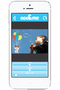
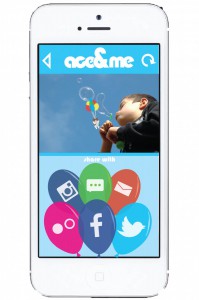
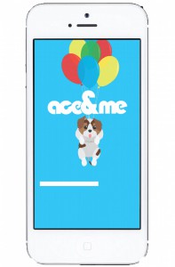
I started planning how the app would look and it actually took me about a week to complete. I originally explained how I wanted the app to have a blue sky theme and this required me to create new animations for certain features. I started with the logo for the app, we didn’t have a name for it so I just called it ace&me as a placeholder until we came up with something else but the name stuck.

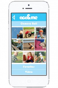
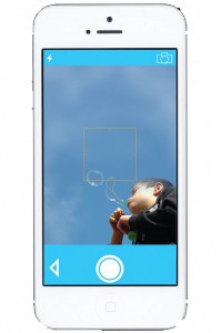
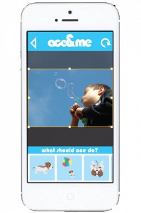
I wanted the letters to be very round and to look almost like a cloud and I use the bauhaus font to accomplish this. The apps colors would consist of different shades of blue, and we needed the app have the user be able to figure it out without much help. The app needed a way to have the audience see where Ace would be going once they had settled on which animation was chosen.

A1A2A3A4A5A6A7A8

I tried my best to have the apps layout be as simple as possible, and when shown to my boss was told it was much better than what we previously received and this is the model we started working off of and improving little by little the next step was to have this animated to fully show the user what the experience would be like.

Internship #11: Ace&Me Part 2

We had a meeting with a potential programer, Joan he had recently moved to NY. Brian and I discussed with him what we wanted the app to be and how we thought it should look. I myself hadn’t really designed or had any experience with apps so Brian thought Joan would be able to design the app and program it for us. In the mean time I was working on the app logo and also asked to design different glasses for Ace to wear.

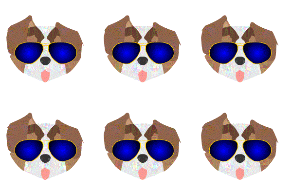
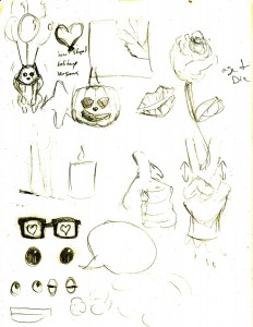
I decided to design only a few, 2 different styled sunglasses and 2 different styled reading glasses for the user to choose what they want Ace to wear, I was also planning out the next few animations I wanted to create but I was quickly interrupted before I could start that.

dogglasses

Brian and I were sent over e-mail the designs Joan had created for the app and I was told by Brian he didn’t look at them and wanted me to review it and come up with any changes I thought they should have. I looked and the designs sent and I didn’t like them.

I took one look and I just knew I didn’t like them, I’m not going to show them because they weren’t made by me and I don’t have permission to show them. But to me they didn’t look thought out and I had several issues with the designs. Firstly everything seemed rushed and the spacing of all the elements didn’t make sense to me. I thought the colors were too dark and didn’t go well with the tone of the app. Lastly the icon was redesigned and was simply my images with a different colored background there was nothing to the design I thought I couldn’t do better.

My boss was busy so I had plenty of time to gather my thoughts but I didn’t want to be harsh or too judgmental. When I finally sat down with Brian I opened up the designs and tried to say something  but was instantly stopped when my boss said, and I quote “this is shit” and I kind of agreed. We went over the images but Brian was already decided on the beginning that this was not the right guy for the job, so he saw what I had written down and said “you know what? why don’t you just do it?” and I said I’ve never really done it before and he said it was ok he trusts my judgement and that we’d improve it little by little. So I started sketching out the layout of the app.

Internship #10: Ace&Me Part 1

The next day I was called in for a private meeting with my boss. Brian told me that he was thinking of using the balloon dog as the set up for an idea he had. He liked the design of the dog and said he wanted to do something separate from what we were already doing. Initially I was interned there to work on the Selfmade project but then he pitched to me the idea of having an app with the character I created. It would be an incredibly simple app, the user would take a photo and be able to have a selection of animations to choose from to include in their photos. The animations would all be of different actions the dog would make. In exchange for my services I would be given certain royalties on the app and a separate undisclosed payment, nothing is set though. I of course agreed to being a part of it and was told that I’d be working apart from the rest of the group, the entire project being only discussed between Brian, myself, and once we found one a programmer.

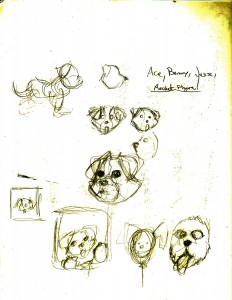
First thing I did was think of a name for the dog. We wanted something that could be either a boy or girls name. I had an entire list of names.

  • Sam
  • Mel
  • Benny
  • Jesse

to name a few, but ultimately chose the name Ace. My boss loved it and asked for me to start designing an app icon before moving forward with anymore animations. So I started sketching but I really only had one idea that I was sure would be perfect.

concept4

I had 3 designs in mind but only made the one I knew would work and it was decided it would be the one we’d use.

icon app copy

Internship #9: Balloon Dog Part 3

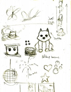
After finishing including the balloon dog into the photo with the baby my boss Brian asked for me to think of more for the dog to do. He really liked the design and style of the dog and wanted more, he even said it could be like the company mascot. So while I started coming up with ideas the zombie assignment came up so I set this project aside for a bit. I originally had the idea to have holiday versions of the dog on the balloons so I decided to draw this idea. I presented this to Brian but he said he didn’t want to got that far yet, we needed to have a fully thought out character.

concept3

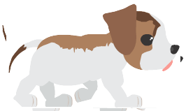
So I worked on making a front and side view of the character, to make the dog walk. This is when I just started coming up with ideas little by little starting with the walking cycle. walking

Next I was asked to make the dog walk and lead into another animation. This is where the dog would then walk and turn them roll onto his belly. This was challenging to me since I had never done something like this. I took that entire week to sit down and draw how I would accomplish this. I had never animated a dog and don’t have one around to draw from. The main problem was figuring out how to turn the head and the solution I came up with pretty funny. I collect action figures and one or my figures was modeled after a raccoon character whose head shape was similar to what I wanted. So I took photos of the head used the photos as a guild for the turn action. After finishing I showed my boss what I had and he loved it, and asked me to think up a name for the dog.

acewalkandturn

The next day I was called for a private meeting with my boss, my job was about to get alot bigger…..

Internship #8: Zombie

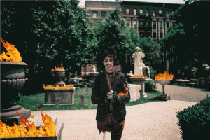
We get an image from a client who requests we turn him into a zombie in the photograph. This is one of those times where it took teamwork to complete this assignment. I wasn’t originally supposed to be involved in this assignment,  i’ll explain in my next blog, but I had so many ideas pop up about how to complete this assignment that I requested I be part.

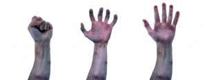
First we decided who was doing what, Alec was supposed to zombify the person in the photo, my co worker Lisa went back and forth with the client and I would provide the animation effects. I decided to have zombie arms pop out of the ground and be clawing to grab something. This was a challenge as it involved using real arms and nothing drawn. To accomplish this I first went online to find stock photos of arms. I needed to find the arms in the right positions to make the illusion work. I considered photographing my own arm but I only had the day to finish the assignment. After I found the right arms I edited them to the right scale and used the same filter in all the arms to make them look dead and rotten.

hands

The very last part needed was a fire effect, Unfortunately for me I don’t know how exactly to create this effect and didn’t have the time to learn it so I had to use an effect I found online. In think if we had more time I would’ve liked to play with the lighting to make the fire look more realistic but am happy about the way this assignment turned out.

Adam-Zombie

Internship #7: Balloon Dog Part 2

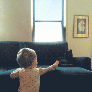
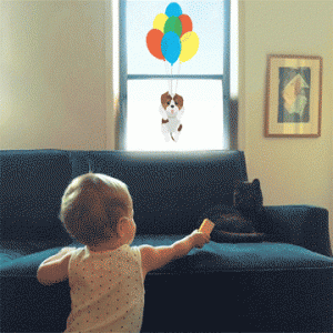
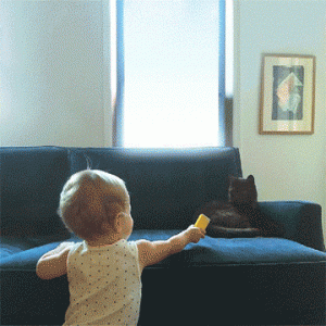
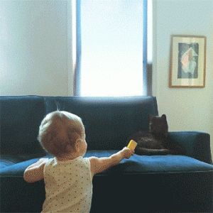
As soon as the animation was finished the very next day I was asked to include the animation in many different ways into a picture of a baby. I was asked to first remove and fix a couple of elements and then include the dog. I worked on this for a couple of days working out the timing and entrances the dog would have. I created in total 4 different ways for the animation to be used but the last one was a bit of a challenge. I hadn’t put so much focus on my animation skills recently because I was focusing more on my illustration skills. But I find myself having fun working on animation especially when I have to figure out a challenge.

2dog 1dog

3dog

The last animation I created needed for the dog to sit on the couch at the end of his entrance. To do this I took alot of time to picture how this would look and how it would need to be animated but I was happy with how it ultimately came out. I had one more challenge to figure out.

4dog

Although I had finished the animations I had one big problem. The gif files were too large to send over email to show my boss. This was because i didn’t know how much space gif files take up. I had to research several ways to send them at first I thought I’d send them as mov. files but my version of flash wouldn’t convert the files correctly. So I had to find another way to send the gifs, I saw online that the file size can be reduced through photoshop. This could only be done if i reduce the image size, and it worked.

Internship #6: Balloon Dog

I was still getting settled into my internship and discovering that everyone has a different workflow. We are each given different tasks depending on the skill we possess to research our tasks and pull together our ideas. For example, we receive a photo and then we each come up with ideas on how to change and edit the photo to provide at least 5 different responses. Because I was mostly dedicated to animation I was given a task by my boss. Brian wanted me to come up with different animation ideas that we could just use in animations targeted towards girls. I was given a good amount of time to research anything I needed and was given helpful tips by Brian to look up Facebook or Instagram to gather ideas on what would appeal to them most. This is when I went into my sketchbook and just started drawing. I didn’t know exactly what I wanted draw I just knew it had to be something cute. I sent a couple hours just thinking up different ideas for different animations. Finally at the end of the day I pitched my ideas to Brian but one specifically caught his eye.

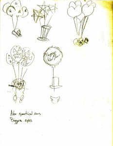
concept1 concept2

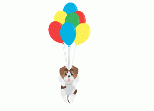
I had this idea to use cute animals and give the animals the same head shape but different features and colors and made and example of this and included one with the animal being a dog strapped to different colored balloons. He threw out the whole different animals thing and loved the idea of a dog tied to different balloons, he then asked me to animate it. I spent the rest of that day animating the balloon dog and he loved it but kept trying to make the dog cuter and simpler till we finally arrived to the animation you see below.

balloondog